Creative solutions for plastic waste

Tom Hughes

Plastic is a material that we’ve tended to avoid, put off by our awareness of the environmental problems that its irresponsible use has created. The reduction in plastic use, finding more ecologically friendly alternatives, is still a great idea. But what about the mountains of plastic waste that already exist? Can we contribute in some way to preventing these carbon-intensive materials from ending up in landfill, or in the gullets of turtles, fish and sea birds?

At Future Makers, a creative hub in Nottingham, we’ve been learning about plastic waste and helping set up facilities for turning it in to useful recycled (and recyclable) products. Adding value to a waste product makes the process of collecting and recycling it worthwhile and cost effective. The Future Makers ethos is to approach these problems in a creative way; they bring together the infrastructure required with the expertise and knowledge that enables artists and designers to explore new ways of working.

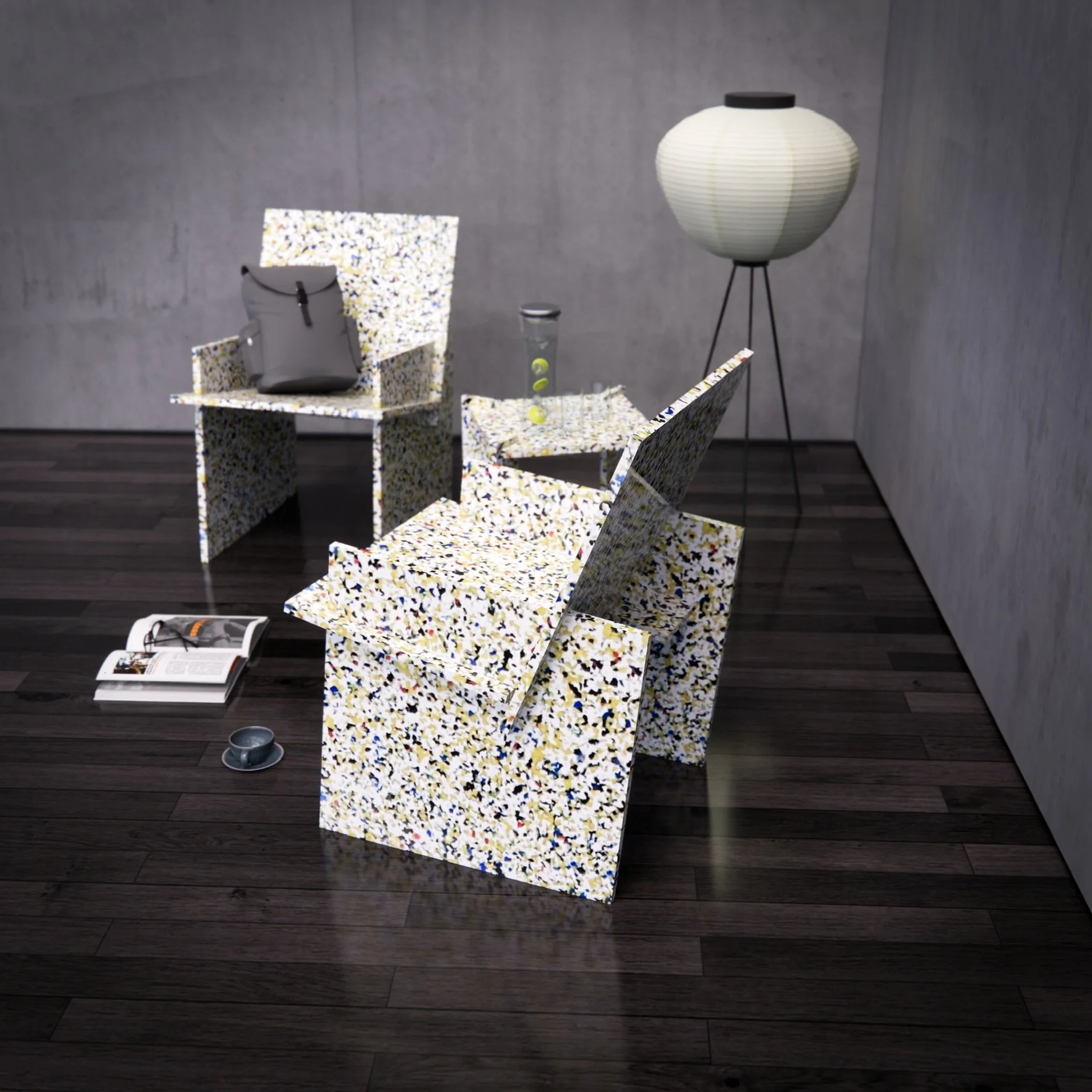
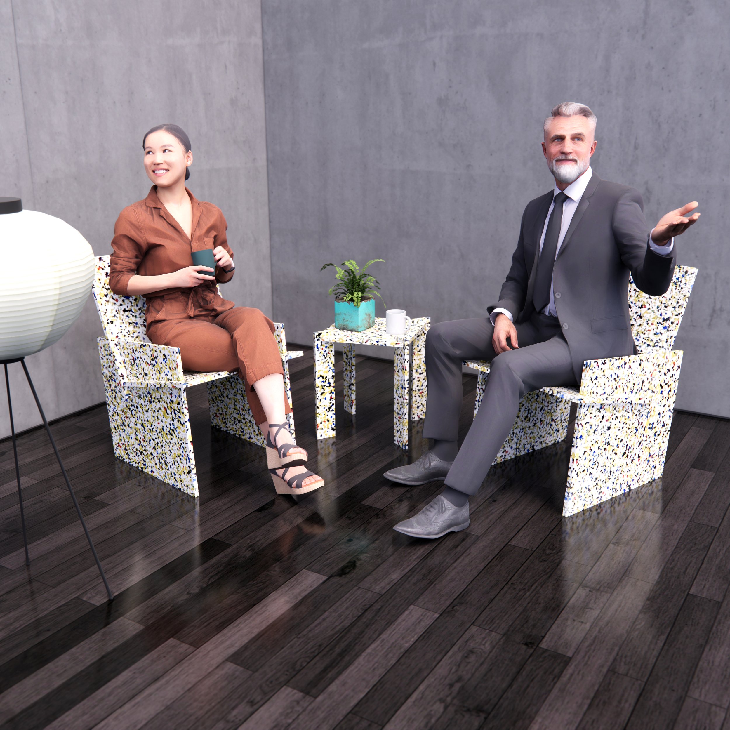
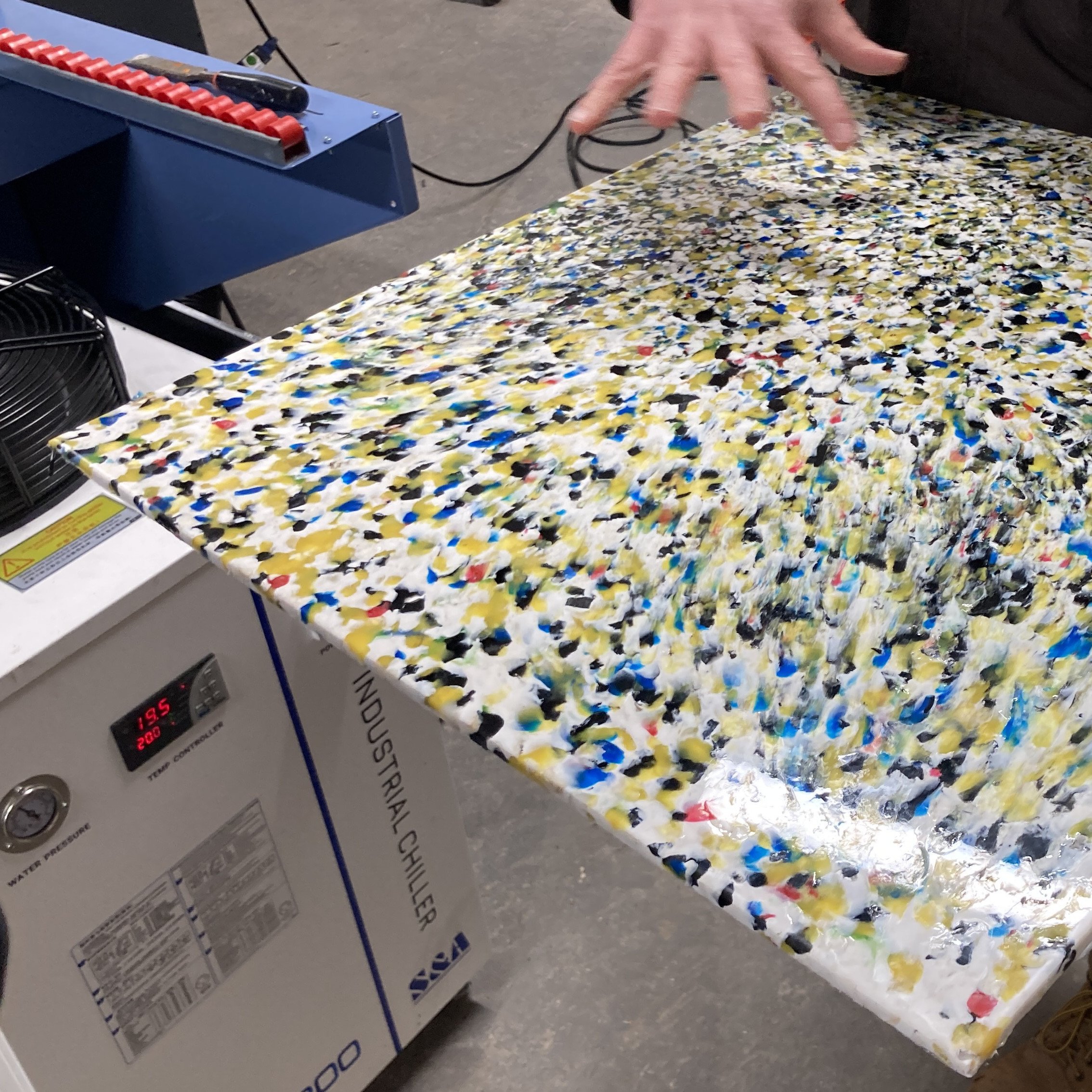
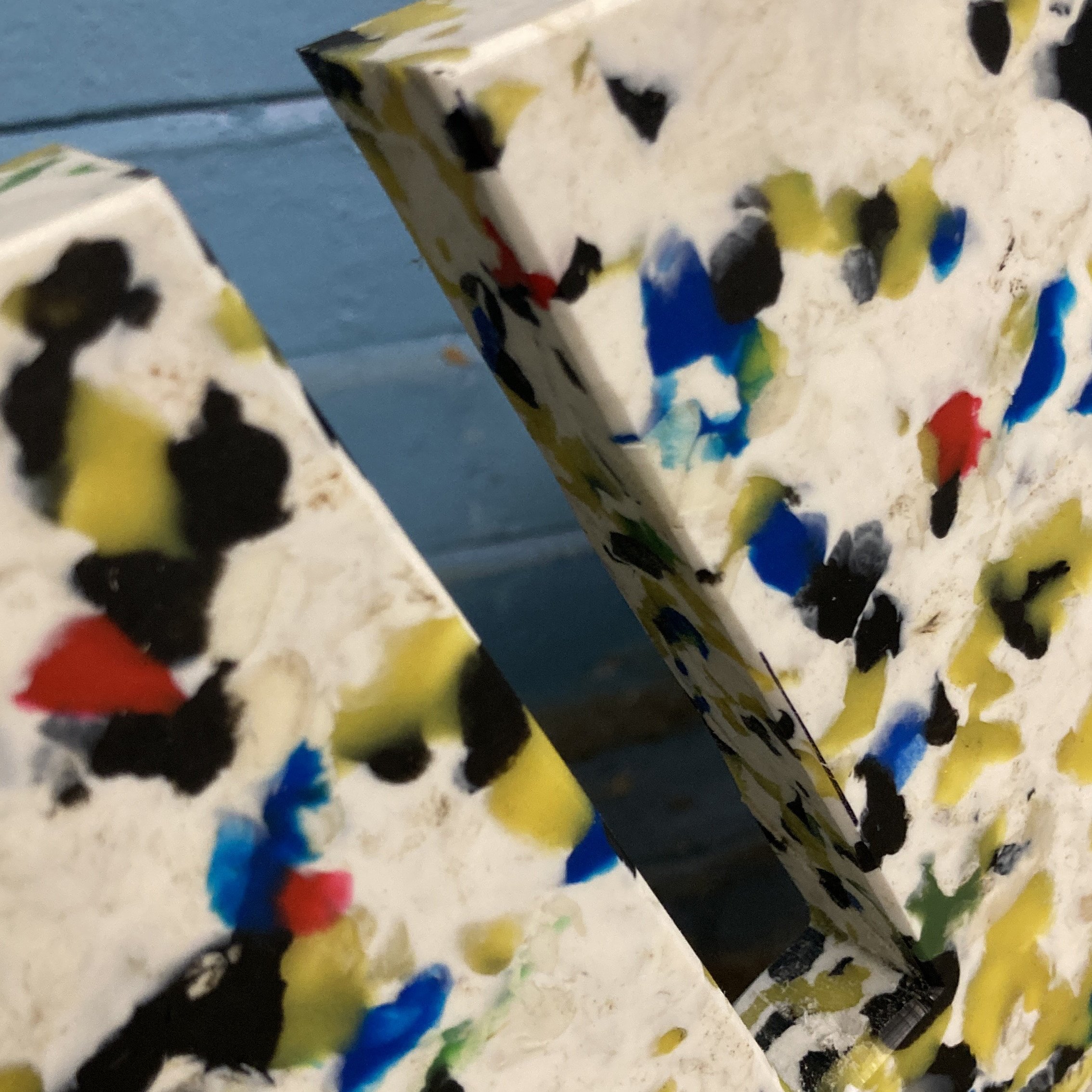
Importantly, there is an economically sustainable approach. New ideas aren’t just conceived as one-off experiments, instead they build the knowledge and experience required to create viable commercial opportunities. In this spirit we were commissioned to work with the initial, terrazzo-style production run from Future Makers’ industrial sheet press, to create some simple-to-build furniture pieces.

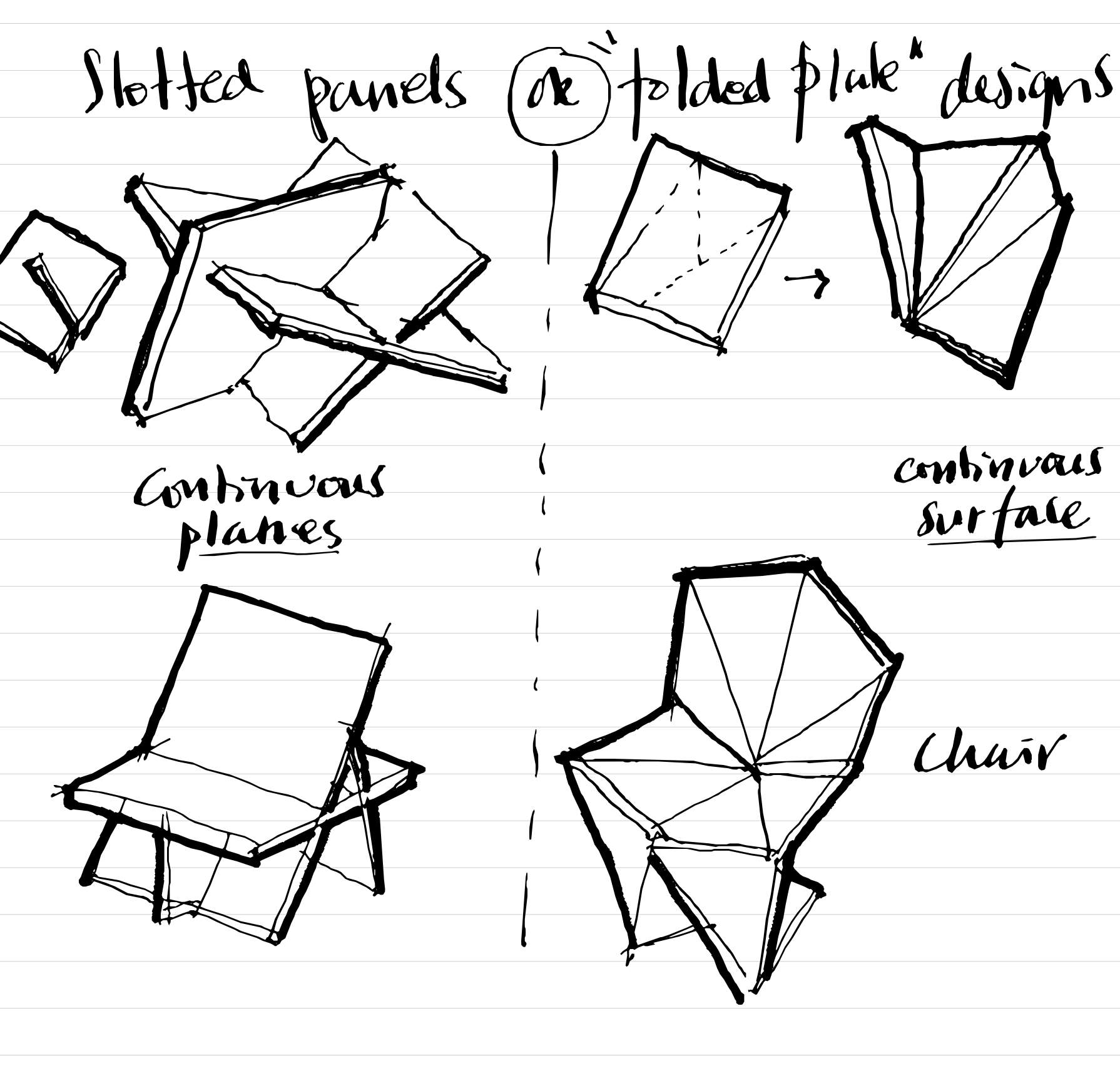
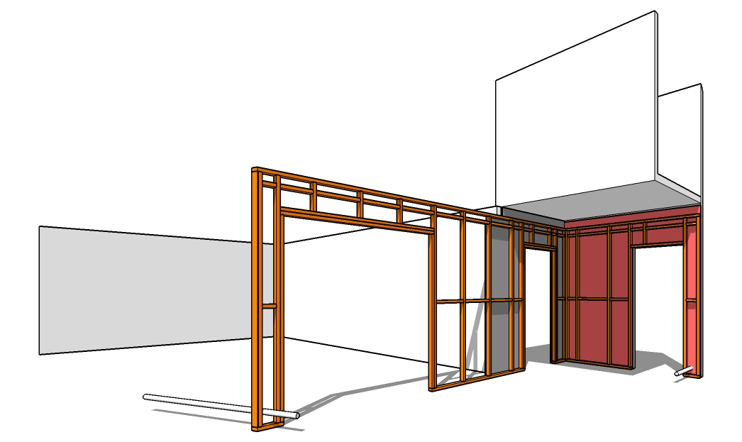
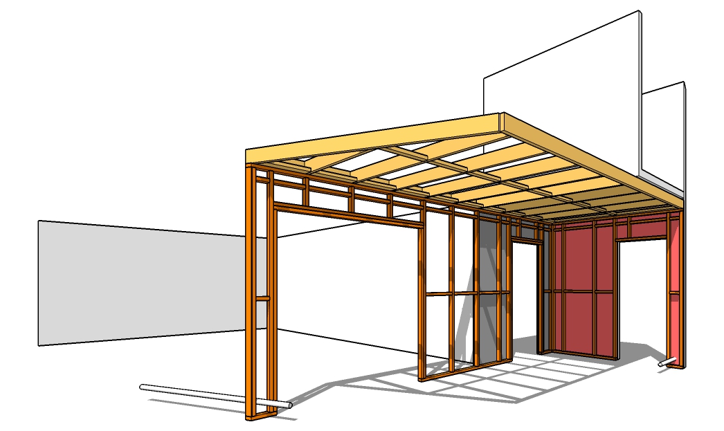
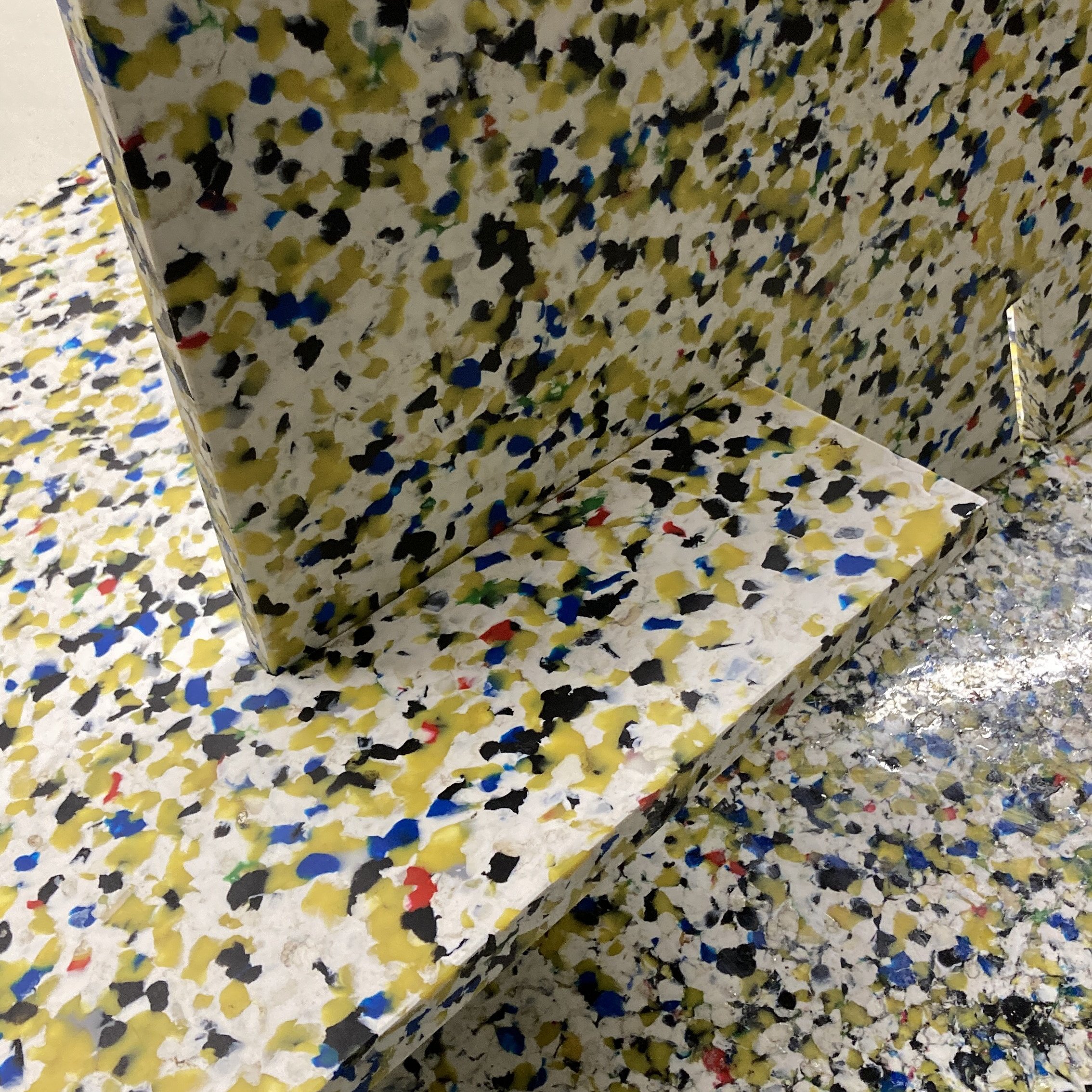
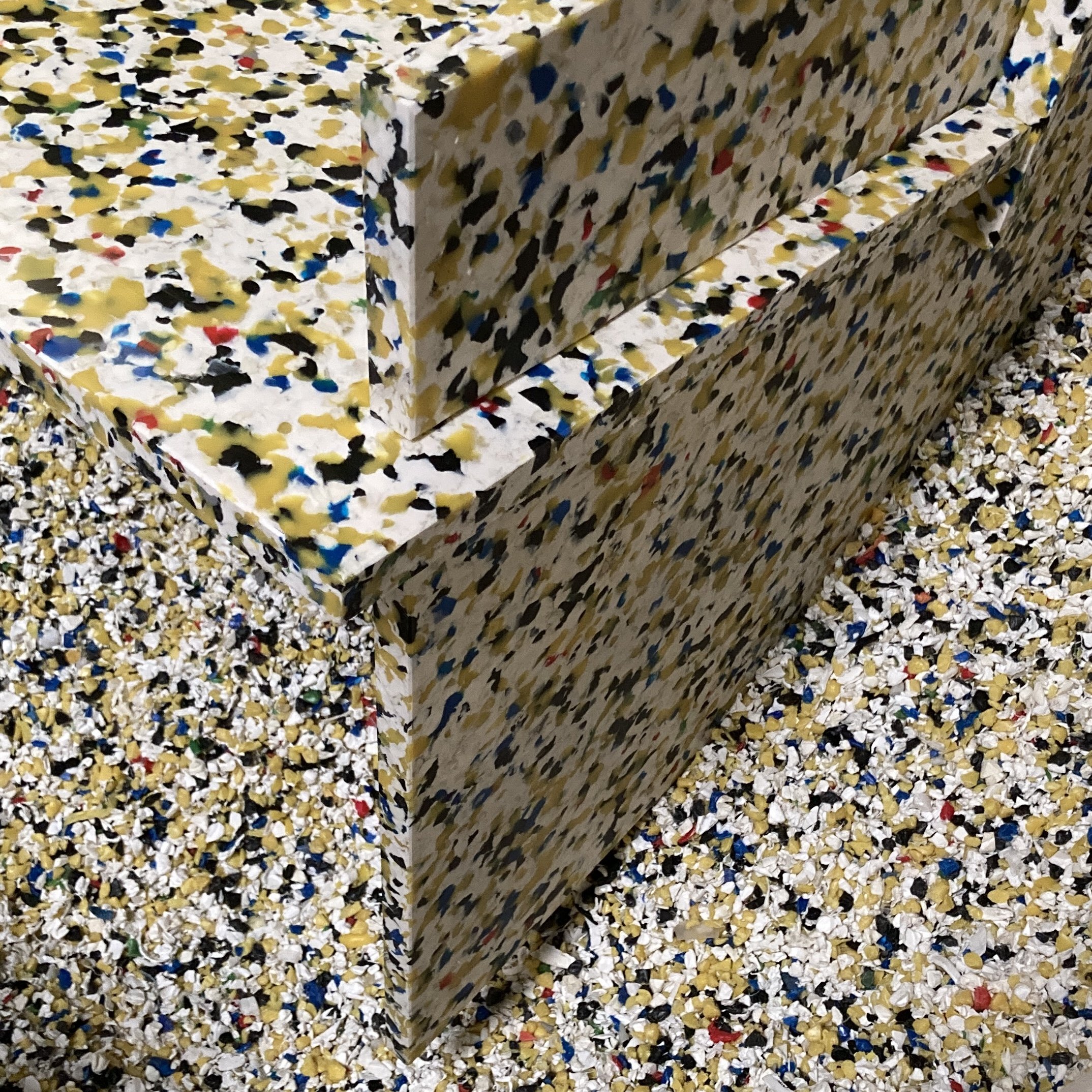
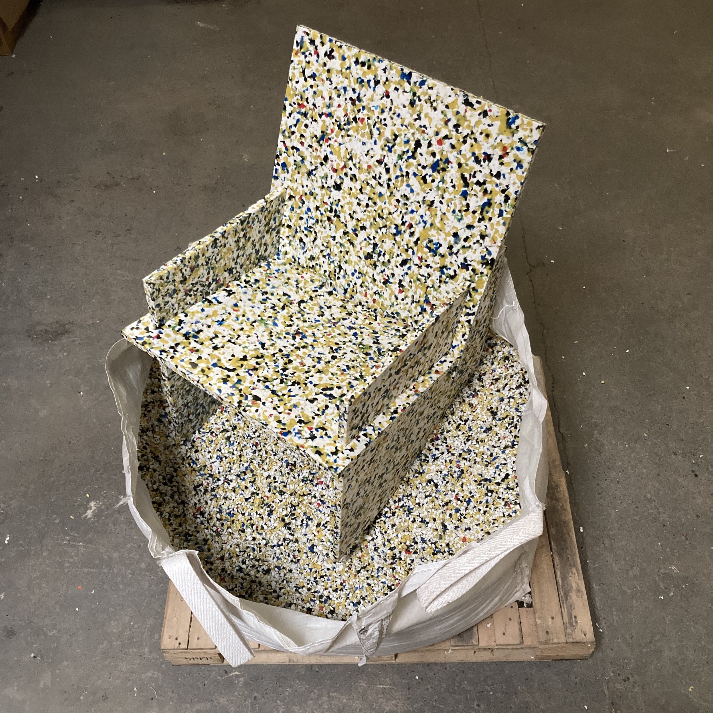
Using the HDPE sheets, made with waste left over from artist Joshua Sofia’s 2001 Regulated Exhibition at Backlit, and in collaboration with Marcus Rowlands (Sheltered Spaces), we designed a slot-together furniture system for an armchair and coffee table. Easy to assemble and disassemble, without fixings or complex brackets, this can be transported to exhibitions and events. As a product, it could be mass produced and shipped, flat-packed to customers. As a single type plastic, it is recyclable again at the end of its useful life as furniture.

In itself not THE solution to the problem, but hopefully another piece of evidence that plastic waste has value. And a thoroughly rewarding project to be involved in!


Photography: Colosseum Mann hospital, by Montaag

Thibaut Devulder

Some images from my photoshoot of the Colosseum Mann hospital, in Oslo, recently redesigned by the very talented team at Montaag, a multidisciplinary design studio based in Norway and California.

P8530150.jpg

Photography: Nordisk Film & TV Fond

Thibaut Devulder

Some images from my photoshoot of the office interior at the Nordic Film & TV Fond in Oslo, freshly redesigned by Kubik Interiørarkitekter.

Photography: Akersbakken 12

Thibaut Devulder

A photoshoot of Kubik's latest interior design, on Oslo's riverside. 

Photography: Kubik's Nedre slottsgata

Thibaut Devulder

A new photoshoot forKubik Interiør Arkitekter: a newly redesigned staircase in Oslo's city centre.

Photography: UGG showroom

Thibaut Devulder

I have just completed another photoshoot with interior architects Kubik, this time to photograph their recent refurnishing of a showroom for the uber-trendy shoe designer UGG, in Oslo.

Designing self-build projects for artists

Tom Hughes

A recent project at One Thoresby Street artists studios and gallery gave us a chance to develop new techniques for designing with self-builders.

Artists at the One Thoresby Street gallery, building our design themselves

As part of a longstanding relationship with the artists at One Thoresby Street (OTS), we were asked to design a lobby space for the top-floor Attic Gallery. This would sort out circulation between the gallery and studio spaces and provide a vital fire safety feature by separating the occupied space from the access stairwell. Unusually, the lobby would be built entirely by the artists themselves.

We approached the project through a careful survey of the existing building and designed the lobby to create a great experience for visitors as they approached up the stairwell. A sliding fire door, held open on electronic sensors linked to the fire alarm system ensures that movement and views through are eased. The height of the lobby is reduced to contrast with the tall gallery space, which also minimises the materials used and creates a storage and projection deck overhead.

High technical standards had to be met in the project to create a fire resistant construction, the budget was tight for materials and the building team (skilled makers but not construction professionals) needed to have excellent clarity over the build process.

This put huge demands on the communication of technical information, so we took an approach more normally found in larger scale projects - we created a 'Building Information Model'. This was a CAD model showing every structural member, board and component, organised to give the artists a coordinated picture of the materials to order, the dimensions for cutting, the assembly sequence and the spatial relationship between every item in the final assembly. We then lent the group a laptop with the CAD model installed so that they could take the information directly off it on site.

The build proceeded smoothly with a tiny number of requests for additional information, wastage of materials was kept to a minimum and the end result is a happy self build client, an effective adaptation and an safer, better Attic Gallery space at OTS.

Assembly manual for custom-designed furniture

Thibaut Devulder

In the summer cabin we redesigned on the Oslo fjord, we articulated the main living space with an open screen that had to perform many functions: create a light visual separation within the open plan space, provide storage for outdoor clothing and shoes for up to ten guests, integrate a large TV and offer seating in front of the new wood stove.

We finalised the design of this custom-made furniture as the project was already on site and decided to build it out the same oak bench plates used for the new kitchen. We created detailed instructions for the builder about how to make and assemble this large piece of furniture. Our instructions even included the detailed cutting patterns to minimise waste from the standard benchtop boards used to make it!

Photography: Kubik's new office for Norman & Co

Thibaut Devulder

Kubik Interiørarkitekter — the talented interior architects with whom we are sharing an office space in Oslo — asked me to take photos of their freshly completed new interior for Norman & Co, Norway's oldest law firm, in Oslo's exclusive Akerbrygge neighbourhood.

Here are some of my shots, trying to capture Kubik's delicate contrast of warm materials and cool light...

Photos taken brilliantly, in all aspects of the word!
Nice, precise, detailed and beautifully captured with brilliant colours. We will definitely ask 2hD again to photograph our interior projects!
Hege Liven, interior architect at Kubik

Portfolio project
A seaside cabin in Hvitsten

Thibaut Devulder

Sketch impression of the remodeled cabin, looking at the fjord from the playroom

We love to design cabins, as they bring together so many of our design interests.

First, our predilection for architecture in remote (and often sensitive) natural locations, to create small thresholds where man meets nature, where minimal environmental footprint and limited access call for an economy of means.

And we are fond of designing tiny spaces — creating places rich in human interactions and intricate functions where people can really "key in" with the architecture, bringing back the simple joy of being together, sheltered from the elements.

But as importantly, cabins also act as social nodes where the complex community of the different generations in a family or in a group of friends congregate, each with their different needs, expectations and desires, making for a challenging but fascinating briefing process.

This redesign of a seaside cabin in Hvitsten, on the shore of the Oslo fjord, brought all these aspects together and was a nice counterpoint to our earlier design of a skiing winter cabin in the mountains of Hedmark.

A small stream flowing between the existing cabins

About the project

As is often the case with Norwegian cabins, our clients for this project spanned over three generations. Initially built in the 1950s by the great-grandfather, the summer cabin and its small sleeping annex have been used ever since by the family for spring and summer holidays.

The extended families are now struggling to all fit in the cabins, which has become both too small and in need of repair. Now retired, the grandfather and his partner also want to use the cabin a lot more throughout the year, so they needed the uninsulated cabin to be upgraded for the winter climate and wished to have a real bathroom installed.

All had cherished childhood memories of the cabin and wanted to preserve as much of its exterior aspect and rustic character as possible. So, their requirement to comfortably fit in up to twelve sleeping guests for occasional extended family gatherings called for inventive remodelling and renovation, considering their tight budget!

Looking at the existing cabins

Perched against a steep rocky hillside overlooking the sea, the cabins face south-west into a breathtaking view of the Oslo fjord and its slow ballet of sailboats and cruise ships.

The Oslo fjord, as seen from the main cabin

Plans of the existing cabins

In the main cabin, the small living room actually had a large window opening towards the fjord, but the kitchen and meal area — central to family life in the cabin — were situated behind it, in the darkest part of space of cabin, right against the rock face to the north. The other facades of the cabin were essentially blind because of a small hallway and the two bedrooms to the west. As a result, the main daytime social spaces had no visual connection with either the covered porch to the south-west or the sleeping cabin to the west, both of them often used in the mornings and evenings for informal meals and drinks.

Typical of spaces with light coming from only one direction, this configuration made the living room and meal area appear strangely gloomy, as the large window created a glare effect in contrast with the other darker and unlit interior surfaces. Built to look straight onto the fjord through this large window, the space had only short interior perspectives, making it appear more cramped and small than it actually was.

Situated a few meters downhill and to the west, the sleeping annex had a quiet simplicity to it, nested in the overgrown vegetation and straddling a small stream in the rocks. Unfortunately, an improvised shower had been installed inside a few years back without proper ventilation and created damp problems, so that in addition to being overcrowded, its sleeping rooms had also become uncomfortable.

Welcoming everyone

The initial plan was to integrate the existing porch into the main cabin, to create an extra bedroom. While this made sense to accommodate more guests, we all agreed that this compounded some of the existing problems, in particular closing off the main cabin from the fjord.

From two to fourteen sleeping guests! (click for full size) 

Turning the problem around, we actually removed one bedroom from the main cabin, thus keeping only one for the most frequent occupants of the cabin: the grand-father and his partner.

We carefully checked the feasibility of our proposal by preparing a comprehensive list of use scenarios, from one couple to up to fourteen sleeping guests! We found that moving the shower out of the sleeping annex, ventilating it properly and making some slight adjustments to its interior layout and bedding would allow eight people to comfortably sleep there. All this could be done at minimum cost, so that most of the available budget could be dedicated to the main cabin.

Now remained the task of optimising the shared daytime spaces in the main cabin. And this was essential: every parent can imagine the intense atmosphere when up to three families, including young children, are stuck together indoors for a whole rainy afternoon! Thus, in addition to creating functional living quarters, we also needed to organise sub-spaces within this small cabin, so that everyone could define his or her comfortable own space.

A niche in the rocks

We approached this task from two different angles.

Our design strategy for the remodelling the main cabin, drawn over the plan of the existing cabin (click for full size).

First, we created two different sub-spaces: one for the adults, facing the fjord, more social and relaxing, and one more playful for the children, cradled against the vegetation of the shaded cliff face. These two spaces intersect around the dinner table, the natural converging point for the whole family.

Then, we connected these spaces to the outdoors by nesting these sub-spaces around generous openings — not just towards the fjord, but also towards the sleeping cabin wrapped in overgrown vegetation down to the west, the mossy rocks at the north and the sunbathed terrace to the south — to create a dual feeling of spaciousness and enclosure.

Sketch impression of the remodeled seaside cabin, looking across the living room

Although the main living space remains compact, it feels opened to the light patterns and textures of its natural surroundings.

Frequently eating out during the summer months, the kitchen and dining area extend out onto a terrace that is stepping down, so as to maintain unobstructed views of the sea horizon, even when terrace parasols are used or the large awning on the south facade is deployed. The terrace also acts as a connecting point between the main cabin, the play garden and the shaded path to the sleeping cabin.

The proposed plan for the main cabin (click for full size)

Fitting it all together

Space was very limited inside the main cabin, so we concentrated most of the storage along the west wall, designed as a large oak surface perforated by the kitchen and large window niche where children can sit and play. To make sure that everything fitting nicely, we produced a detailed specification for these densely fitted interior — both in Norwegian and in English, at the clients' request.

We love to involve our clients in the building process. And since one of them is keen on woodworking, we had a design session together to develop together the design of open screen between kitchen and sitting, which also will also integrate coat/shoe storage, seating, a book shelf and the TV equipment. He will later on build it himself.

The very basic existing drainage and electric systems were upgraded to cater for the new bathroom and appliances. The cladding was damaged and needed replacing, so we insulated the whole building fabric and fitted new energy-efficient windows. Along with a flexible shading system and ample provisions for natural ventilation, our clients will be able to enjoy their cabin all-year round!


Workshop visit: Warrington & Rose

Tom Hughes

Looking at potential suppliers of concrete worktops for a fit out project recently, I contacted Warrington & Rose. Locally based and with some really interesting pieces on their website, including an intriguing experimental piece with cinnamon sticks cast in to a concrete table top. 

I had a good chat with Michael Thorpe, who turned out to be an ex-student of mine from Nottingham Trent University who set the company up after graduating and a few years working in the industry.

Great to see a former student creating some quality products, taking experimental risks and branching out as an entrepreneur!


Walker House remodel

Thibaut Devulder

The existing house

Our clients are now finalising the site work on our remodel of their home in Eidsvoll, Norway.

We were originally approached by the clients in 2011, to reorganise a family house that had become overcrowded for their family of five and — more importantly — to create a modern comfortable home they would be proud of.

The clients' brief

The model of the surveyed house

Already extended once, this house was in fact spacious enough for the family. Yet the existing layout made poor use of the internal space: stiffly compartmenting into disconnected rooms, the floor plans created several "dead areas" on key locations of the three levels, which were mostly left unused by its inoccupants or barely used for storage.

The existing services were obsolete and poorly placed — with no bathroom on the ground floor for instance — and the clients were eager to upgrade the building fabric and technical installations as part of the remodelling exercise. Summer overheating and noise from the increasing overhead airport traffic were particularly problematic.

Conscious that their three teenage sons would soon be leaving the family home, the parents were also willing to remodel the house so that the upper floor could easily be isolated from their accessible quarters on the ground floor in the coming years, to be rented out to tenants with minimum additional work.

All these had to be addressed with minimum alterations to the exterior of the building, to fit the budget and the local planning rules.

Unlocking the flow

After a detailed survey of the existing house, we identified key factors breaking the flow through the house. These were tackled by a series of strategic moves that could unlock the potential of the space in a cost effective way. At the core of the approach was to clarify the organisation of public and private spaces, and how these flowed into one another.

A few key changes to the internal building fabric allowed us to both connect the spaces for greater flexibility in use (to host large family events, for instance) and respond to the need for privacy between the different parts of the house.

 Creating an experience

Altering the floor plans was the first move to transform this home. We extended this approach to carefully select interior materials and light fittings, to suggest and emphasize the new relationships between the spaces.

Entering the house, the visitor is drawn further into the spaces by a series of focal points revealing themselves progressively from different viewpoints as the house is explored, linking the social spaces and the large garden outdoors.

Improving comfort

The timber structure was fully re-insulated internally, using high density natural wood fibre insulation to improve all year round thermal comfort and dampen external noise. Comfort was further improved by replacing the existing windows with hi-spec new low-energy and noise reduction glazing.

With minimal changes to the existing drainage system, two new family bathrooms and a guest toilet were added to the ground and first floors. Connected to a new centralised ventilation system, they dramatically improve indoor air quality in a quiet and energy efficient way.

Working in close collaboration with the clients, with their in-depth knowledge of every corner of the house and the way it was constructed, allowed very detailed design and planning of all the alterations, while keeping building costs low.

Low energy house, high quality space

Tom Hughes

Over the bank holiday I dropped in to see how the clients for our low energy house are getting on. They've been in residence for a good few months now and it was great to see the house in operation as a home.

The property is going to be open to visitors as part of the programme of tours arranged during September 2013 by West Bridgford Eco Houses- if you want to visit check out their blog post about the house.

All the energy saving features are behaving well, although it is too early yet to get statistical feedback on performance. The basic principle is to make good use of passive solar gains from the south and trap the heat in the the high thermal mass of the building, inside a highly insulated jacket. Overheating is prevented by the thermal mass, which evens out temperature highs and lows, and by effective use of shading on the south facing windows. The other important factor is to control drafts, and the build quality here is exceptionally good.

The really gratifying thing to see was that the house is working well as a home for our clients- it's clearly a comfortable, welcoming and relaxed place to live.