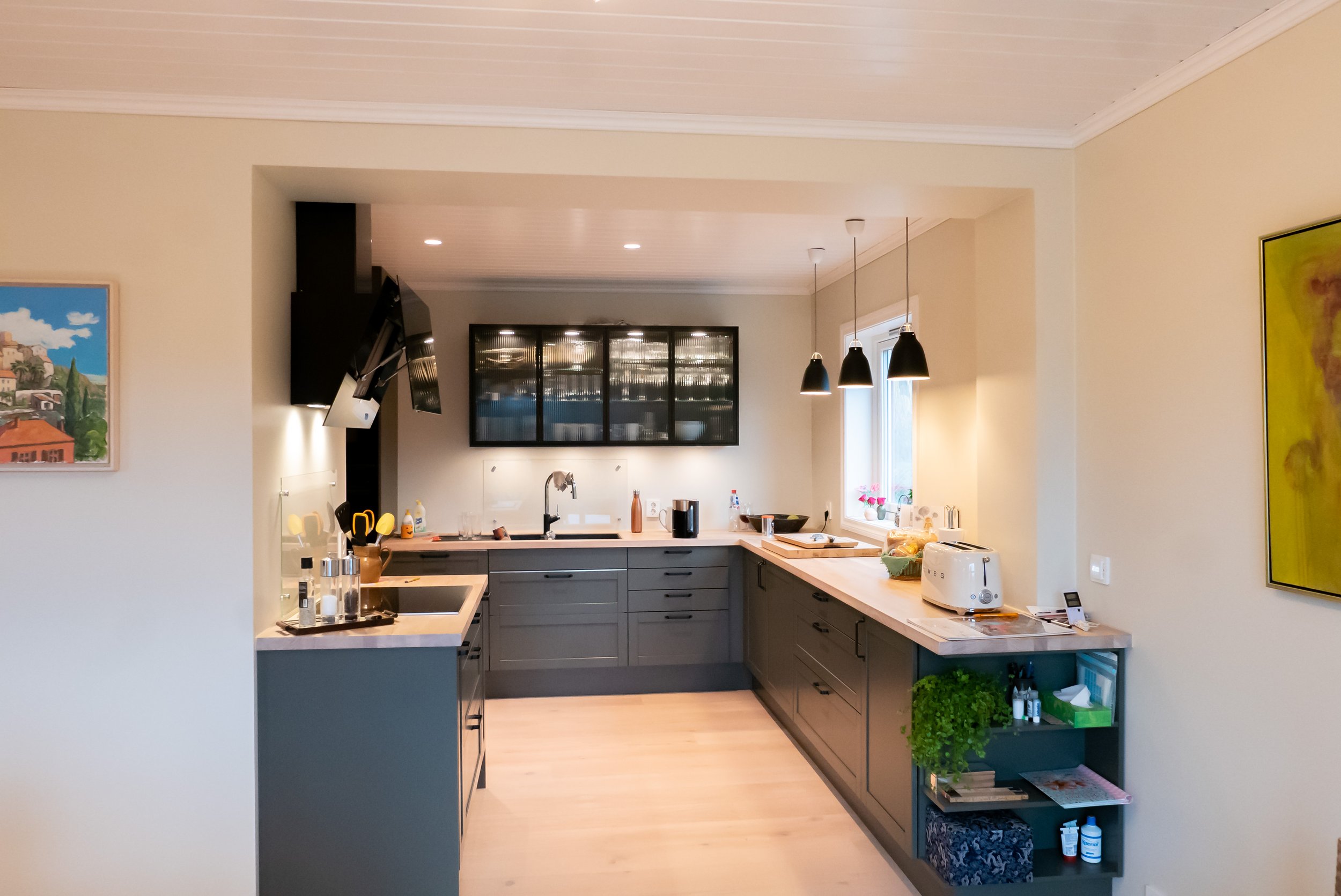
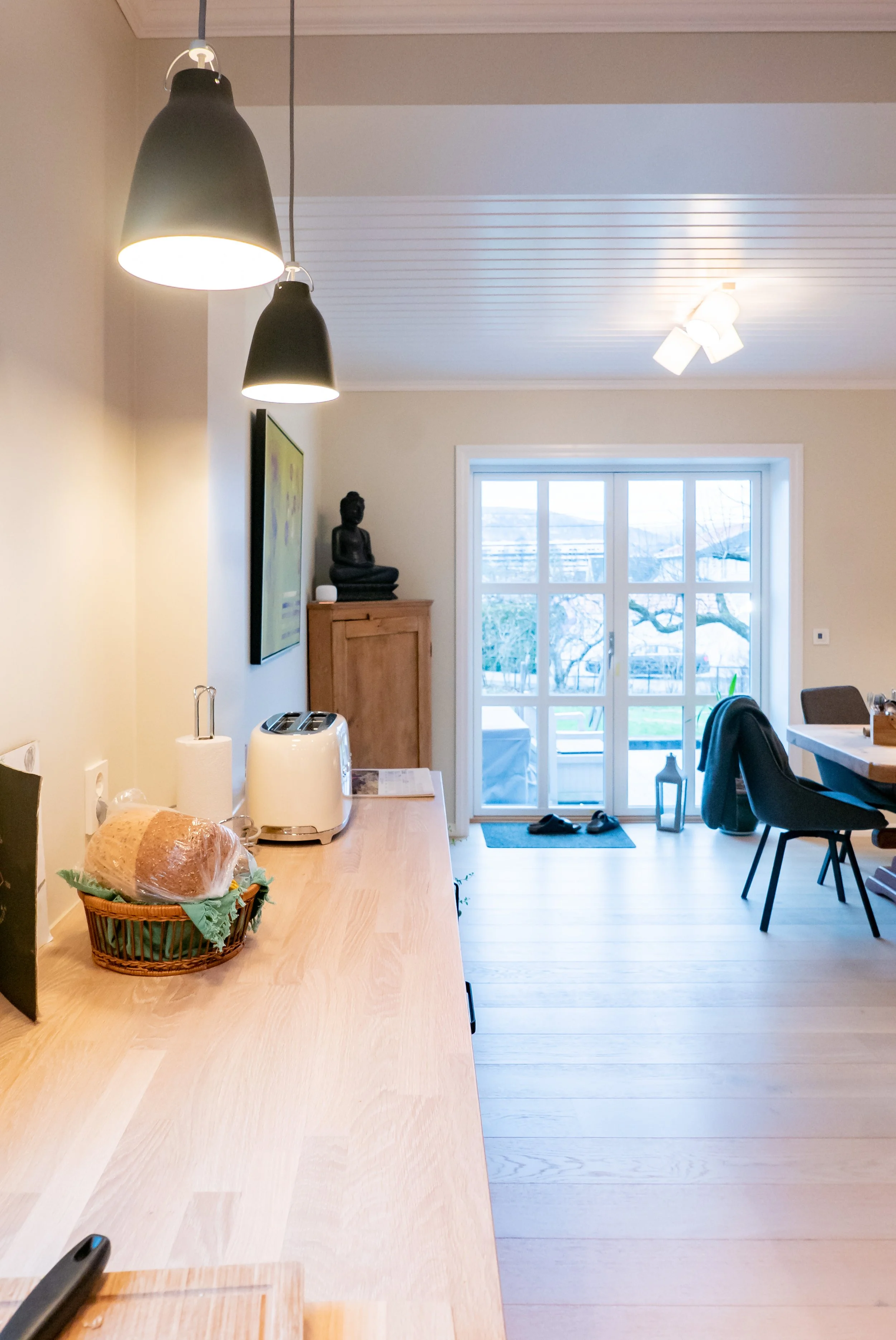
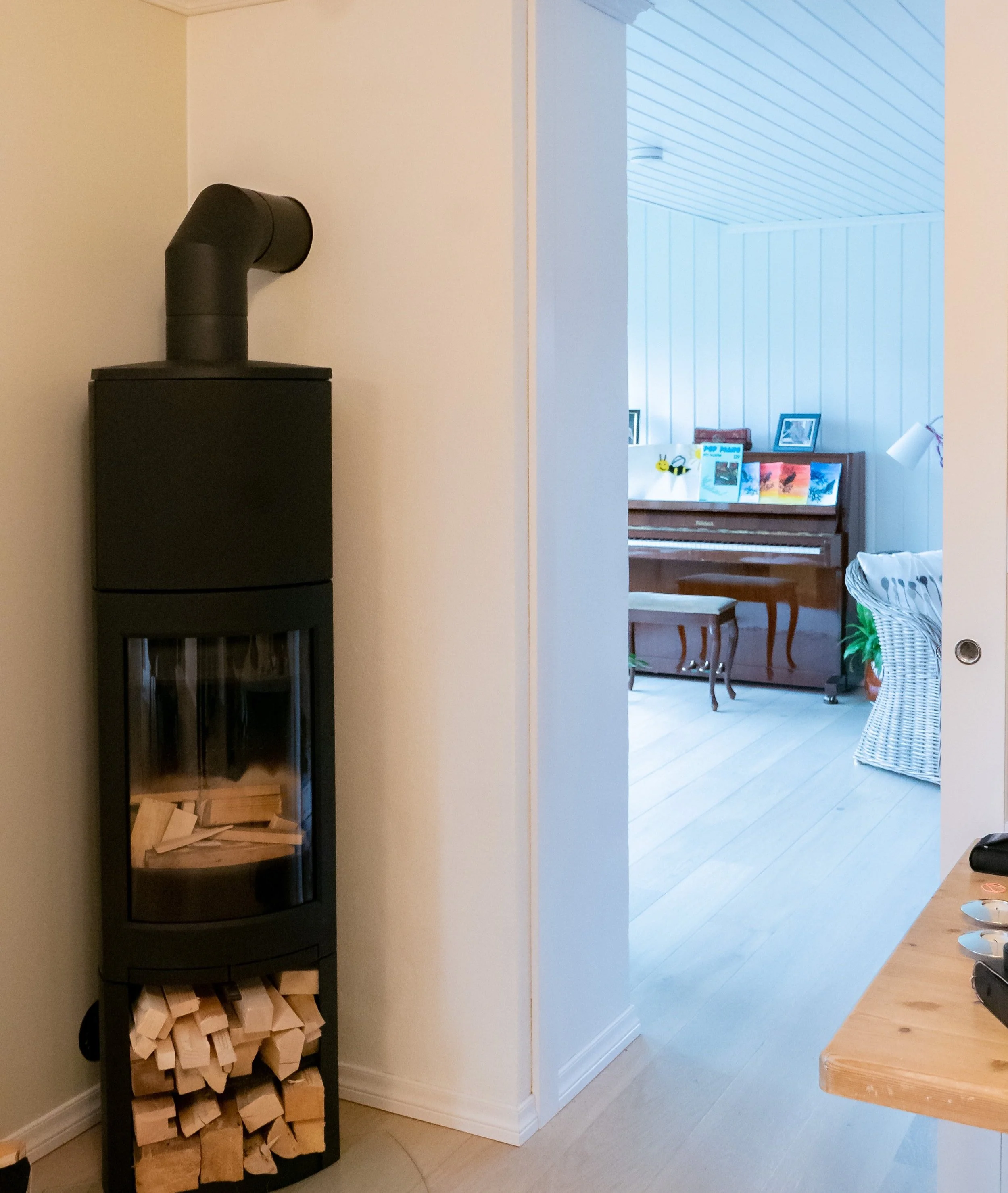
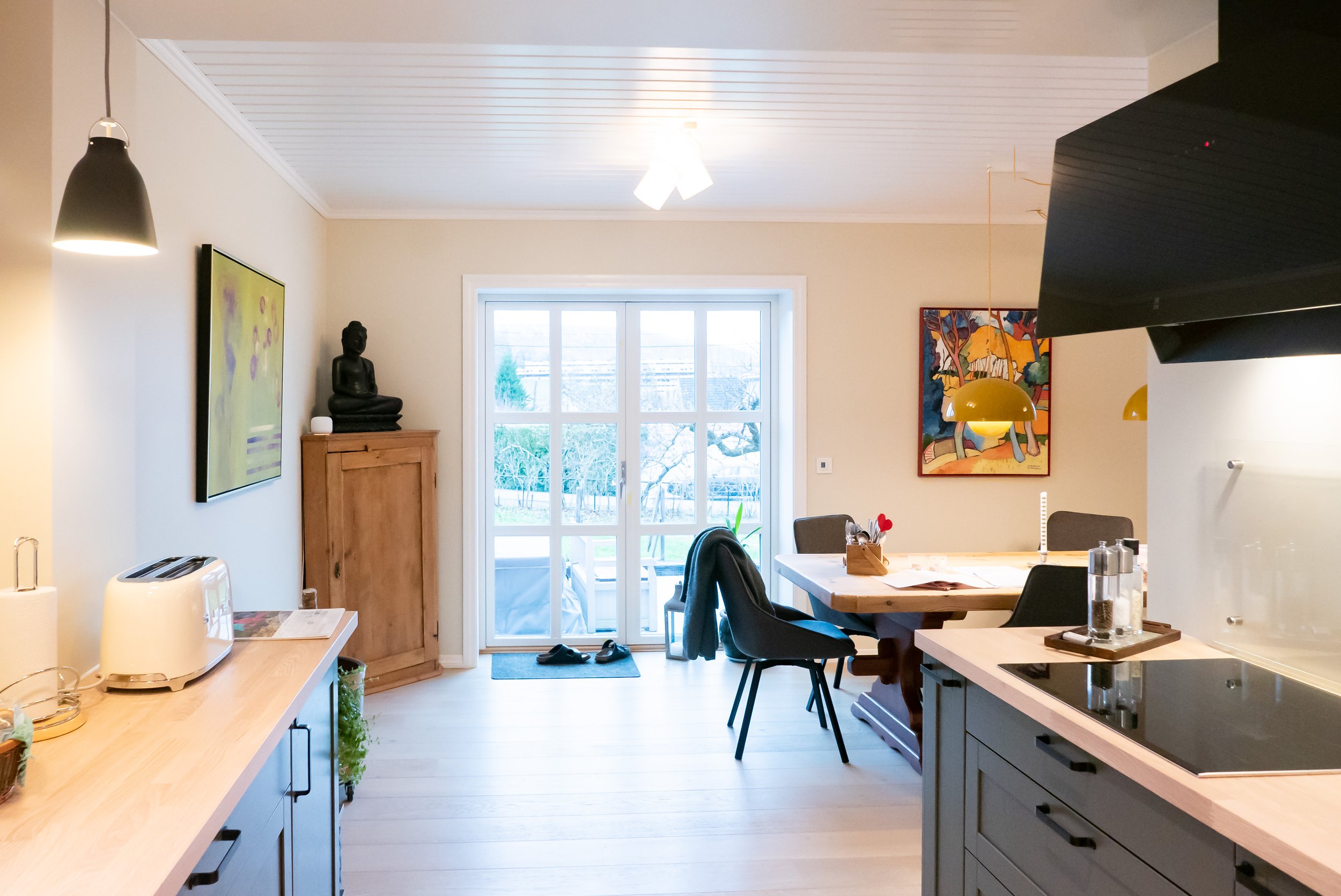
Visualising the effect of a new window in an existing kitchen, early in the design process to explore ideas with our clients…
Portfolio project
From basement to master wing
Our transformation of a family house in Oslo in now complete and our delighted clients can move into the brand new master wing of their home, converted from an existing disused basement.
The brief
Our clients wished to create a parent wing to their family home — a single floor on a two-unit house in Oslo. The new quarters were to accommodate their new master bedroom, together with a comfortable bathroom, home office and kitchen space. With the children growing up, the clients also liked the possibility of renting out part of the house in the future,
It was not possible to extend the house further onto the site, but the apartment had access to an existing basement, mostly unused. This low ceiling space was dark and uninsulated, and therefore cold and damp, and had no fire escape. High levels of radon gas were also measured in the underground space, making it further unsuitable to use as a living space. To complicate matters, this basement could only be accessed through a steep staircase, from a shared area outside the flat.
A new wing, filled with sunlight…
We focused our approach on creating new spaces that felt integrated into the existing home, with a sense of privacy yet avoiding the common claustrophobic feeling of converted basement spaces.
Since the conversion of the basement needed new fire escapes, we made the most of these required new openings, transforming them into landscaped staircase and planted light wells, bringing daylight and views from the garden deep into the new spaces. Transforming technical constraints into creative opportunities!
With minimum changes to the existing structure and services of the house, we relocated the staircase to the inside of the flat, connecting the new space below to the existing circulation, so that it became a natural extension of the home. All technical functions were concentrated in the middle of the plan, with a large bedroom, home office, gym space, kitchen and modern bathroom wrapping around them along the new large windows. Deeper into the floor plan, where no daylight could be brought, we tucked efficient storage space for the family.
The new lower floor has generous access to the garden, through a cascading timber terrace, transforming what could have been a dark access staircase into a attractive and private exterior space, streaming sunlight into the new bedroom.
“2hD has helped us to evolve an old, dusty and mouldy basement into a place we love to spend our time at home”
Comfortable and future-proof
Our remodelling strategy integrated a full upgrade to the basement fabric, adding high insulation levels in the new lowered basement floor and existing walls — greatly improving both thermal comfort and energy efficiency — as well as in the ceiling to create acoustic privacy from the upper floor.
In the long-term future, renting out the lower floor as a separate apartment will be as simple as closing a couple of doors, to separate a fully living unit equipped with kitchen, bathroom and wood oven, and with direct access from the street through its private terraced exterior staircase.
Do you want to breathe new life into unused parts of your home?
Construction started in Hagalykkja
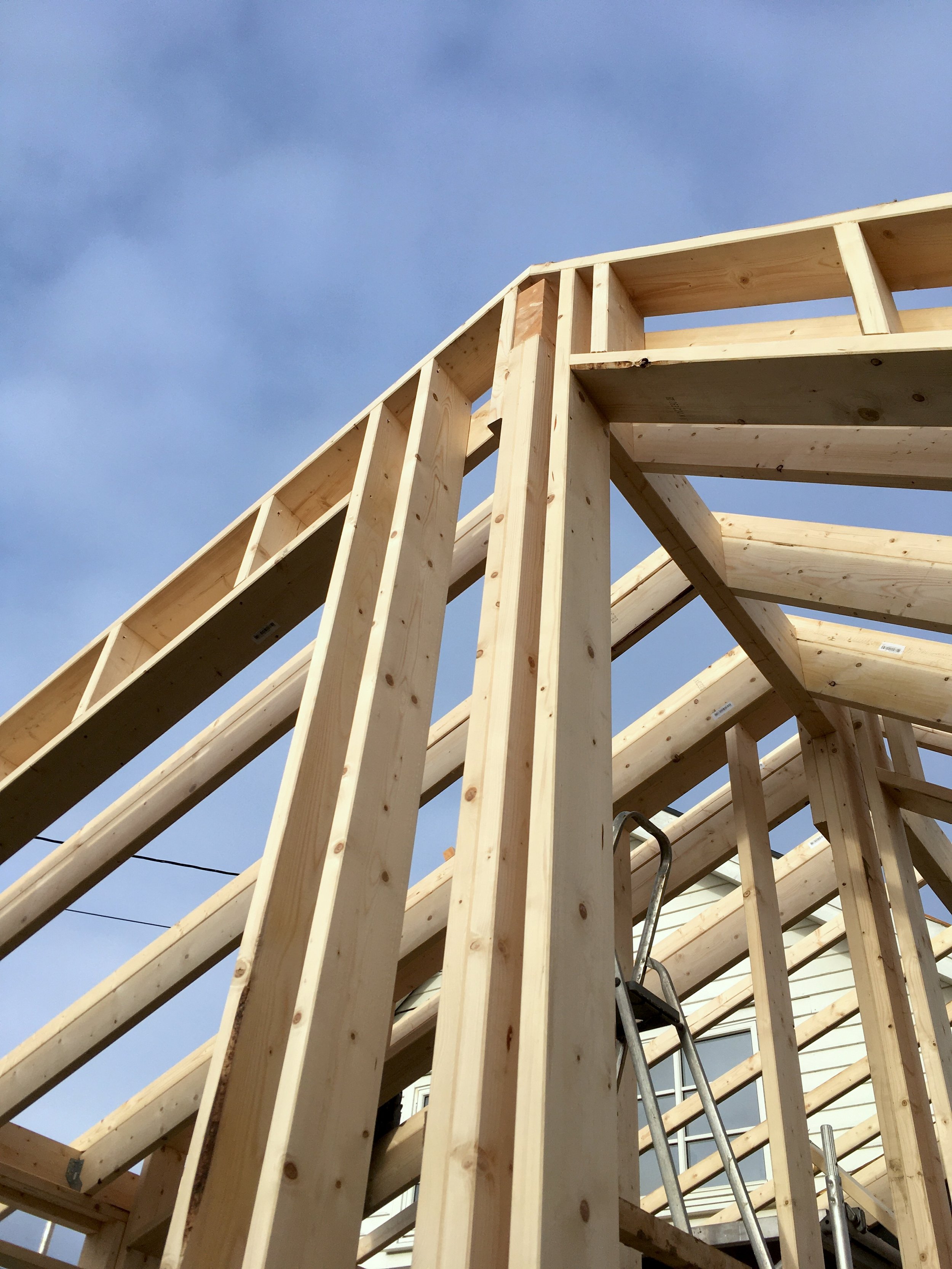
Building work has started on our family house remodel in Eidsvoll. with the timber framing of the new extension now completed.
In this first phase of the construction process, this extension will be fully built and fitted with a new kitchen connected to a winter garden, before being integrated into the house. The second building phase will then start, whereby the old kitchen will be converted into an accessible master bedroom and a new modern bathroom.
This careful phasing informed the design process and was developed in collaboration with the clients to minimise disruption to the family life, allowing them to continue using the house throughout the construction period.
Thinking of remodelling your home while still living in it?
Planning permission granted in Hagalykkja
Our project for the remodelling and extension of family house on the bank of the lake Mjøsa, in Eidsvoll, has just been granted planning permission.
We are now finalising its detailed design, in collaboration with the builder, ahead of the construction process starting in October 2023.
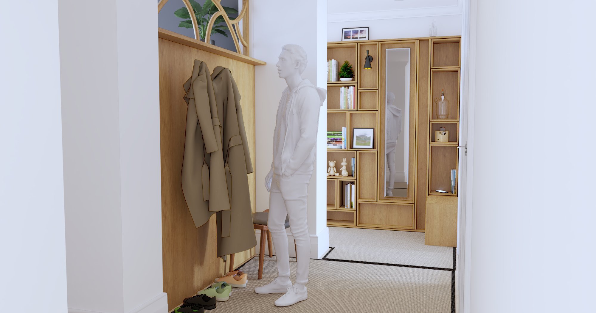
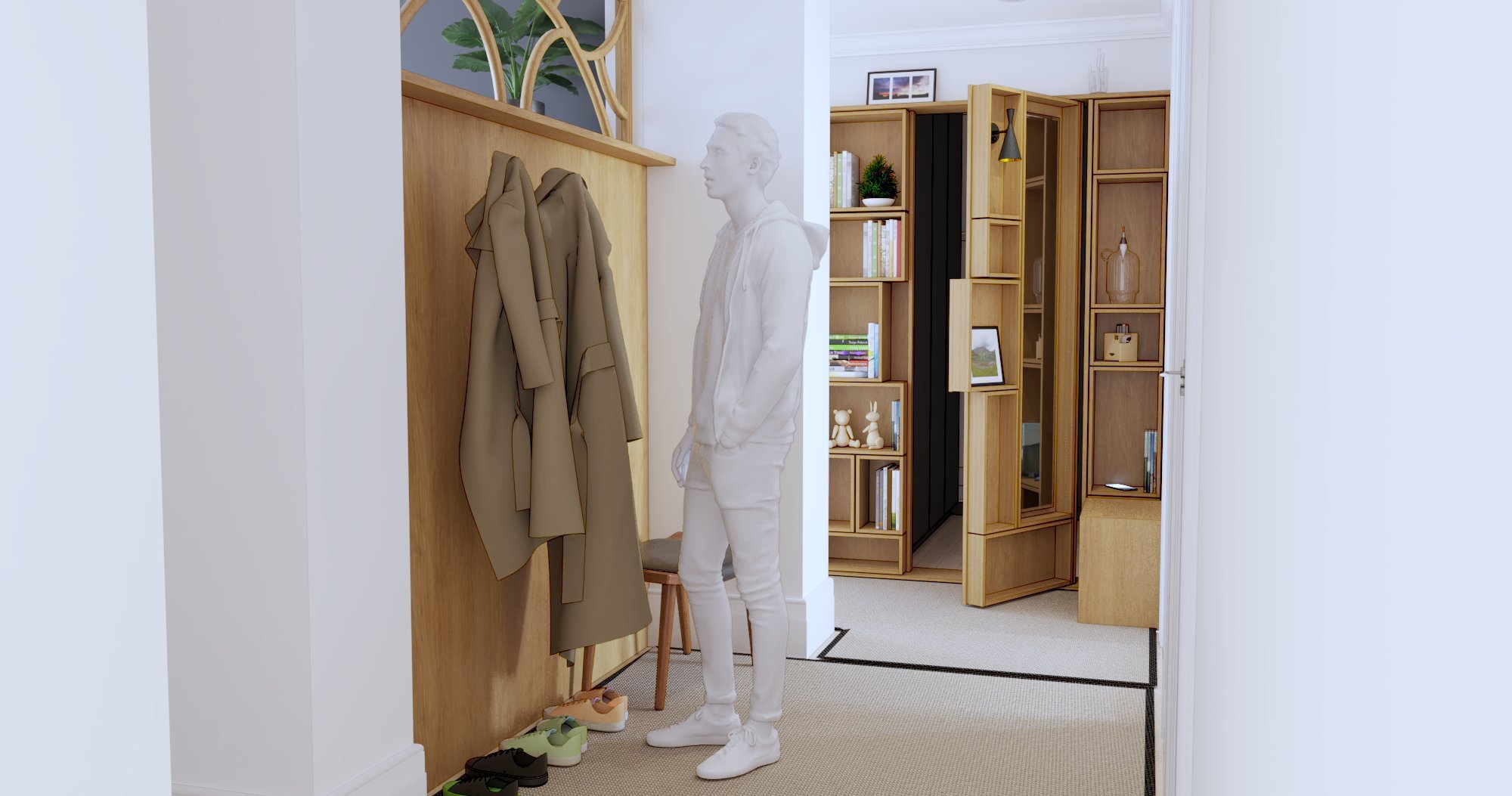
Study for a secret door
New approach
As part of a larger remodelling and refurbishment of a family house in Vinterbro, we have put a particular focus on redesigning the house approach from the street, linking a new accessible and welcoming entrance to the home with a new woodworking workshop and garage.
The existing approach, as seen from the street
Portfolio project
The kitchen is the heart
For this project, we helped our clients remodel their home to create a vibrant and flexible social space at its heart, where the whole family could share meals, be creative, work and entertain friends around a large communal table.
The remodelled kitchen, with its large communal table and views to the garden
Getting to know the existing house
The couple with their twin daughters had lived in this house, located in Bærum — not far from another remodelling projects of ours, for six years before they decided to remodel. Originally built in 1921 as a log house, it had been extended and altered several times over the course of a century.
The most recent of these extensions had caused the sole window of the existing small kitchen to be closed off, so that the only daylight was coming through an adjacent playroom. The neighbouring living-room, with its large windows towards the garden, was mostly used as a TV and music room. Despite its comfortable size, this room was surprisingly difficult to furnish, in part due to an awkwardly placed door to the outdoor terrace, and the large dining table at its centre was only used for occasional festive occasions.
Our analysis of the existing ground floor of the house
Developing a design brief
We sat down with the family to explore their needs and aspirations for their home, bringing in fond memories of former homes they inhabited and loved, and created together a concise brief for this project. Concentrating on three rooms on the ground floor, we were to create an attractive social space at the centre of the house, well connected to the beautiful garden and filled with daylight, to be shared by all members of the family for their daily activities: making food, sharing meals together and with guests, handicraft, playing the piano, doing homework (or home work!), etc. Occasionally, the family should also have the possibility to close off part of the ground floor when multiple activities should be kept separate.
Transforming the house
… and our design strategy to transform the spaces, explained step-by-step
With a clear brief defined, and the house carefully analysed, a solution to unlock the potential of a home can be sought. A seemingly simple change can thoroughly transform the way the home is being inhabited.
With minimal structural changes to the house, we reorganised the internal partitions and windows to create a spacious room with a large communal table as its centrepiece, wrapping the kitchen area around an existing chimney. This creates a unified space while maintaining a gradation of privacy between the more discrete food preparation workbenches of the kitchen, the central table and the desk area close to the new wood stove.
A large French door, aligned with the kitchen benches, opens views and easy access to the garden, seamlessly extending the dining area onto the large terrace outside.
The fully shelved partition, which accommodates on the kitchen side the bookshelves and communal desk space, and on the living-room side the television, creates a soft boundary between the social kitchen and more private living-room, which can be fully shut off by a hidden sliding door when required.
Our proposed new ground floor layout
With the large TV screen discretely tucked out of the way into the new partition, the space in front of the large living-room windows becomes a sort of winter garden overlooking the green areas outside, with a breakout sitting space filled with daylight and plants.
Between this interior “garden room” and the open terrace outside is the covered porch, now free of circulation and transformed into a sheltered sitting corner. Whatever the weather, there is always a comfortable place to sit and enjoy the garden!
And as with most of our projects, the remodelling work was also the opportunity to upgrade the comfort and energy efficiency of the building in a cost-effective manner, allowing for further external insulation of the walls when the external cladding needs changing in the future.
“2hD approached our ideas with a completely fresh eye. They came up with a solution which, in retrospect, feels simple and natural, and yet completely changed the way we use our home to be together!”
Planning application granted for Bølerveien 31
A rendered view of our proposed remodelled upper floor, overlooking the forest
We are delighted to announce that our remodelling and extension of a house in Bøler has been granted planning permission by Oslo Kommune.
The post-and-beam timber house, designed by architects Karlsen & Westbø in 1979, sits on a beautiful plot sloping into Bølerskogen, a wilderness reserve on the brink of lake of Østensjøvannet, in Oslo.
We are looking forward to finalising the detailed design and the interior design with our clients!
Building work starting in Rudsveien
Panoramic view of the existing ground floor, all walls stripped to the log structure of the original house.
Building work on our remodelling of a family house in Gjettum has now started. The walls have been stripped, revealing the log walls of the original house, before the key change to the structure is reorganise the kitchen and living-room.
We have also done an updated survey, so that the furniture and benches of the new fitted kitchen can be produced.
Credits to our clients for tackling the demolition work themselves!
Planning permission for Rudsveien remodel
Our remodelling project in Gjettum, a suburb of Oslo, has been granted planning permission by Bærum Kommune. We are now planning building work to start on site in May 2022.
Roof garden under construction
After getting planning permission more than a year ago , the roof terrace we designed on top of a residential building in central Oslo is finally under construction. The work on site is taking place under a “roof over the roof”, so that the construction of the new staircase and roof garden can take place with minimum disruption to the inhabitants.
Samba in the stair
Following our complete remodel and extension of their cabins in Hvitsten, overlooking the Oslo Fjord, our clients asked us to also fit an extra living space in one of the little annex buildings on the site.
The tiny cabin that we designed accommodates a play space for the children during daytime, a small workstation, sleeping space for two adults and two children, as well as a small terrace for summer breakfast overlooking the fjord. To reach the private sleeping space tucked up over the small living-room, we custom-designed a compact alternating tread stair, called sambatrapp (“samba stair”) in Norwegian, which also doubled as a bookshelves for the desk underneath.
We love working on self-build projects and custom-made furniture, so we were thrilled when our client announced that he wanted to build the stair himself. As with our custom-made screen wall in the main cabin, we developed in collaboration with him alternative designs for the stairs, adjusting the design to joinery techniques he mastered, to produce a full cut-and-assembly manual to build the stairs.
Visit to the seaside cabin in Hvitsten
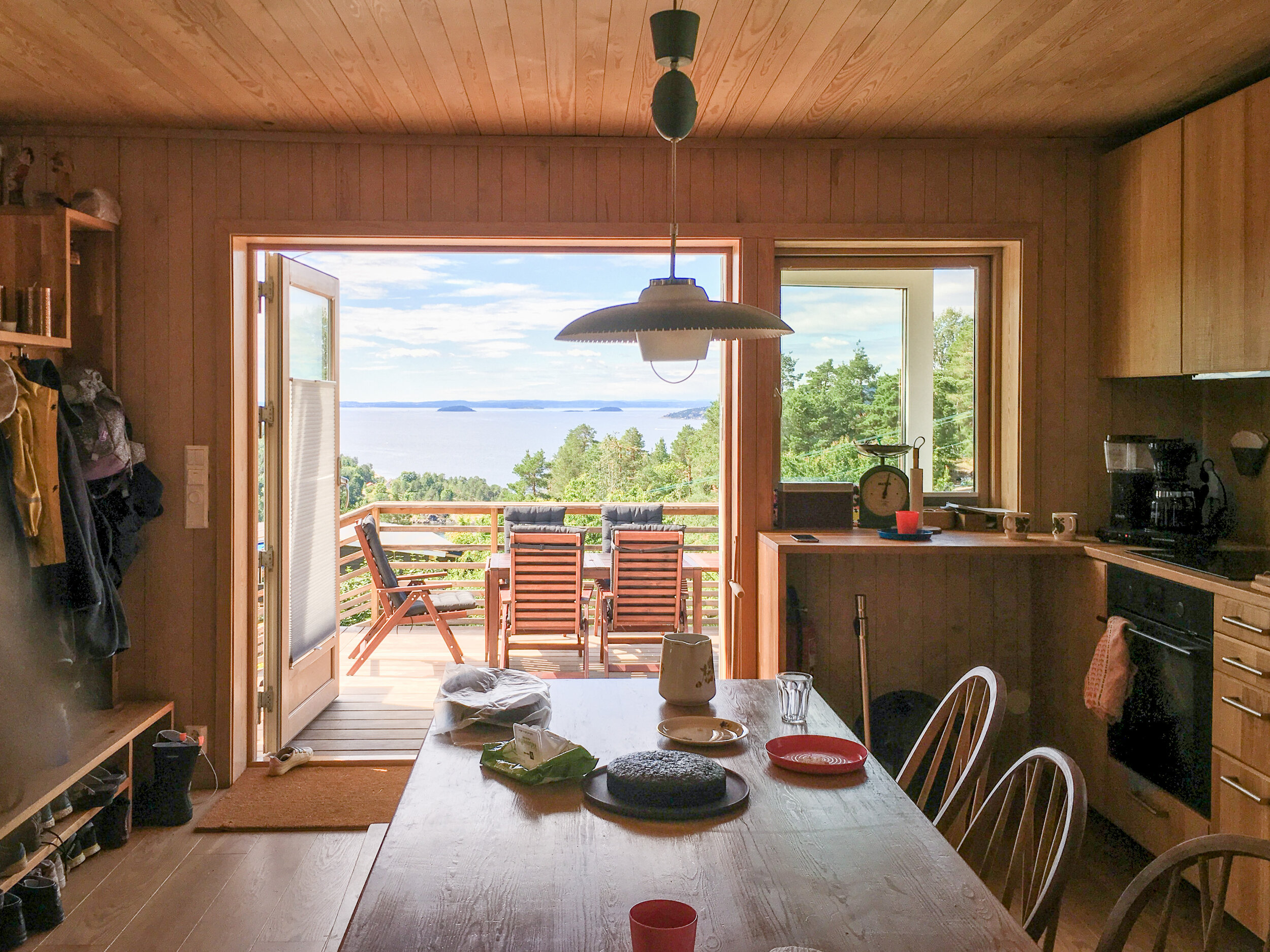
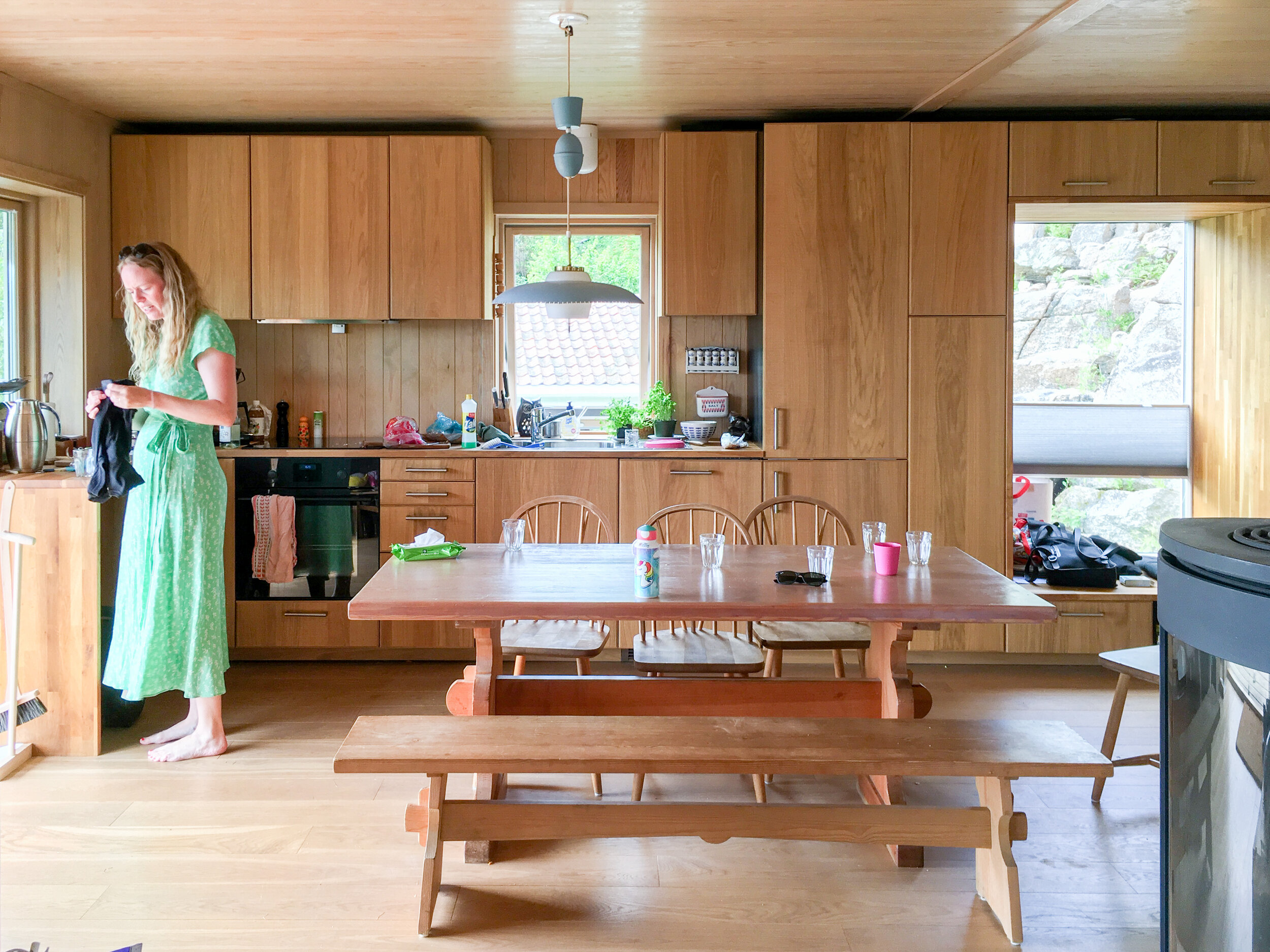
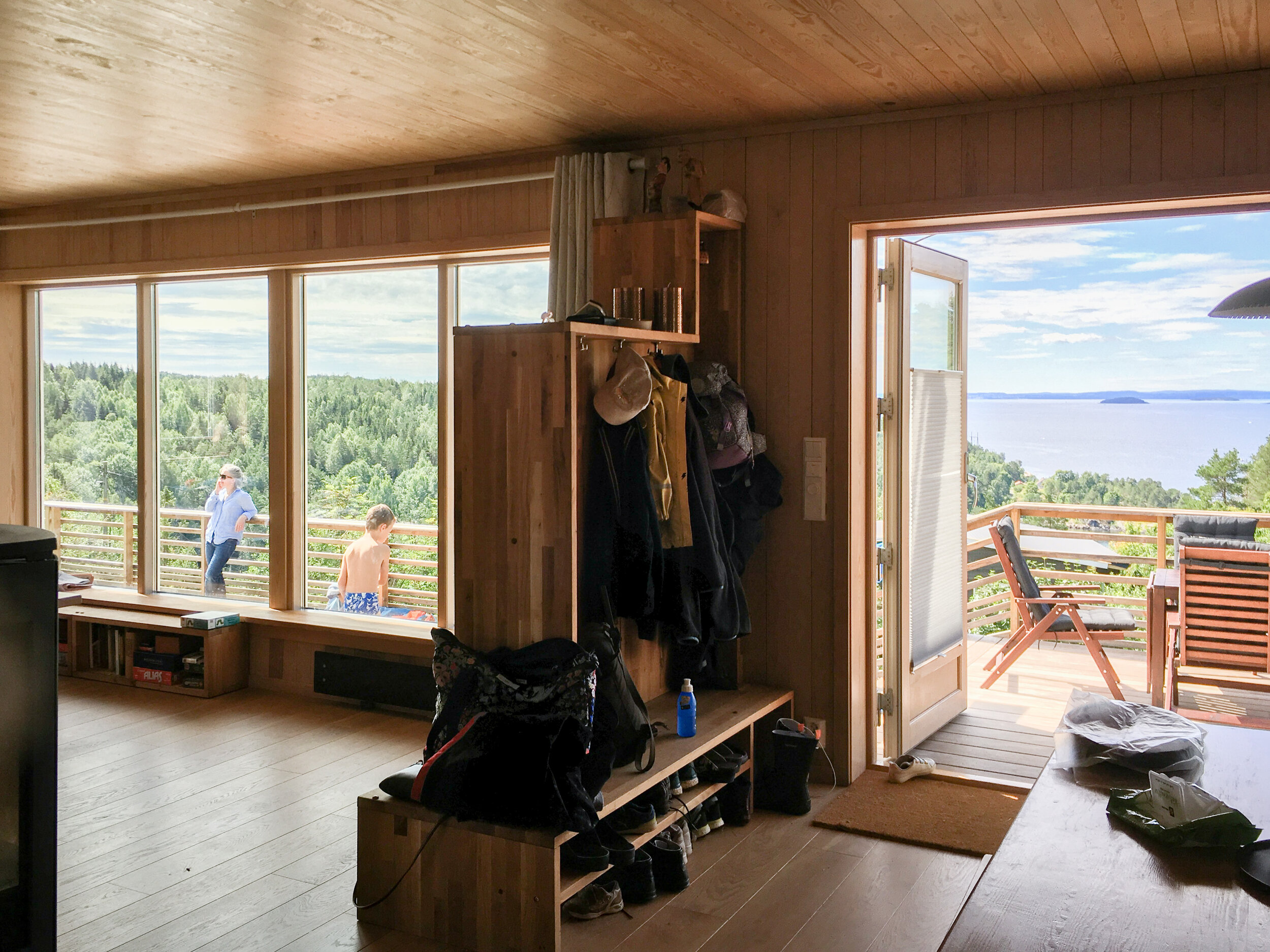
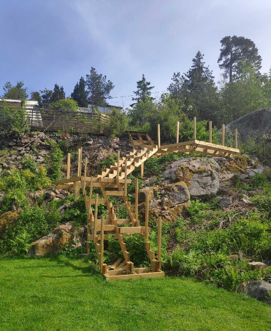
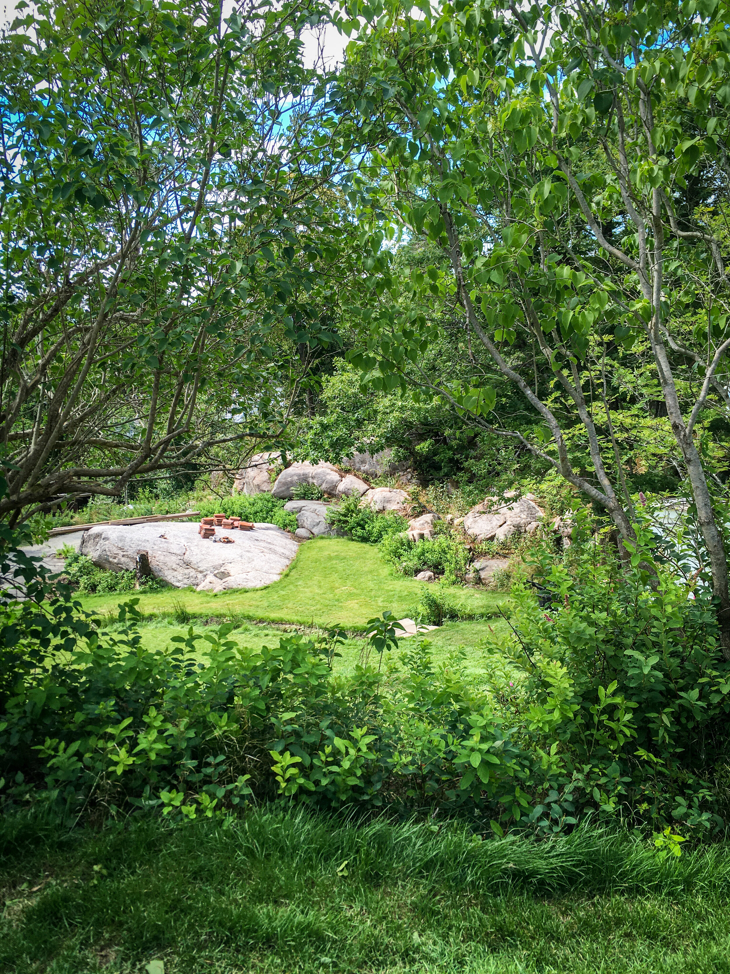
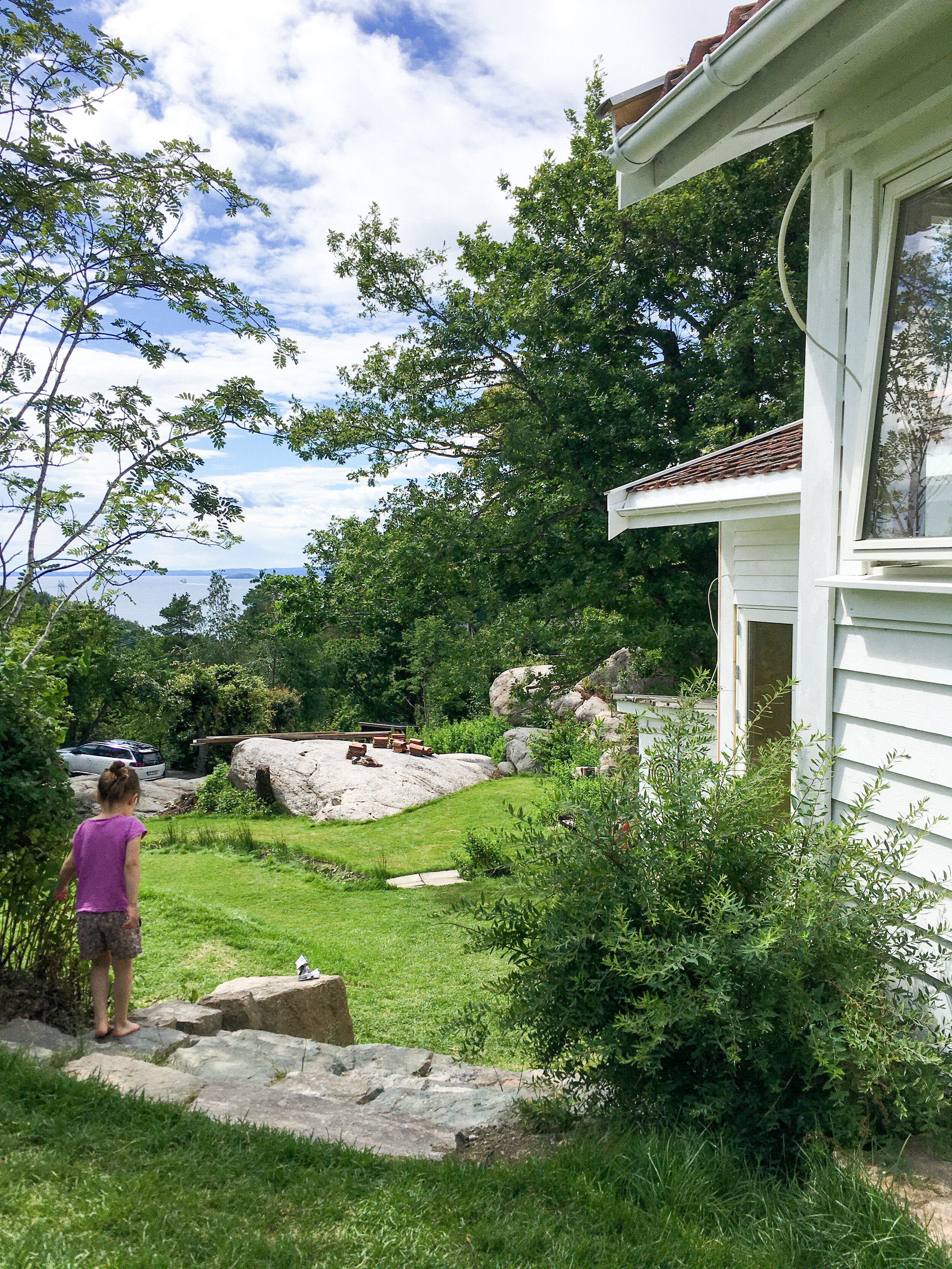
A visit to the summer cabin in Hvitsten we remodelled and extended a few years ago. The little annex cabin and terraced landscape that we have just finished designing are now in the process of being built. The landscaping on this steep site overlooking the Oslo Fjord is really bringing together the different indoor and outdoor spaces, happily used by three generations of families and friends!
Portfolio project
Vertical living in a former boiler house
A pod-like extension provides services, daylight and ventilation.
This intriguing little project is now under construction in Nottingham. Our client’s town house occupies part of a former builder’s joinery workshop in a Conservation Area. Entry to the main house is through the ground floor of a free-standing former boiler house, complete with an 11m high brick chimney. Our challenge was to re-purpose this special, tiny building to contain a home working office and guest accommodation.
We stripped out and redesigned the boiler house interior to fit a mezzanine level under the opened-up roof structure, and used ‘space saver’ stairs to maximise the floor area. The tiny floor plan is offset by an impressive vertical connection between the levels- with everything needed for occupation accessed off a vertical circulation route culminating in the bed platform.
Careful organisation of the section creates space for a mezzanine level
The temptation is to cut lots of holes in an existing building to let in light, provide ventilation and create new service routes, but in this case we decided to preserve the integrity of the boiler house by adding a highly-serviced pod to the exterior. This provides the necessary service connections, and brings light and ventilation to the interior. The addition is anonymous, in keeping with the industrial heritage of the building whilst creating intrigue and mystery of its own.
Design Team:
Lead designer: 2hD Architecture Workshop
Structural Engineer: ML Kubik & Son
Need some creative input to transform an old historical building into a living space?
A roof top terrace in central Oslo
Having secured planning permission for our roof terrace project in central Oslo, we are now finalising the detailed design, with construction of the staircase extension and roof landscape due to start on site this spring. Above is a quick visualisation we prepared for our clients’ presentation to the residents of the housing cooperative — based on the 3D model that will also be used to communicate all the technical documentations for the construction phase.

