Community inspired architecture

Tom Hughes

I teach with fellow 2hD Director Chris Heuvel at Nottingham Trent University (NTU) and I'm a director of Sneinton Alchemy — a Community Interest Company based in Sneinton, 2hD's local neighbourhood in Nottingham. Sometimes this mix of roles is a bit demanding, but more often than not there's a symbiosis, bringing strength and depth all round.

And so it was with a recently-completed project to design a small community allotment building for the "Growin Spaces" project in Sneinton.

Alchemy has been training a team of Community Organisers over the last few years: dedicated individuals who go out into the community to listen carefully to people on the streets, in pubs, in mosques, churches and homes. They listen to the young and old, to workers, business owners, those in power and the disenfranchised. They build community networks and gradually empower people to take action, follow their dreams and build a stronger community. And it works.

Growin' Spaces

One "proof of the pudding" is the Growin' Spaces project - set up by Stevie Doig. He had an idea about a community allotment which, over time working as a volunteer Community Organiser, he built into a reality. Listening with our team at Alchemy helped him build the mandate he needed to get the wider community on board. This ensured the sustainability of the project and gave him confidence to make broader links and gain important contracts and supply lines.

Now Growin' Spaces has transformed many abandoned allotments into productive growing space, providing work experience and structure for long term unemployed along the way. The project also feeds hundreds of local people each month, using allotment produce and "Fare Share" food wasted by supermarkets.

Low-tech architecture

The success of the project has generated the need for small buildings on site at the allotments. Initially a place to shelter and lock up equipment, this might expand over time to provide a learning space and other facilities. So Stevie asked me, with my 2hD hat on, if I might be able to help him explore design ideas.

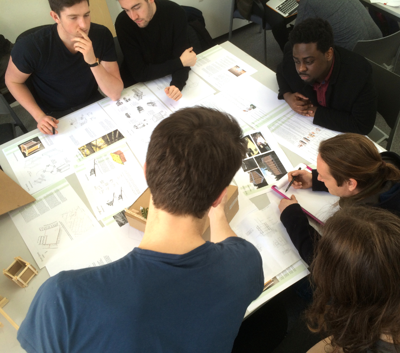
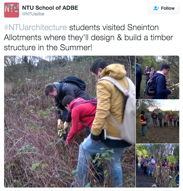
I teamed up with Chris and we identified an opportunity at NTU to create an architecture studio student design project. Chris got the students out on to the allotments, meeting Stevie and his volunteers, and pitching-in with some clearance work. This experience inspired them to create imaginative but buildable designs for a small wooden building using low-tech timber framing. 

Stevie and the Community Organiser team then came to NTU to interview the students and select their favourite designs. These projects were displayed at the "Our Sneinton" public event, with a winner being chosen by popular vote. Over the summer, the building will be built!

Great outcomes, including for NTU meeting a number of the objectives of its new Strategic Plan, including "enriching society", "valuing ideas", "creating opportunity" and "empowering people".

So for 2hD, NTU, Sneinton Alchemy and Growin' Spaces, it´s a win, win, win, win situation.

Community inspired architecture at its finest!

Artist residency at La Malterie

Thibaut Devulder

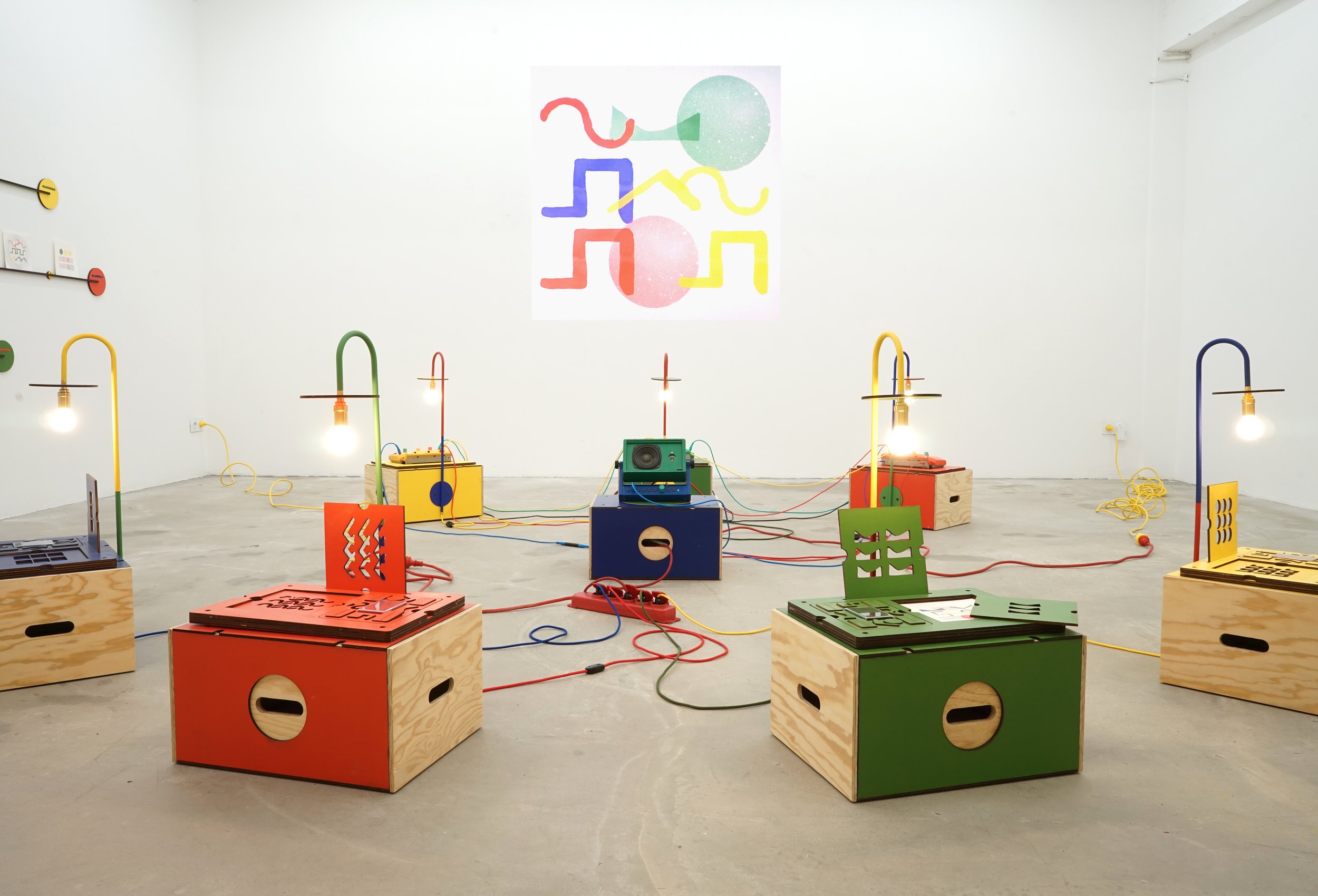
I am spending the week at La Malterie for an artist residency, to develop our art performance Ooo-Ya-Tsu and prepare for our next public presentation, on Thursday.

Together with collaborating artists Qubo Gas, we are dwelling a bit more on the subtle interactions between the physical drawings and the animated video projection on the watercolour paper...

Come and see the live Ooo-Ya-Tsu performance on Thursday!

Update 16/02/16: we posted some photos of the performance...

In the snow

Thibaut Devulder

The Hvitsten cabin under construction, in the snow...

From the window niche in the play area, overlooking the snowy approach and the existing annex cabins

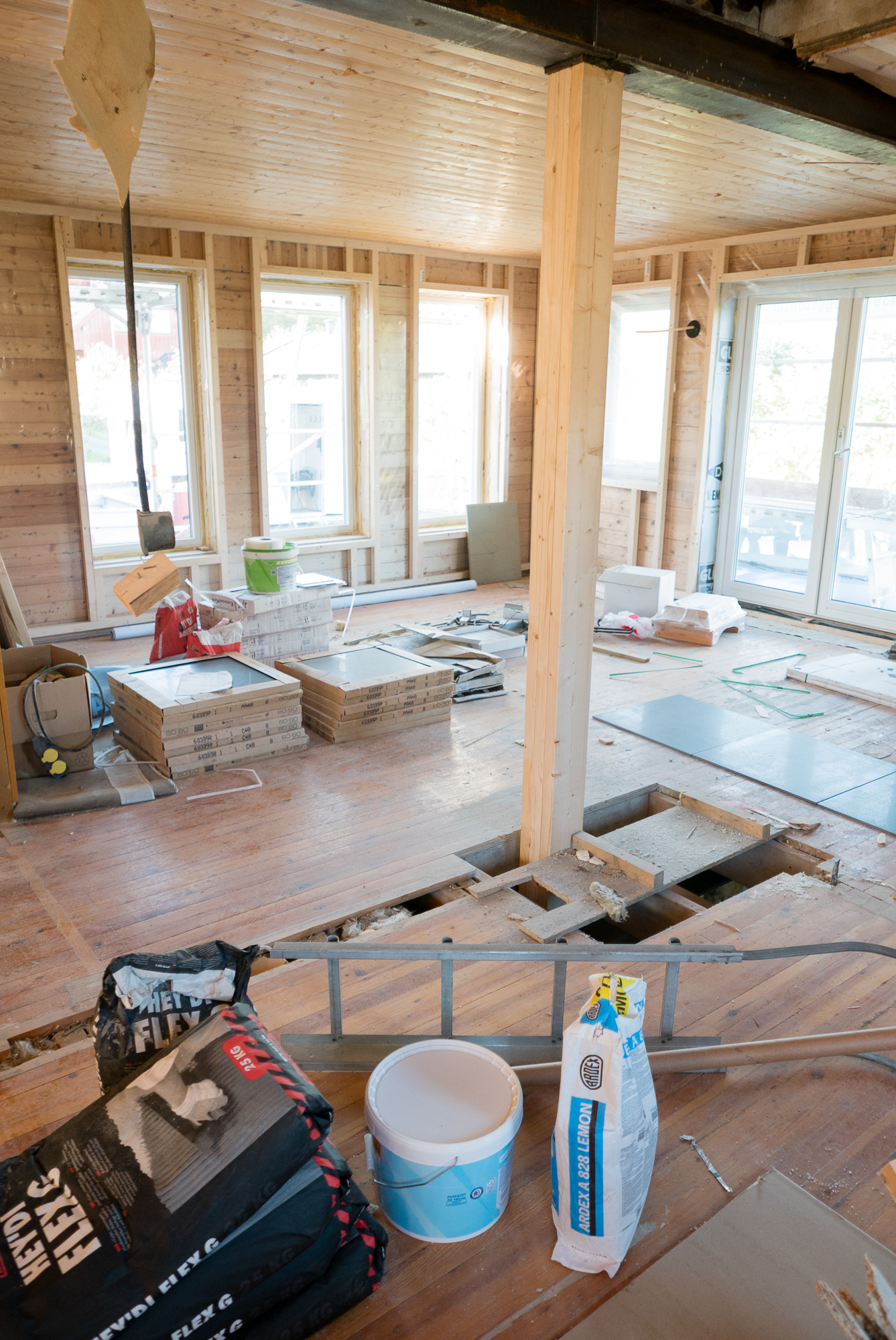
Hvitsten — a seaside resort on the Oslo fjord where we are redesigning a cabin — can still be pretty cold in winter. Yesterday's visit to the building site showed me an aspect of the project I hadn't experienced yet: the summer cabin in the snow.

Part of the client's brief was to make the cabin comfortable to use all year round, so I could finally put our design to test, overlooking the snowy landscape from its cosy interior.

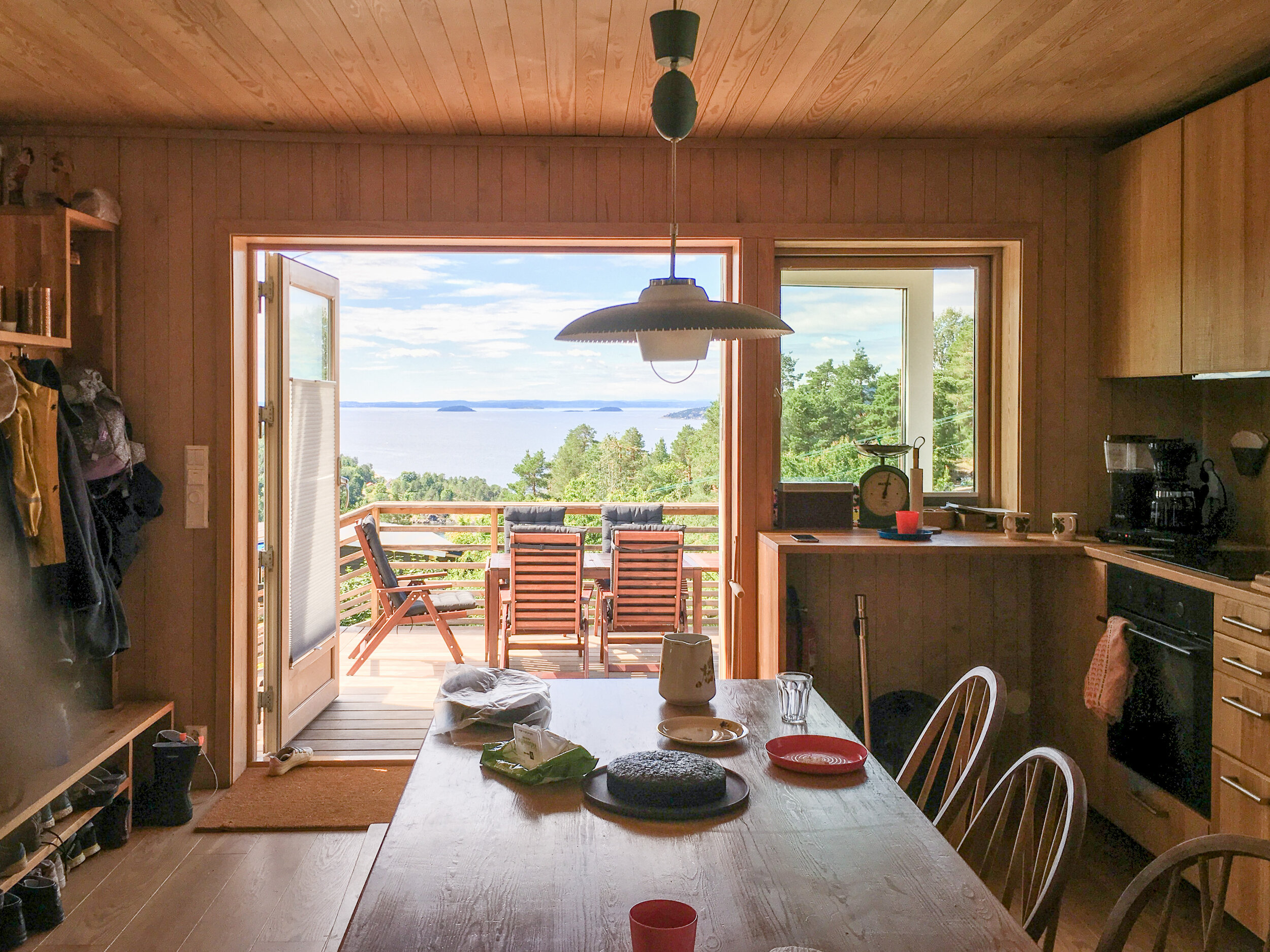
The interior is nearing completion and the new oak-clad storage wall was being installed, with its integrated kitchen and window niche in the play area.

The new kitchen and storage wall being installed

Portfolio project
Remodeling a family home in Bærum

Thibaut Devulder

We have just finalised the design for the remodeling and extension of a family house in Bærum, near Oslo. The detailed drawings package has now been sent to potential builders and, before construction starts this spring, we would like to share some of the ideas behind our design approach.

Sketch view of the redesigned home, approaching the new entrance

About our clients

Our clients, a young Norwegian couple with a toddler, had purchased a derelict detached house in the neighbourhood of Gjettum. The existing house had been divided into two rental apartments, one on each floor, connected by a shared entrance staircase.

Their plan was to merge these two floors into a single family home, where they would live and host frequent gatherings with their large extended family. The structure and footprint of the existing house was to remain mostly unchanged, but its fabric upgraded to meet modern environmental standards. Our clients were also considering the option of accommodating a rental apartment within the house, to create some additional income until they needed the whole house for their growing family

The existing house

The general feeling of the existing house was somewhat claustrophobic: the redundant spaces created by the two identical floor plans, the small cellular rooms and window-less corridors, the few oversized windows... All contributed to the impression of undersized spaces. A large garden surrounds the house but this was completely disconnected from the interior. It was also mostly spoiled by a garage and a long driveway to the south boundary of the site, which made the approach to the building unwelcoming.

Floor plans of the existing house (click for full view)

The existing house, viewed from the street approach

Our design strategy

An obvious solution would have been to extend the house to open up the main living spaces. However, as in many of our projects, we focussed on making the most of the existing building. Key to this approach was to reconnect the various living spaces — both interior and exterior — so that the different architectural functions could flow into one another.

Our design strategy, as presented to our clients during the sketch design phase. Drawn on top of the floor plan of the existing house (click for a full view)

Connecting the social spaces

Our first step was to move bedrooms to the upper floor, so that we could gather all social spaces on the ground floor, just a step away from the garden. We then removed a few internal walls to open two long perspectives across the whole ground floor. This created a close connection to the garden, making it both visible and easily accessible from all living spaces.

These spaces — where eating, relaxing and socialising take place — naturally organised themselves around these open lines, articulated by the existing staircase and a new wood stove. Each living space is designed with its own sense of scale and openness. Yet, it can be used as an extension of another, giving maximum flexibility both for everyday life and for the large social gatherings that our clients love to host.

The kitchen — the natural heart of the house for the family — is now placed at the very centre of this plan and is connected to all surrounding social spaces. A screen of open shelving wraps around the kitchen, to subtly shelter it and discretely accommodate storage, appliances and a study (that doubles as an accessible guest bedroom) on the north-east.

Opening up to the garden

Each of the living-rooms extends to the garden through large French doors: on the south-east, onto a large timber terrace stepping down to the main garden, and on the south-west to a more private terrace that opens the dining room to the evening sun. Since all windows had to be replaced, we took this opportunity to redesign many of the openings to the garden, drawing daylight from different directions in all spaces and carefully framing attractive views to the outdoors.

To the south, we created a new functional and welcoming entrance to the house that also accommodates an accessible modern bathroom. Both this small extension and the new garage (relocated closer to the access road) are designed with similar flat roof details and horizontal cladding, contrasting with the taller existing house. Together, they frame an attractive new approach to the house that echoes the traditional "tun" of Norwegian farmyards, under the dappled shade of newly planted cherry trees.

An overview of the ground floor in relation to the garden (click for full size)

The remodelled basement, with its separate rental apartment

The private spaces

A new family bathroom and four bedrooms are located on the upper floor. One of these rooms doubles up as a separate TV/play room, where extra guests can stay overnight.

The basement is also remodelled: two thirds of it are transformed into a comfortable self contained apartment, which will be rented out to tenants before becoming an integral part of the house for family guests and teenager children. The large new windows bring plenty of daylight into the space and the separate access to the north and landscaping create a small private garden for the tenants. The remaining space in the basement accommodates a large washroom, as well as the technical installations and storage.

Comfort and sustainability

As part of the remodeling, we upgraded the whole house to meet current energy conservation standards, externally insulating the fabric of the building and replacing the existing windows with highly insulated ones.

We also made the most of the panoramic wood stove on the ground floor by coupling it with a modern balanced ventilation system: diffusing the stove heat in the whole house — including the four bedrooms upstairs— we could design the house so that most of the heating needs would be provided by renewable firewood, while also keeping optimal indoor air quality.


Another public performance of Ooo-Ya-Tsu

Thibaut Devulder

We are excited to announce another public presentation of our art performance project Ooo-Ya-Tsu on 4th February, at La Malterie, in Lille (France).

Our live soundscape drawings performance Ooo-Ya-Tsu will be followed by a public discussion with our guest Yves Sabourin — a former tapestry master-weaver at the famous Gobelins Manufactory and now art curator at the French Ministry of Culture.

Home of our artist collaborators of collective Qubo Gas, La Malterie is a non-profit organisation dedicated to the experimentation of arts, in the district of Wazemmes, in Lille, France.

If you are in the area, do come and join us on Thursday 4th February, at 7pm!

Construction work started in summer cabin

Thibaut Devulder

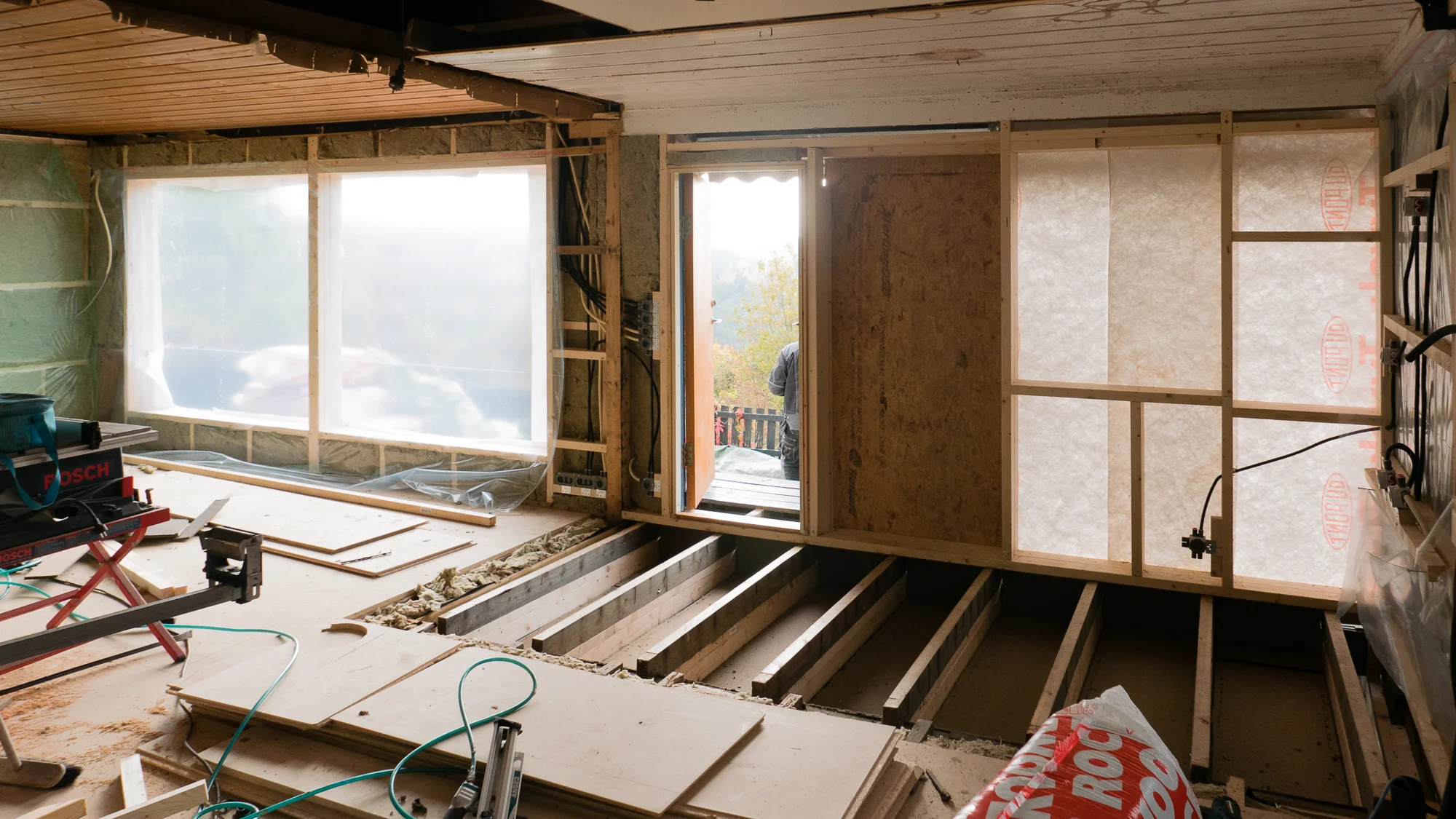
First site visit to our seaside cabin redesign project in Hvitsten, where construction work started a few weeks ago. The new interior spaces are starting to take shape...

A visit to the self-built barn

Tom Hughes

I was lucky enough to visit Béranger and Mélanie during the summer to see the progress they've made on the barn. It also turned out to be the day after they got married!

 Barn, home, labour of love, wedding venue... 

The exterior of the building, the main space, kitchen and master bedroom are completed with heroic attention to detail, leaving the upstairs bedrooms still to do. After a break in the internal works Béranger and Melanie plan to knuckle down again over the winter to see how much they can finish.

Casting a critical eye from the future study space. 

The existing roof timbers and stone walling are offset by contemporary insertions

The exterior shell retains its barn-like simplicity

You can follow progress on the project via our clients' blog, or check out our previous barn related posts. Congratulations to our clients on their dedication and sheer hard work... Good preparation for married life!  

Au revoir! 

First Ooo-Ya-Tsu public performance

Thibaut Devulder

We are excited to announce that the first public performance of our art project Ooo-ya-Tsu will take place on Friday 9th October 2015 at 8pm, at La Gare Numérique (Jeumont, France).

Flyer for the event (© La Gare Numérique)

Flyer for the event (© La Gare Numérique)

The evening will also include an exhibition of light sculptures by maker artist Stéphane Martin and a DJ set by Ooo-Ya-Tsu's Jef Ablézot, a.k.a. Afrojaws.

This public performance will be concluding our on-going artist residency at the Gare Numérique.

Back in Oslo

Thibaut Devulder

From left: Jef Ablezot (Qubo Gas), Olivier Durteste (DDDxie), Thibaut Devulder (2hD), Dolby the dog and Morgan Dimnet (Qubo Gas)

Ten days into our artist residency at the Gare Numérique (Jeumont, France). Good progress on our Ooo-Ya-Tsu art performance, in particular on the phase music soundscapes that will be created during the live musical dialogue with the musician DDDXIE.

Back to Jeumont next week to finish the residency and rehearse for our first public performance!

Ooo-Ya-Tsu à La Gare Numérique

Thibaut Devulder

I have just started a month-long artist residency at La Gare Numérique in Jeumont (northern France) to finalise our performance art project Ooo-Ya-Tsu.

The Ooo-Ya-Tsu collective (left to right): Olivier Durteste (DDDXIE), Thibaut Devulder (2hD), Morgan Dimnet and Jef Ablézot (Qubo Gas)

Located on the Belgium border, La Gare Numérique is a former train station, transformed a few years ago into a platform for the development of arts and digital technologies, offering state of the art facilities for artists, dancers, musicians and makers to develop and present their projects.

La Gare numérique will also be hosting the first public performance of Ooo-Ya-Tsuon Friday 9th October 2015, at the end of our artist residency.

After L'Aéronef, Le Cube, La Malterie and l'Hospice d'Havré, La Gare Numérique is the fifth art centre to host us for the development of our collaborative art project Ooo-Ya-Tsu, a live drawing and sound performance I am working on with art collective Qubo Gas and musician DDDXIE.

Update: the public performance has been announced!

Creating a flexible outdoor social space

Thibaut Devulder

For this small project, we were approached by clients who wanted a sheltered space to host their frequent outdoor social events. We helped them design an integrated and flexible garden structure, to create a comfortable outdoor microclimate, whatever the weather or the occasion.

Our client, enjoying a late summer evening in the transformed terrace

The house already had a well-exposed adjacent terrace, but the the westerly wind and rain showers often disturbed the frequent social gatherings organised by our clients. They were looking for an affordable solution that would provide them with flexible configurations for the various social occasions (from small family dinner to large work events with 20+ guests).

Analysing each use scenario, we focused on creating a solution that would integrate well with the existing hard and soft landscaping, yet remain flexible in its use and the degrees of shelter it could provide.

In particular, we wanted to keep the space as open as possible to its surrounding. So we opted for a system of retractable textile roofs and glass screen walls, so that the outdoor space could function well throughout the year, whatever the weather, the number of guests and the type of activity it would host.

In parallel to this design process, we investigated both custom-made and standardised garden structures. We eventually converged towards a hybrid option, whereby we customised an existing pergola system to tailor it to the specific needs and taste of our clients and to the site, keeping the project on budget and allowing for fast-track installation — on time for the Norwegian National Day!

Testing furnishing configurations and checking their feasibility using standardised and custom-made elements, we refined the design with the clients to converge towards the final built result.

Our clients have since then sent us some nice photos, having enjoyed their new outdoor space from early spring to late autumn, hosting many social gatherings with family and friends!

Portfolio project
A seaside cabin in Hvitsten

Thibaut Devulder

Sketch impression of the remodeled cabin, looking at the fjord from the playroom

We love to design cabins, as they bring together so many of our design interests.

First, our predilection for architecture in remote (and often sensitive) natural locations, to create small thresholds where man meets nature, where minimal environmental footprint and limited access call for an economy of means.

And we are fond of designing tiny spaces — creating places rich in human interactions and intricate functions where people can really "key in" with the architecture, bringing back the simple joy of being together, sheltered from the elements.

But as importantly, cabins also act as social nodes where the complex community of the different generations in a family or in a group of friends congregate, each with their different needs, expectations and desires, making for a challenging but fascinating briefing process.

This redesign of a seaside cabin in Hvitsten, on the shore of the Oslo fjord, brought all these aspects together and was a nice counterpoint to our earlier design of a skiing winter cabin in the mountains of Hedmark.

A small stream flowing between the existing cabins

About the project

As is often the case with Norwegian cabins, our clients for this project spanned over three generations. Initially built in the 1950s by the great-grandfather, the summer cabin and its small sleeping annex have been used ever since by the family for spring and summer holidays.

The extended families are now struggling to all fit in the cabins, which has become both too small and in need of repair. Now retired, the grandfather and his partner also want to use the cabin a lot more throughout the year, so they needed the uninsulated cabin to be upgraded for the winter climate and wished to have a real bathroom installed.

All had cherished childhood memories of the cabin and wanted to preserve as much of its exterior aspect and rustic character as possible. So, their requirement to comfortably fit in up to twelve sleeping guests for occasional extended family gatherings called for inventive remodelling and renovation, considering their tight budget!
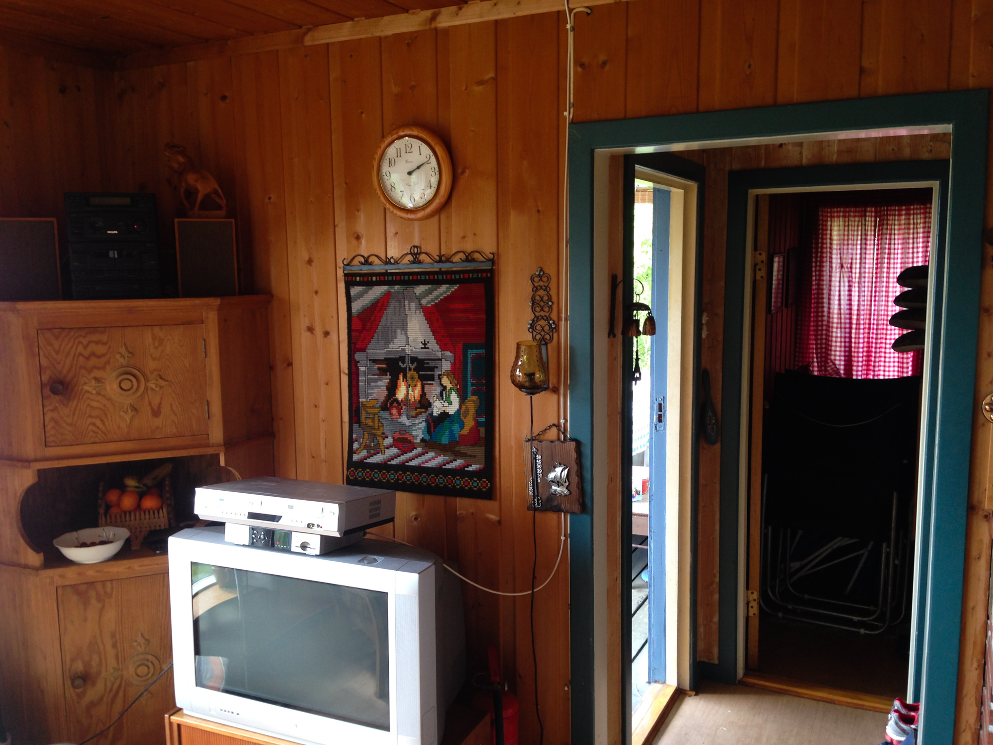
Looking at the existing cabins

Perched against a steep rocky hillside overlooking the sea, the cabins face south-west into a breathtaking view of the Oslo fjord and its slow ballet of sailboats and cruise ships.

The Oslo fjord, as seen from the main cabin

Plans of the existing cabins

In the main cabin, the small living room actually had a large window opening towards the fjord, but the kitchen and meal area — central to family life in the cabin — were situated behind it, in the darkest part of space of cabin, right against the rock face to the north. The other facades of the cabin were essentially blind because of a small hallway and the two bedrooms to the west. As a result, the main daytime social spaces had no visual connection with either the covered porch to the south-west or the sleeping cabin to the west, both of them often used in the mornings and evenings for informal meals and drinks.

Typical of spaces with light coming from only one direction, this configuration made the living room and meal area appear strangely gloomy, as the large window created a glare effect in contrast with the other darker and unlit interior surfaces. Built to look straight onto the fjord through this large window, the space had only short interior perspectives, making it appear more cramped and small than it actually was.

Situated a few meters downhill and to the west, the sleeping annex had a quiet simplicity to it, nested in the overgrown vegetation and straddling a small stream in the rocks. Unfortunately, an improvised shower had been installed inside a few years back without proper ventilation and created damp problems, so that in addition to being overcrowded, its sleeping rooms had also become uncomfortable.

Welcoming everyone

The initial plan was to integrate the existing porch into the main cabin, to create an extra bedroom. While this made sense to accommodate more guests, we all agreed that this compounded some of the existing problems, in particular closing off the main cabin from the fjord.

From two to fourteen sleeping guests! (click for full size) 

Turning the problem around, we actually removed one bedroom from the main cabin, thus keeping only one for the most frequent occupants of the cabin: the grand-father and his partner.

We carefully checked the feasibility of our proposal by preparing a comprehensive list of use scenarios, from one couple to up to fourteen sleeping guests! We found that moving the shower out of the sleeping annex, ventilating it properly and making some slight adjustments to its interior layout and bedding would allow eight people to comfortably sleep there. All this could be done at minimum cost, so that most of the available budget could be dedicated to the main cabin.

Now remained the task of optimising the shared daytime spaces in the main cabin. And this was essential: every parent can imagine the intense atmosphere when up to three families, including young children, are stuck together indoors for a whole rainy afternoon! Thus, in addition to creating functional living quarters, we also needed to organise sub-spaces within this small cabin, so that everyone could define his or her comfortable own space.

A niche in the rocks

We approached this task from two different angles.

Our design strategy for the remodelling the main cabin, drawn over the plan of the existing cabin (click for full size).

First, we created two different sub-spaces: one for the adults, facing the fjord, more social and relaxing, and one more playful for the children, cradled against the vegetation of the shaded cliff face. These two spaces intersect around the dinner table, the natural converging point for the whole family.

Then, we connected these spaces to the outdoors by nesting these sub-spaces around generous openings — not just towards the fjord, but also towards the sleeping cabin wrapped in overgrown vegetation down to the west, the mossy rocks at the north and the sunbathed terrace to the south — to create a dual feeling of spaciousness and enclosure.

Sketch impression of the remodeled seaside cabin, looking across the living room

Although the main living space remains compact, it feels opened to the light patterns and textures of its natural surroundings.

Frequently eating out during the summer months, the kitchen and dining area extend out onto a terrace that is stepping down, so as to maintain unobstructed views of the sea horizon, even when terrace parasols are used or the large awning on the south facade is deployed. The terrace also acts as a connecting point between the main cabin, the play garden and the shaded path to the sleeping cabin.

The proposed plan for the main cabin (click for full size)

Fitting it all together

Space was very limited inside the main cabin, so we concentrated most of the storage along the west wall, designed as a large oak surface perforated by the kitchen and large window niche where children can sit and play. To make sure that everything fitting nicely, we produced a detailed specification for these densely fitted interior — both in Norwegian and in English, at the clients' request.

We love to involve our clients in the building process. And since one of them is keen on woodworking, we had a design session together to develop together the design of open screen between kitchen and sitting, which also will also integrate coat/shoe storage, seating, a book shelf and the TV equipment. He will later on build it himself.

The very basic existing drainage and electric systems were upgraded to cater for the new bathroom and appliances. The cladding was damaged and needed replacing, so we insulated the whole building fabric and fitted new energy-efficient windows. Along with a flexible shading system and ample provisions for natural ventilation, our clients will be able to enjoy their cabin all-year round!