InPhase warehouse

Tom Hughes

We're delighted to be working for InPhase Media Services on the initial stages of a warehouse conversion project. The site, near Nottingham station, will house two large film and photography studios and state of the art facilities including a massive infinity wall.

Head over to the InPhase website or see their facebook or twitter presence for updates as the project evolves.

InPhase Media concept sketch

Portfolio project
Self-build house on a Norwegian hillside

Thibaut Devulder

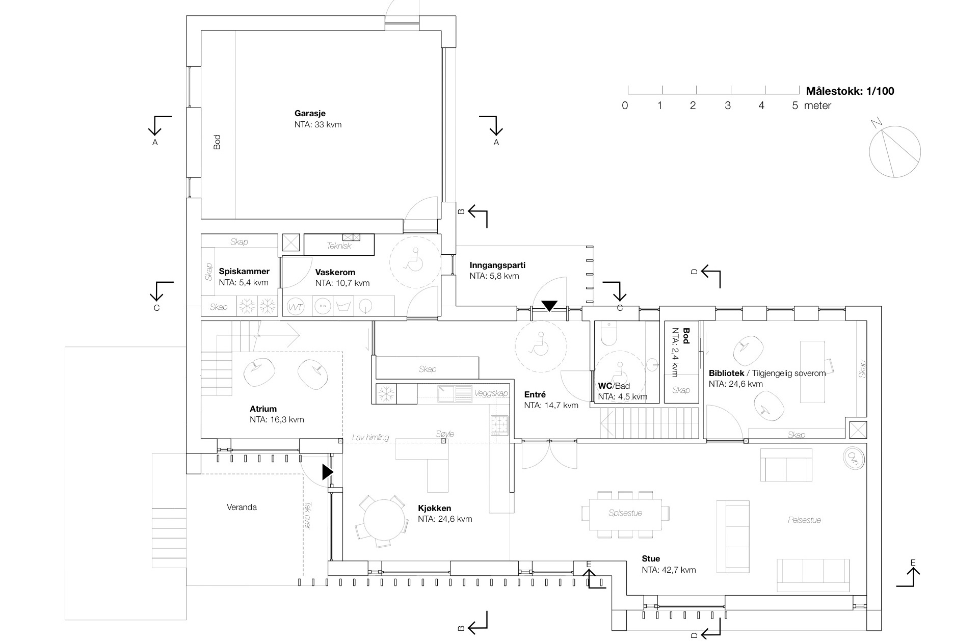
The single-family house we designed on a hillside of Eidsvoll, in Norway, is now under construction by our self-builder client. Created as two wings intersecting with the landscape, the design reconciled our clients' wishes for both discrete privacy and openness to the surrounding woodlands.

Sketch impression of the house with its two intersecting wings, from which the terraces cascade into the forest

Moving out of their current undersized house in the same town, the family wanted to settle on one of the plots owned by the family (we helped the client masterplan this area back in 2011). The plot is situated on an ideally oriented hillside with woodlands at its doorstep and great views to the surrounding countryside.

We designed the family house to clearly separate public spaces receiving visitors (including a small home office) and the more private parts of the house. These two realms are organised in separate wings, articulated by two intersecting gables. At this intersection, an open atrium links the two levels and a sheltered outdoor porch opens up towards the adjacent woodlands to the south-west, stepping down into the landscape through a series of cascading terraces.

Interior view of the atrium, at the intersection of the two wings (Photo @ Caroline Prøven Brohaug)

The external form of the house also responded to the height restrictions of the local planning rules and the steep site slope. Despite the site steepness, the house benefits from a full wheelchair access to all key functions of the home.

Privacy from the existing neighbouring apartment building (also owned by the client) was preserved by vertical timber fins along the facade, framing the views and giving a common vocabulary to the different elevations.

Foundation and groundworks are almost completed and the timber superstructure (insulated with natural cellulose fibres) will be completed before the first snow, at the end of November.


Aalto 2015 Campus masterplan

Thibaut Devulder

Images have just been published by Oslo's Various Architects of a masterplan for the Aalto 2015 Campus on the Espoo peninsula, close to Helsinki.

We collaborated with Various (with whom we share our office in Oslo) and UK consulants Ramboll on the masterplan for this competition entry.

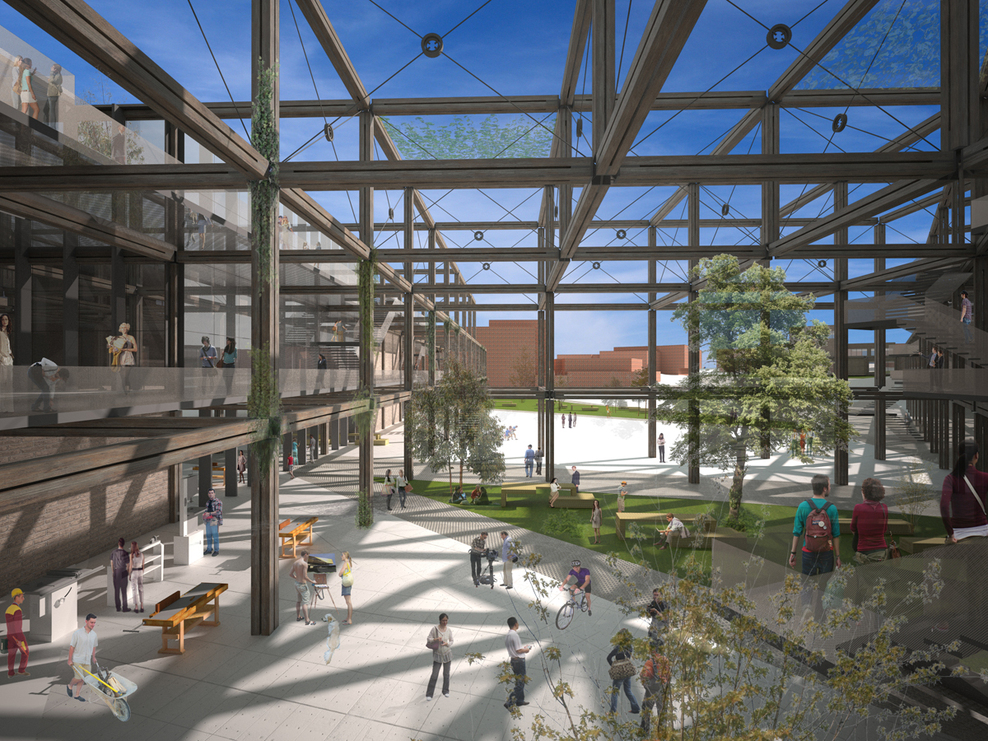
Our approach revisited the idea of the Garden City for which Espoo is considered a Modernist masterpiece. At the core of our design was the Mesh, a three dimensional timber structure extending out of the teaching facilities and workshops into the public spaces. The mesh weaves together social interactions and experimental learning on multiple levels of circulation.

See more on the Divisare website.

Images © Various Architects — published on October 04, 2013 

Alina at the East Centric Architecture Triennale

Tom Hughes

Alina is in Bucharest this week at the invitation of the East Centric Architecture Triennale — where she has presented her shortlisted entry for the Essay Contest. The jury was chaired by renowned Finnish architect and theorist Juhani Pallasmaa.

Her entry, titled 'Conservation Versus Modernisation in Romania  — Through the Lens of Transylvania's Saxon Villages', has been published in the Architext book 'A World of Fragments: Essays on East and Central European Architecture'.

It is part of her ongoing research at Nottingham Trent University into these fascinating historic villages and the controversy surrounding their conservation by foreign agencies.


Weaving space: student exhibition

Tom Hughes

Alina and I are leading the Vertical Studio module this year at Nottingham Trent University, as part of the MArch (Masters in Architecture) course. It's a 10 week design studio delivered to both cohorts of the MArch course, aimed at bringing in practitioners with a particular set of approaches, whilst introducing new students to NTU and preparing final year students for their major dissertation projects.

We've decided to build the studio around the notion of weaving — both as an approach to understanding one way of making structure and space and as an analogy for the multi-stranded assemblage of information, knowledge and ideas that go into an architectural design project.

The site we've chosen is what we've termed an 'urban appendix' — a former thoroughfare truncated by the building of Victoria Station in Nottingham, and then overshadowed by its replacement, the Victoria Centre. This unloved backwater will be stiched back into the urban fabric by housing a dressmaker's shop, design studio and workshop.

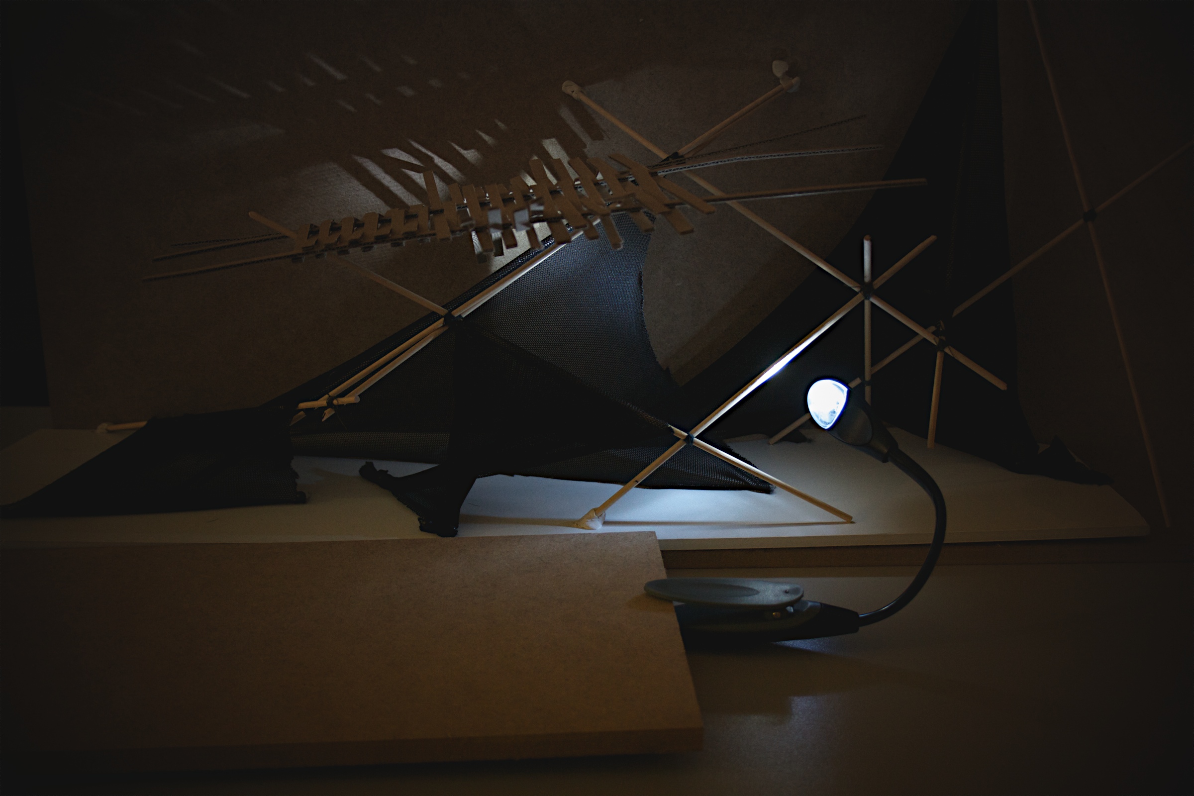
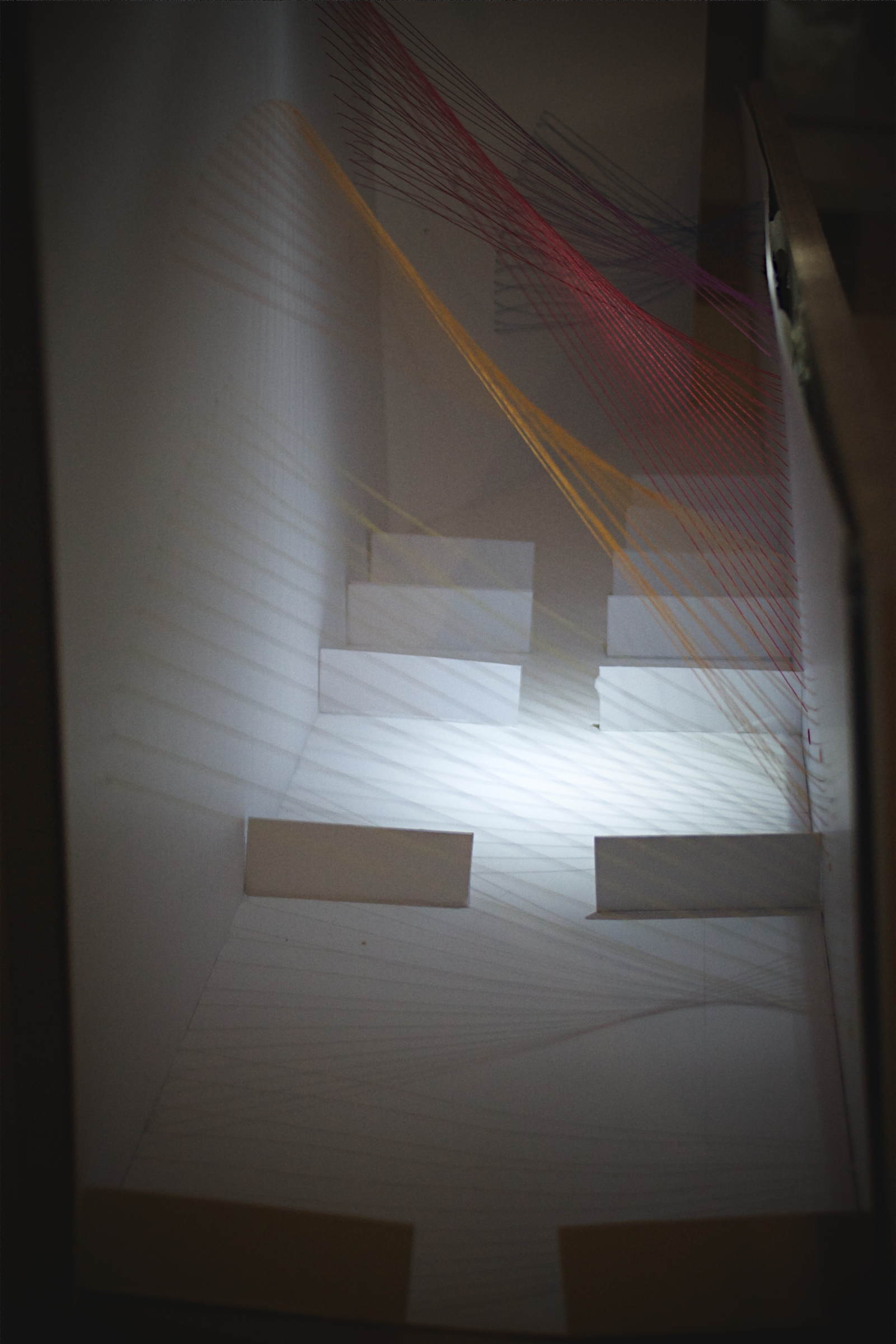
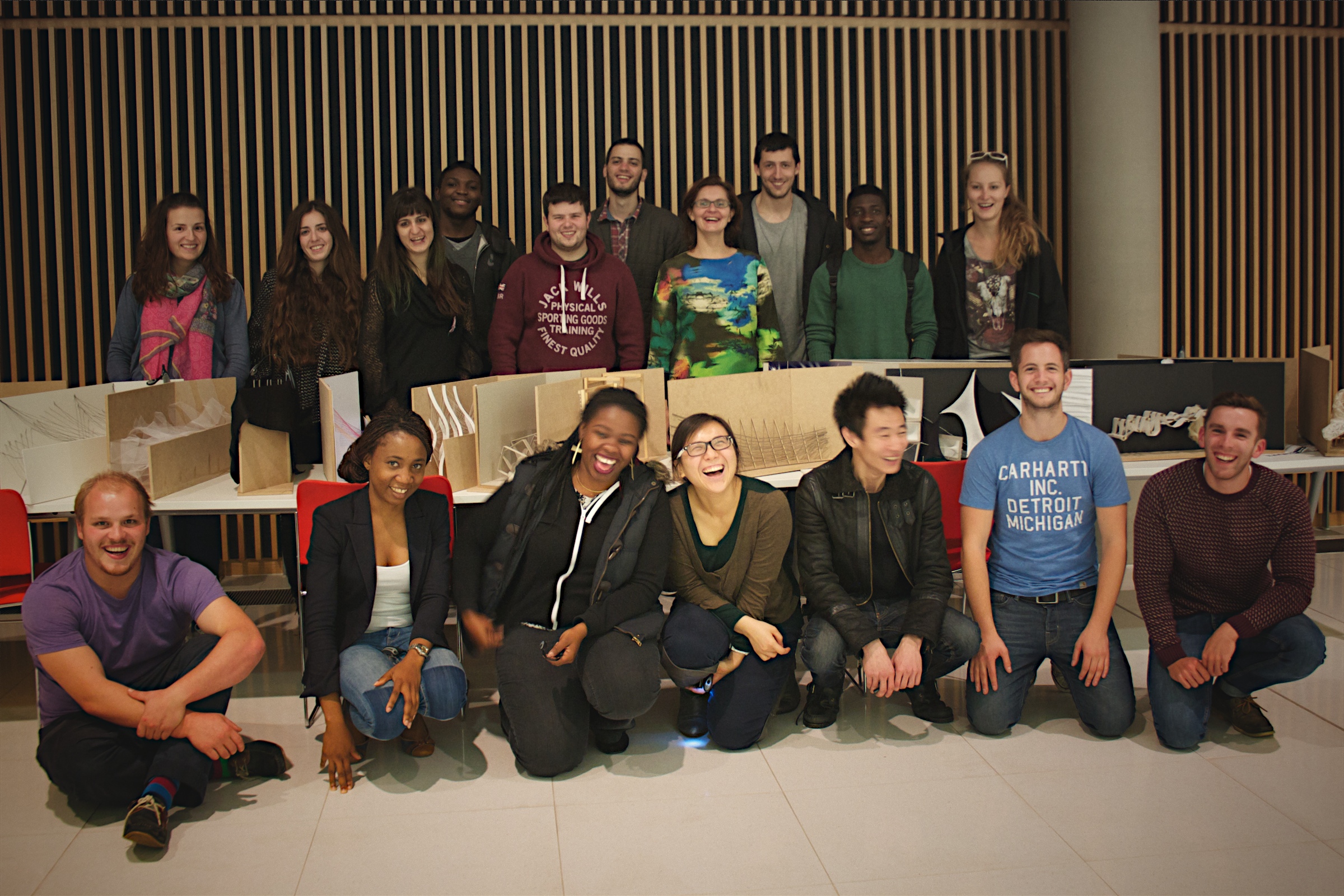
During the first week the students were set the ambitious target of putting on an exhibition of exploratory models. Following visits to Kula Tsurdiu (acting as client) and the NTU textiles exhibition and weaving workshops, the students investigated techniques of stitching, pleating, weaving and fusing to create their models. It was great to see a lot of careful investigation and reckless experimentation coming together in a short space of time — the students really responded to the challenge and we look forward to seeing their designs develop over the coming weeks.

Portfolio project
Gaarder Gården

Thibaut Devulder

Our design for a mixed development project in Eidsvoll, Norway, has been granted planning permission and work has started on site in Sundet, the historical centre of Eidsvoll, on the bank of the Vorma river.

View of the existing building in context from the riverside theatre 

View of the existing building from south

Since its original construction, this building has seen its use change several times, from textile shop to (most recently) an indian restaurant, with each conversion bringing its new remodelling and awkward lean-to extensions added to the existing log timber building, further blurring the old and the new into a cacophonic mix of styles and functions.

We were approached by the client to reorganise the building into a mixed use development, including retail spaces on the ground floor and rental apartments in the upper floor. The nearby open courtyard — a great asset in the town's developing centre — was originally left disused next to the existing building. Realising the potential, we proposed to integrate it into the scope of the project, to define an attractive outdoor breakout space that opens up towards the retail spaces and the new apartments above.

Located next to the riverside and neighbouring a listed old dairy building, it was essential to preserve a sense of scale between the proposed higher density development and the street level — masterplanned to become one of Sundet main pedestrian axis.

To achieve this, the balconies and common roof terrace serving the seven apartments help to break up with the different built volumes on the site and create an interplay of different levels. The courtyard frames the view to the old dairy building facade from the street, sheltering technical areas out of sight from the street (waste storage and heat pump exchangers).

The palette of materials also help to clearly define the original part of the old building from its rebuilt extensions. The main body of the building will be reclad with its original light boarding, with roof form and windows restored based on old photography. In contrast, all rebuilt and new parts have flat roof and are wrapped in dark stained timber rainscreen.

The first phase of the project is now under construction, including the remodelling of the main building and reconstruction of the extension, to host a retail space on the ground floor and four apartments on the first and loft floors.

Portfolio project
Porch that turns a house around

Tom Hughes

We've been working on the remodelling and extension of a Suffolk cottage for some time now — starting with our 2009 RIBA award winning artist's studio. An internal reworking of the ground floor has improved circulation, usable space and natural lighting.

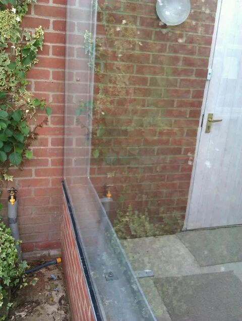
The final element is now on site: a glass and steel porch at the back door will create a generous welcome space and energy-saving draft lobby.

We often find with existing houses that the 'back door' is in fact the main access for family, guests and deliveries alike, and a decision has to be made: reinstate the status of the front door, or accept the established usage and make the back door a decent point of arrival?

In this case the 1980s flat roofed 'garden room' extension to the rear of the house - with improved windows and insulation - has become the main area for entertaining guests; the new porch will turn the house around and connect it all back together.

Arrows

Thibaut Devulder

Preparing a workshop in Lille for our Ooo-Ya-Tsu performance, I am drafting a graphical framework in Processing to work on the drawing interaction. A few accidental numbers changes in the program and suddenly the generated graphics all drifted into weird unpredictable abstraction...

Walker House remodel

Thibaut Devulder

The existing house

Our clients are now finalising the site work on our remodel of their home in Eidsvoll, Norway.

We were originally approached by the clients in 2011, to reorganise a family house that had become overcrowded for their family of five and — more importantly — to create a modern comfortable home they would be proud of.

The clients' brief

The model of the surveyed house

Already extended once, this house was in fact spacious enough for the family. Yet the existing layout made poor use of the internal space: stiffly compartmenting into disconnected rooms, the floor plans created several "dead areas" on key locations of the three levels, which were mostly left unused by its inoccupants or barely used for storage.

The existing services were obsolete and poorly placed — with no bathroom on the ground floor for instance — and the clients were eager to upgrade the building fabric and technical installations as part of the remodelling exercise. Summer overheating and noise from the increasing overhead airport traffic were particularly problematic.

Conscious that their three teenage sons would soon be leaving the family home, the parents were also willing to remodel the house so that the upper floor could easily be isolated from their accessible quarters on the ground floor in the coming years, to be rented out to tenants with minimum additional work.

All these had to be addressed with minimum alterations to the exterior of the building, to fit the budget and the local planning rules.

Unlocking the flow

After a detailed survey of the existing house, we identified key factors breaking the flow through the house. These were tackled by a series of strategic moves that could unlock the potential of the space in a cost effective way. At the core of the approach was to clarify the organisation of public and private spaces, and how these flowed into one another.

A few key changes to the internal building fabric allowed us to both connect the spaces for greater flexibility in use (to host large family events, for instance) and respond to the need for privacy between the different parts of the house.

 Creating an experience

Altering the floor plans was the first move to transform this home. We extended this approach to carefully select interior materials and light fittings, to suggest and emphasize the new relationships between the spaces.

Entering the house, the visitor is drawn further into the spaces by a series of focal points revealing themselves progressively from different viewpoints as the house is explored, linking the social spaces and the large garden outdoors.

Improving comfort

The timber structure was fully re-insulated internally, using high density natural wood fibre insulation to improve all year round thermal comfort and dampen external noise. Comfort was further improved by replacing the existing windows with hi-spec new low-energy and noise reduction glazing.

With minimal changes to the existing drainage system, two new family bathrooms and a guest toilet were added to the ground and first floors. Connected to a new centralised ventilation system, they dramatically improve indoor air quality in a quiet and energy efficient way.

Working in close collaboration with the clients, with their in-depth knowledge of every corner of the house and the way it was constructed, allowed very detailed design and planning of all the alterations, while keeping building costs low.

Low energy house, high quality space

Tom Hughes

Over the bank holiday I dropped in to see how the clients for our low energy house are getting on. They've been in residence for a good few months now and it was great to see the house in operation as a home.

The property is going to be open to visitors as part of the programme of tours arranged during September 2013 by West Bridgford Eco Houses- if you want to visit check out their blog post about the house.

All the energy saving features are behaving well, although it is too early yet to get statistical feedback on performance. The basic principle is to make good use of passive solar gains from the south and trap the heat in the the high thermal mass of the building, inside a highly insulated jacket. Overheating is prevented by the thermal mass, which evens out temperature highs and lows, and by effective use of shading on the south facing windows. The other important factor is to control drafts, and the build quality here is exceptionally good.

The really gratifying thing to see was that the house is working well as a home for our clients- it's clearly a comfortable, welcoming and relaxed place to live.

LaM pavilion in "Inflatable: Art, Architecture & Design"

Thibaut Devulder
IAAD.jpg

Our inflatable pavilion for the Lille Museum of Modern Art is featured in Jacobo Krauel's new book "Inflatable: Art, Architecture & Design", published by Links.

Storgata interiors

Thibaut Devulder

As part of their remodelling and refurbishment of a large office building in downtown Oslo into the new Olympiagården project, Various Architects — with whom we are sharing an office — invited us to work with them on the detailed design of interior furniture for their design of the future Lederne Headquarters.

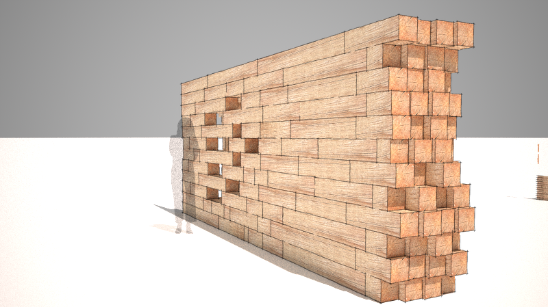
Concept development for stacked wood partitions

Various Architects' design included a series of large timber partitions that would integrate seating, services and storage. Articulating the new refurbished office space in a playful and subtle manner, these interior elements were to create a unifying visual and functional concept for the large open plan office.

Their design and positioning were to weave social spaces to create spots for impromptu social interactions, but also help subtly define more private areas for focused work and conceal the services and air conditionning system. Other furniture such as the reception desk and work spaces, were also to be custom-made in a similar fashion.

Image © Various Architects

Image © Various Architects

Based on their brief we developed a series of design concepts playing on the idea of the massiveness of stacked timber elements, with their textures contrasting with the existing concrete structure of the building. These concepts were developed with Various Architects, in consultation with a number of joinery companies specialised in custom-made office fittings, that gave us feedback during the design stage, to make sure that budget and technical constraints would be met.

We then finalised the detailed design of the timber elements and prepared a series of concept and technical drawings that were incorporated to the tender package for the project.

The refurbishment and fittings of the Lederne Headquarters is now on site. As with our collaboration on the Aalto Campus competition, it has been a pleasure working with Various Architects and we are looking forward to collaborating with them again on exciting projects!

Artist residency

Thibaut Devulder

I had a week-long workshop last week in France with art collective QuboGas and musician DDDIXIE to develop the concept of our collaborative art performance Ooo-Ya-Tsu.

As part of our art residency at music venue L'Aéronef, we also got our first opportunity to experiment on a full scale stage and sound system, testing some of our ideas on motion tracking, video setup and interfacing DDDIXIE old analog synthesisers with my Processing computer program.

Photos © Morgan Dimnet, of QuboGas.

New light filled heart to a 1920s home

Tom Hughes

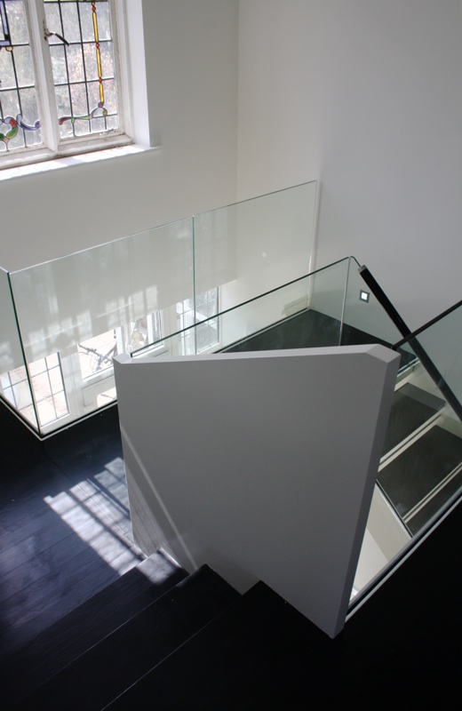
Our strategic approach to the remodel of a 1920s home was to carve out a new space at the centre- relinking areas of the house that for reasons of class had originally been divided into servant and served.

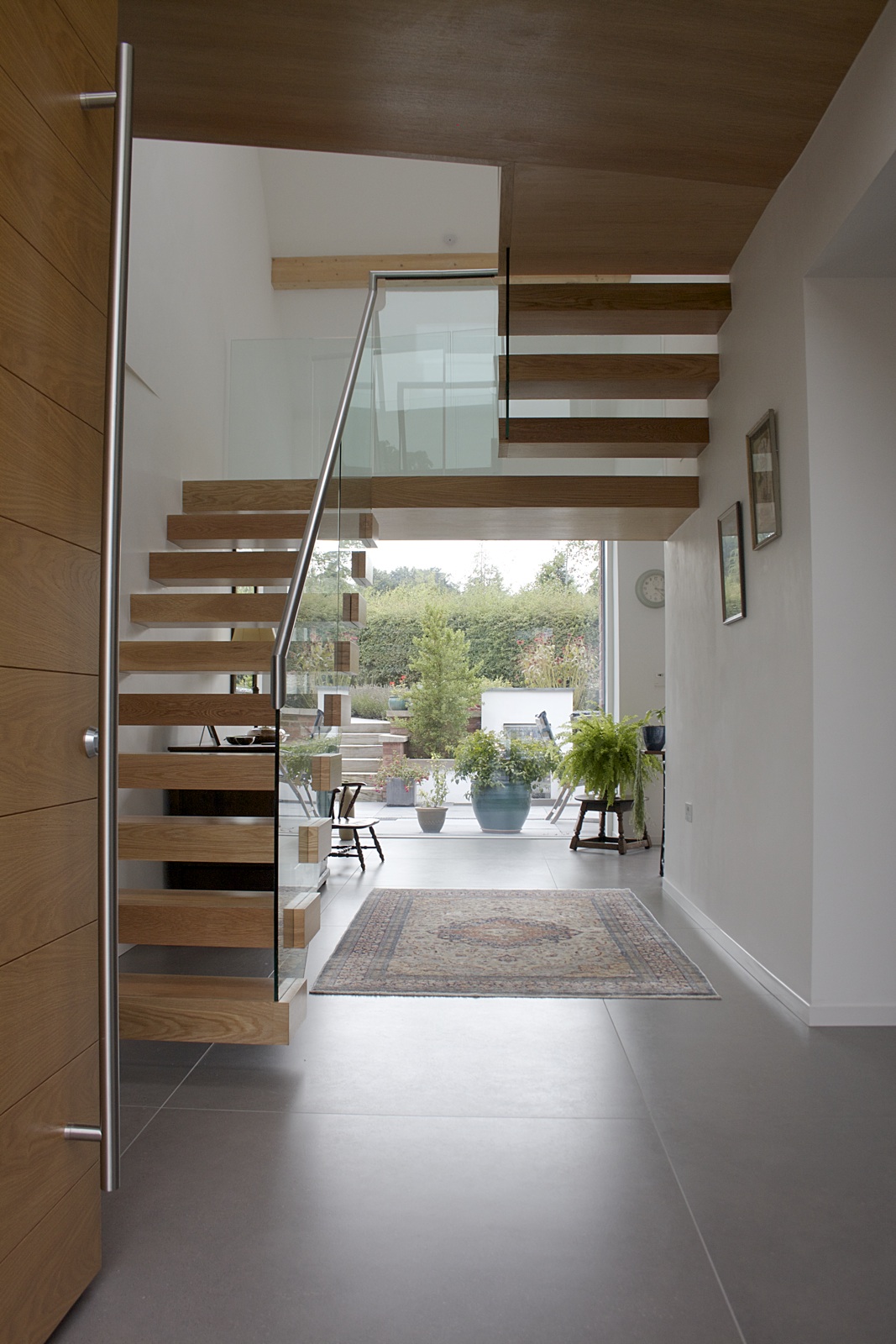
Into this void would go a contemporary stair, a strong element in its own right but designed to direct space- creating important spatial links and sightlines.

The existing stained-glass steel framed window to the south elevation remains in place, pouring light into the new heart of the house.