A photographic dialogue

Thibaut Devulder

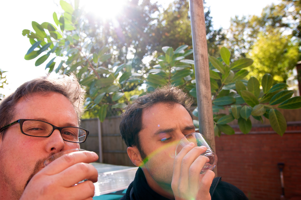
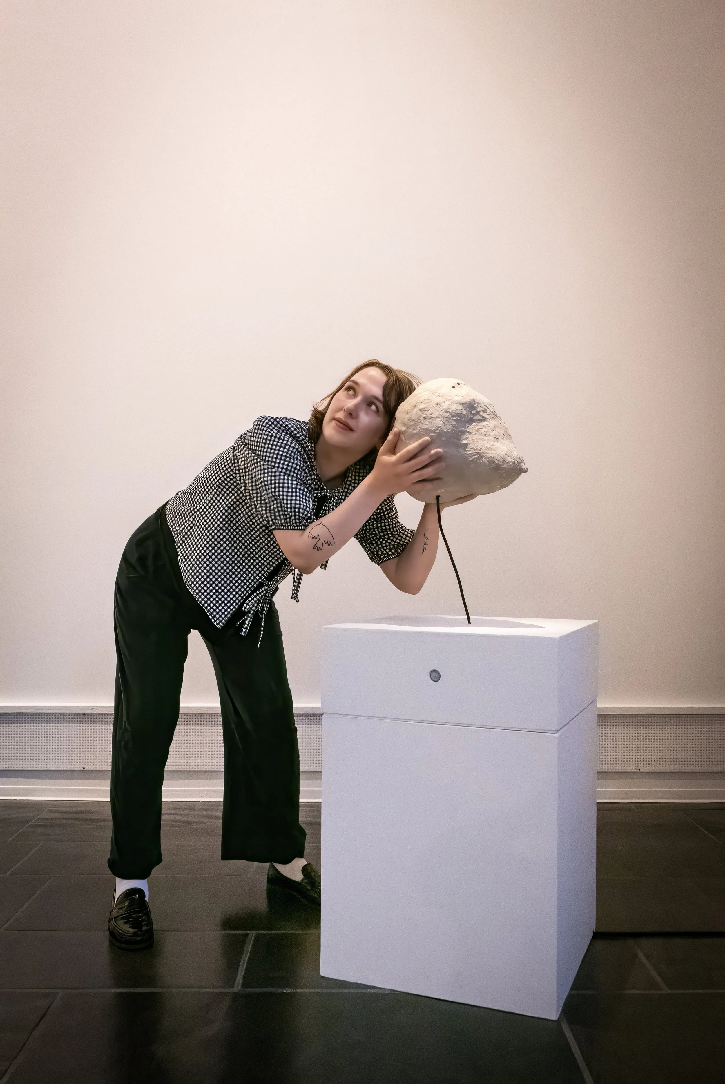
To keep our photographic juices flowing, Tom and I started a photographic dialogue more than a year ago. The rule of the dialogue was simple: one at a time, we regularly post images on Flickr, responding to each other's image in some way — form, light, colour, theme, etc. Only two constraints: 1. photos must be chronological and 2. we don't discuss our photos — we just respond with another photo and never explain the response...

Thirteen months later, the photographic dialogue is taking some interesting turns...

We wanted to display this dialogue on our website, but our Content Management System (TextPattern) did not allow this straight out-of-the-box. No problem: we resorted to our proven mashing approach to web design...

Both Tom and I were already using Flickr to share our photos, so it made sense to use this existing service to manage the images and display them on our website in a dialogue format. We did this by creating a private group on Flickr to which we posted our photos, and automatically pulled these images to our website with a few lines of code, using the powerful Flickr API and the PHPFlickr library.

Alina's presidency

Thibaut Devulder

2hD's Alina is president of the Nottingham and Derby Society of Architects (NDSA), and she has been busy! With a revitalised membership and restructured board, the Society now meets twice a month to take forward its plans. A work shadowing scheme has been set up to place architecture students into local practices as part of their studies, a trade mission has been set up to Nottingham's twin city of Timisoara in Romania, and a new web site and lecture series are in the pipeline. 

On the social calendar, the annual NDSA quiz will take place on 6th Dec, and a Facebook group takes care of the networking. 

2hD at Lincoln Architecture Society

Tom Hughes

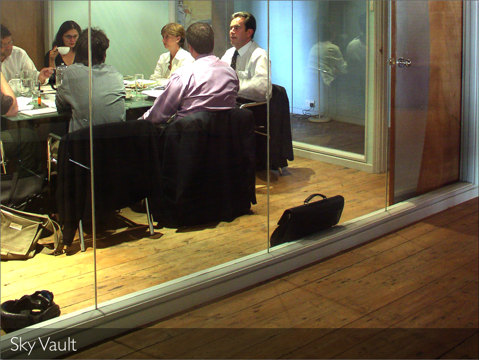
The Lincoln Architecture Society invited 2hD along to give a talk as part of their evening lecture series. I was genuinely impressed by the professionalism of the students who run the society — an excellent welcome pack in my email a few days before the event giving all the info I needed to get to there and a warm welcome and introduction.

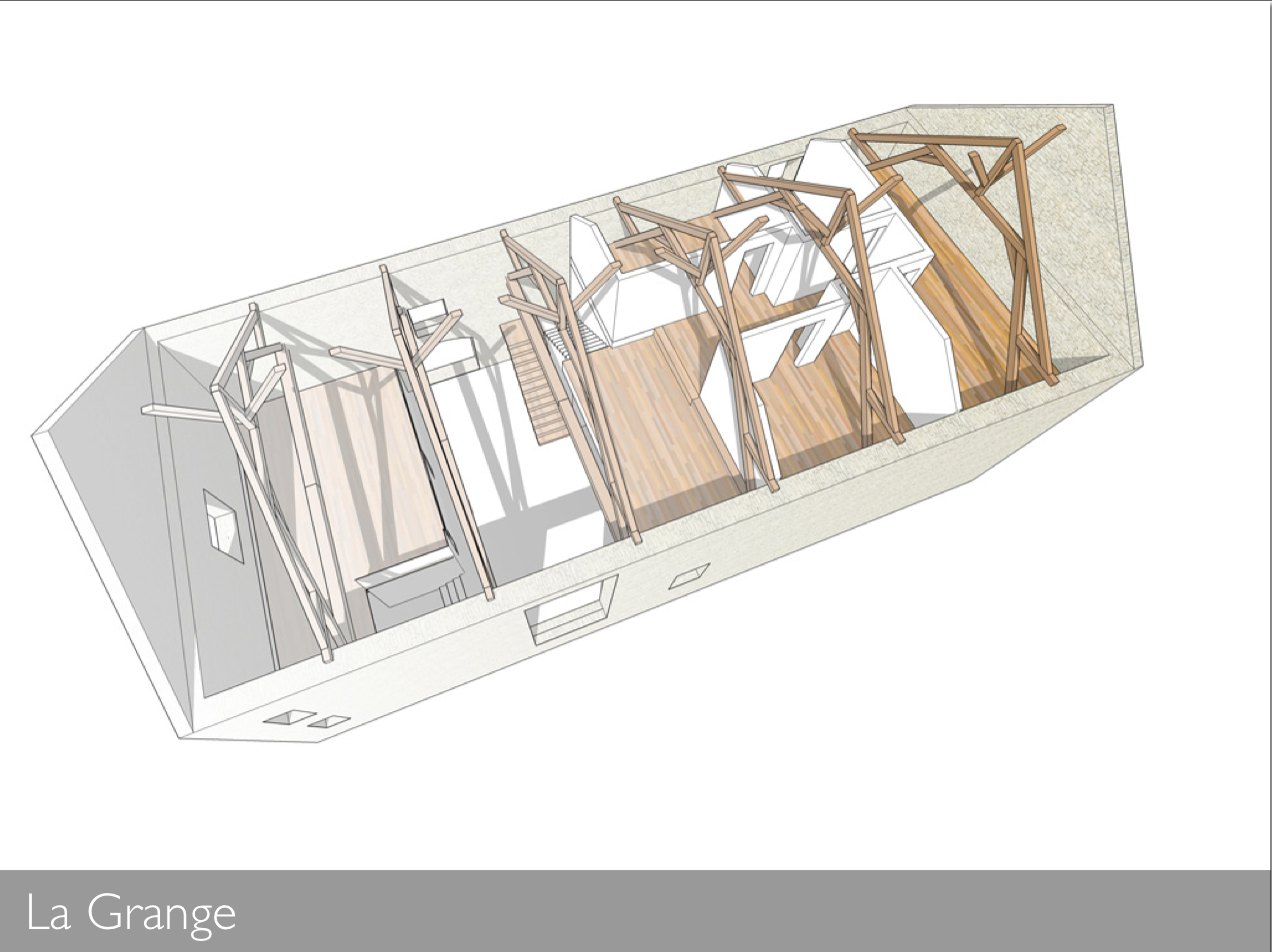
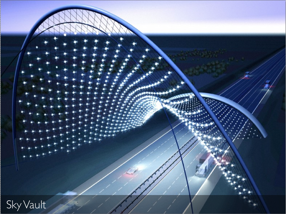
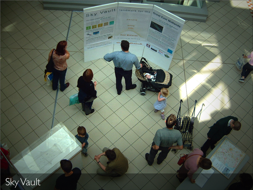
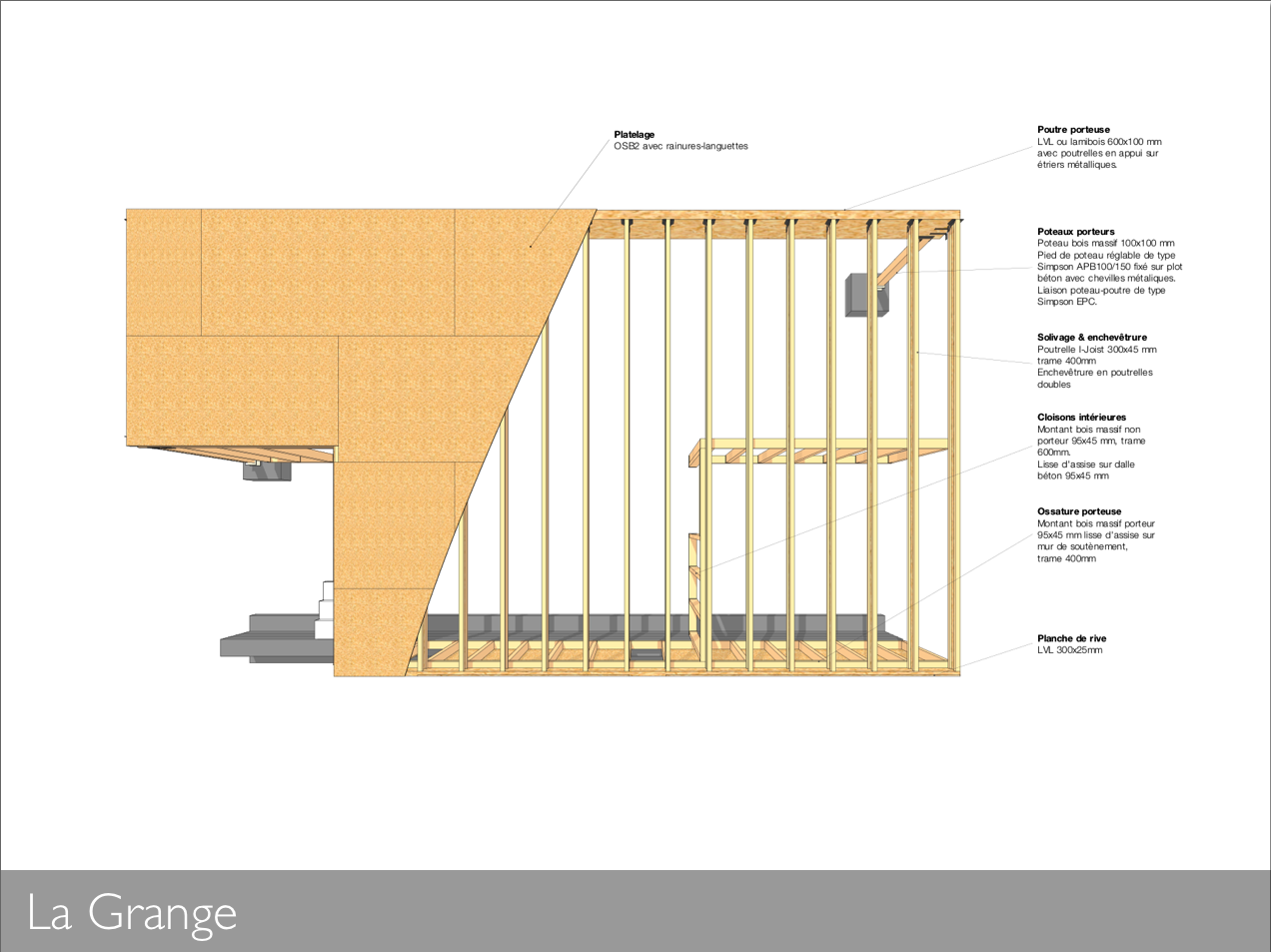
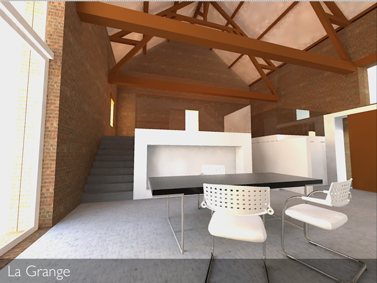
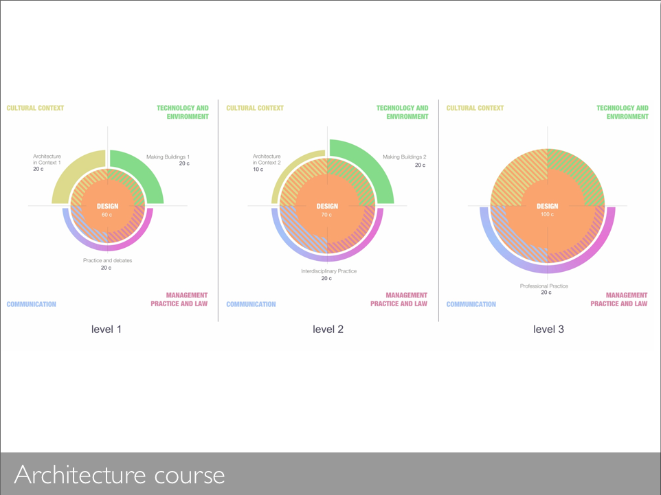
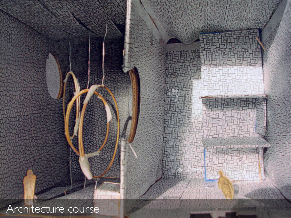
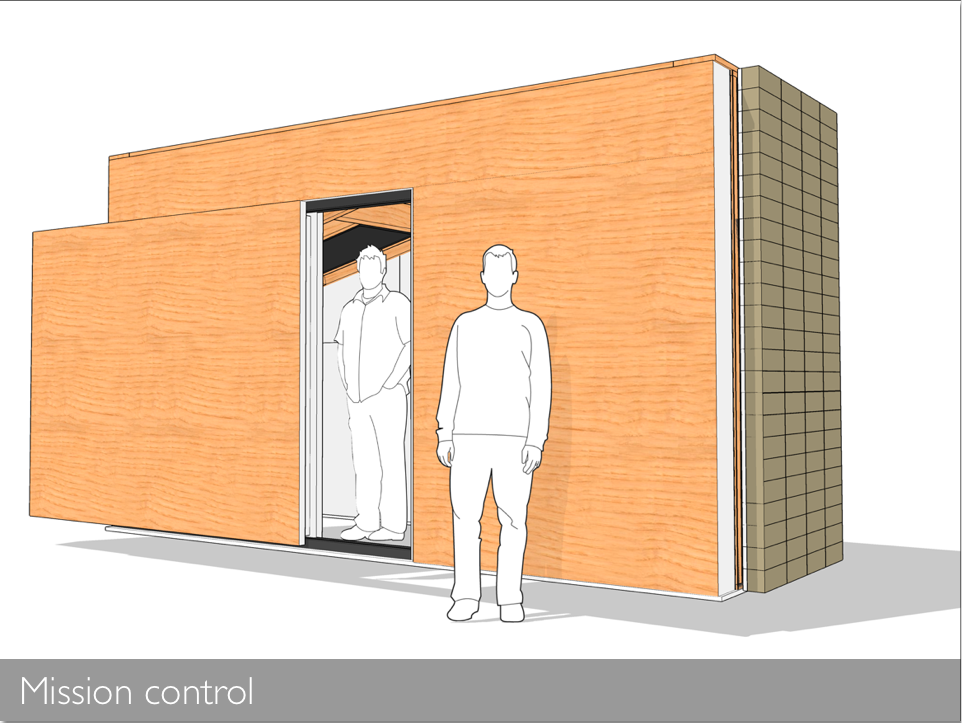
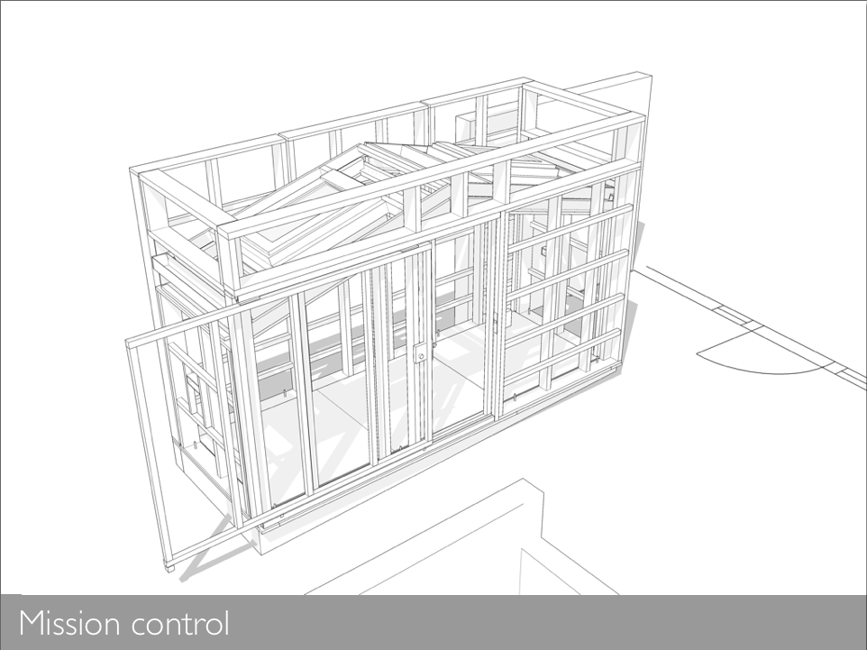
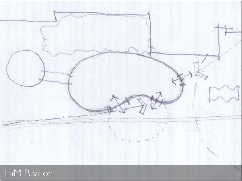
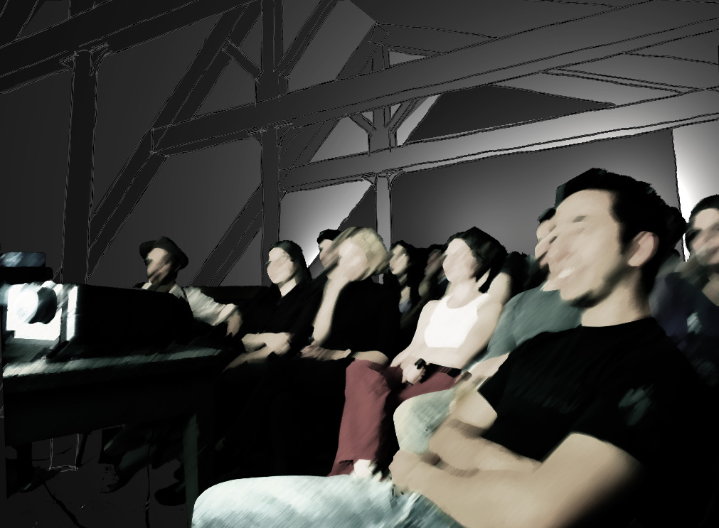
Here are a few of the slides from my talk, which covered the Sky Vault project, the barn conversion in the Dordogne, our work on the NTU architecture course, Mission Control (our hairy micro-office), our Structures on the Edge shortlisted competition entry and the inflatable event space.

Their lecture series looks great — it brings kudos the the Lincoln School of Architecture and is definitely worth checking out if you are in the East Midlands. Take a look at their website.

Adventure Play Centre

Tom Hughes

It's nice to get a recommendation and to support local projects!

This play centre is in need of extra space for an office and creche, and wants to make use of sunken no-man's land corner of their site. However they have no resources for the project until they get funding, and to get that they have to run the idea past the local planners and other stakeholders.

Sometimes in situations like this we can help to break the deadlock by putting a little bit of work in 'up front'. A local contact who we worked with on the Sneinton Trail project put us in touch with the play centre, we went to take a look, and turned out these simple drawings. It's a start.

On one level this is just a feel-good thing to do, but it isn't purely altruistic: it means that there might be a real project sometime in the future (one which would improve our community), we build up a huggable reputation, we might get another recommendation out of it, and we can write and illustrate some self promotional material like this.

Permaculture gardening

Thibaut Devulder

Before winter hits the Serbian hills, I visited the Sokolovica eco-village on the Rtanj mountain in Southern Serbia to help them prepare the gardening raised beds where they will grow most of their food next year.

As part of our permaculture strategy, we wanted to set up the first of a series of deeply mulched raised beds. The first beds were to be placed as close to the house as possible, to make then easier to maintain.

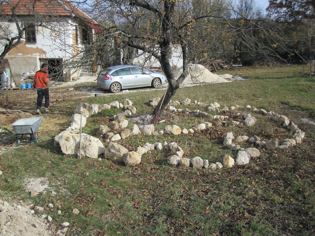
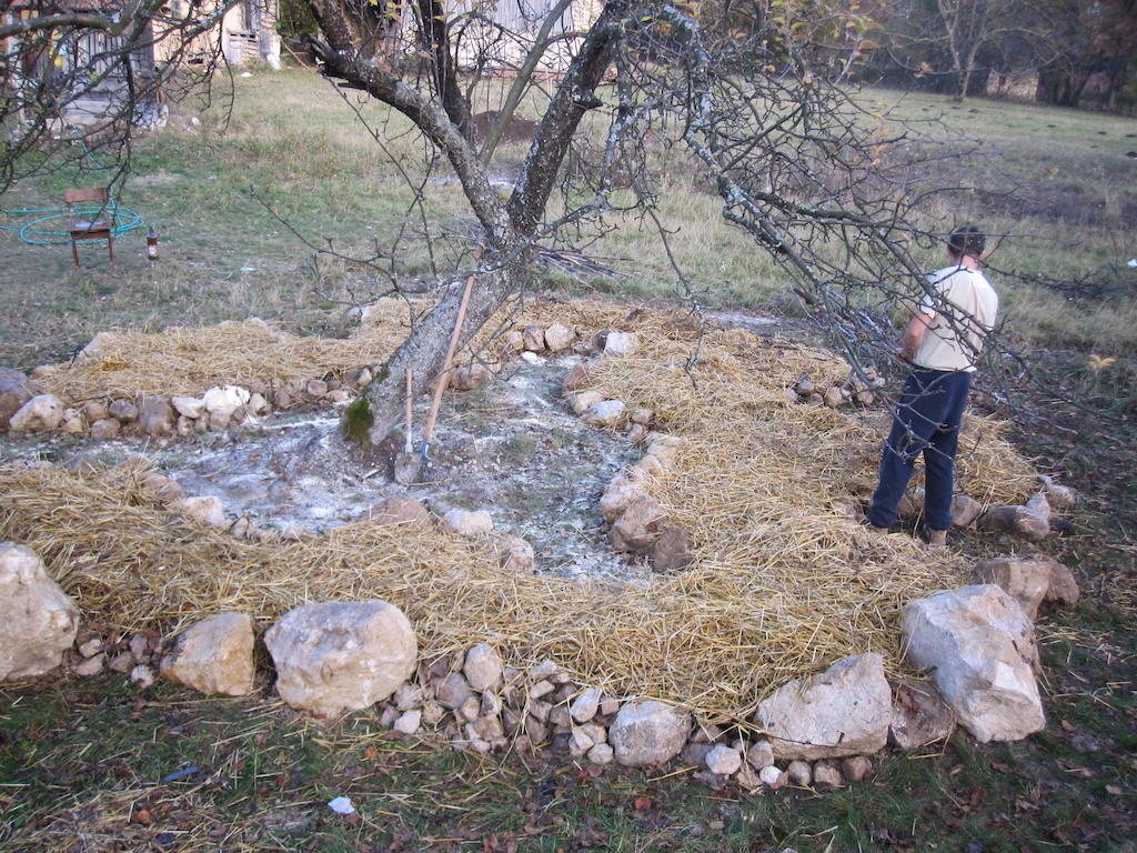
We decided to start small and wrap the first one around a mature apple tree, situated close to the entrance of the site. The shape of the raised bed would follow the drip line of the apple tree (below the perimeter of its foliage), where rain and condensation water tend to naturally get concentrated by its leaves, thus minimising the need to irrigate the bed later on. The drip line is also where the tree’s feeding root are at their densest below ground, so that will maximise interaction with companion plants growing in the raised bed.

Here's a sketch plan of the bed wrapping around the apple tree:

As the raised bed should neither be tilled nor disturbed, we created so called keyhole openings into the bed to allow easy reach to any part of the bed without having to stamp (and compact) the soil.

Placing the bed under the crown of the apple tree made it possible to use its foliage to define a range of different micro-climates in its shadows — protecting the plants below from the hot summer sun and from mid-season morning frosts. The tree foliage would also help protect the bed from the frequent summer thunderstorms, breaking the speed of the rain drops before they could damage the more delicate plants.

The excavation of the nearby reed bed filtering the house's grey water has unearthed a vast supplies of rocks (chalk?) and we decide to reuse some of them to create a border. In addition to keeping the mulch in place, they will provide habitat for small insect predators such as lizards and spiders. Their thermal mass will also play a role in controlling the bed's microclimates: accumulating heat during daytime and acting as condensation traps at dawn. The rest of our full time pest-controlling team — the birds — would happily perch on the apple tree above the bed and keep the insect population under control.

Laying out the raised beds was intuitive and fun: run around the tree with a wheelbarrow to figure the width of path and keyholes. Once this was done, visualising the width of the beds and the position of the keyholes was as as simple as two people walking round while shaking hands — since any part of the bed should be reachable from one of the sides without having to trample the mulch. Refreshingly practical!

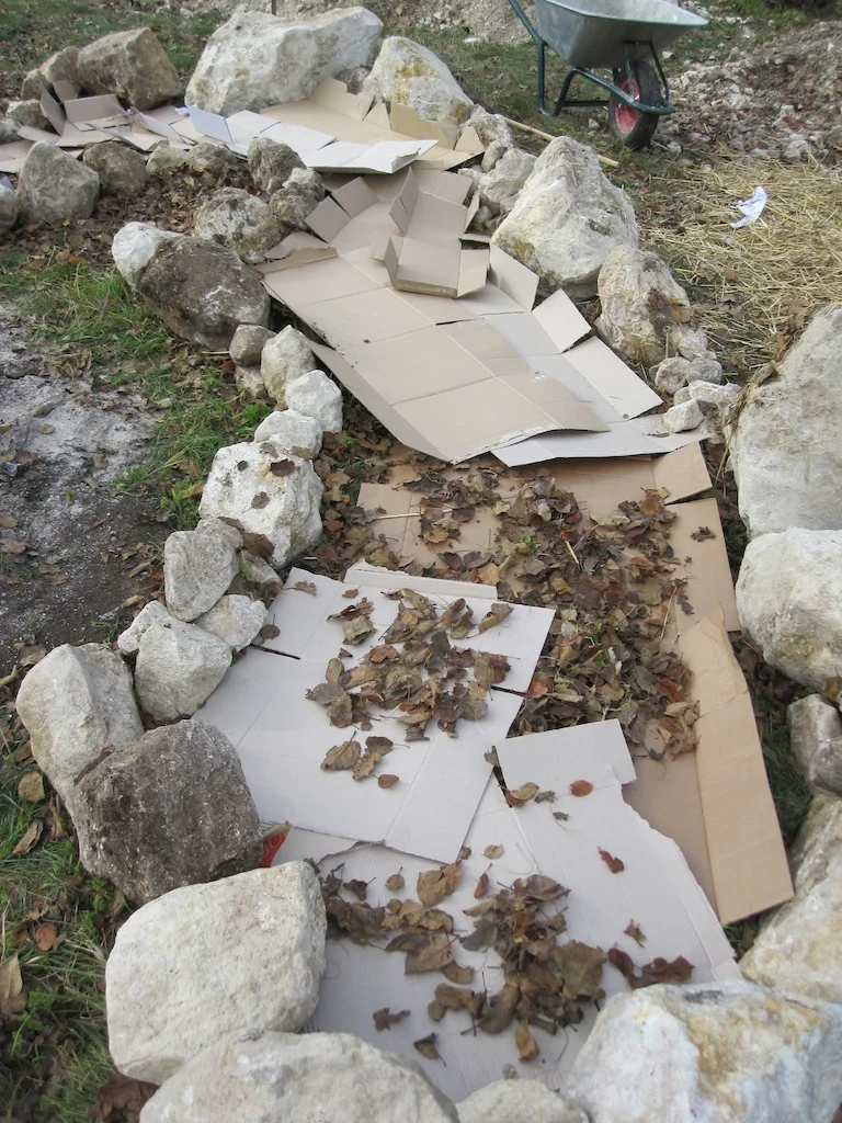
The bed was mulched as follows (bottom to top):

  1. a layer of cardboard (reclaimed from local shops) to suppress the weeds under the bed,
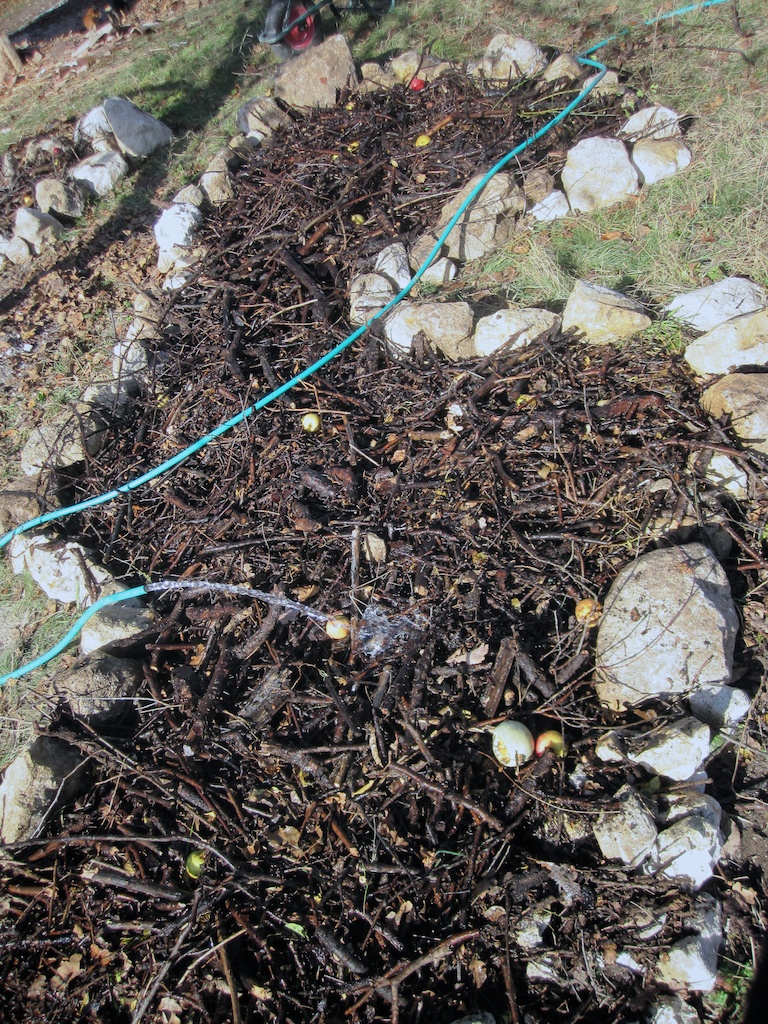
  2. a thick pile of decomposing organic matters (pruned branches, food scraps, fallen fruits), mixed with some soil excavated for cellar drainage,
  3. a deep layer of fallen leaves collected from surrounding roads and alleys,
  4. a layer of straw from locally produced bales to insulate the soil and prevent seed germination until spring.

The raised bed was then copiously watered and will be left over winter to decompose into rich humus. Now waiting for the spring to start planting...

Remote model making

Thibaut Devulder

We've just had an exciting collaboration with artist Tristan Hessing on a public art installation for the Lincolnshire coast. Tom and Tristan have been working together in Nottingham to develop the form of the structure, while I was handling the CAD modelling and 3D renders from Belgrade.

As part of the project, we also needed to produce physical models of the faceted shape that Tristan had come up with. With a 3D computer model in Belgrade and a physical model to be built in Nottingham, how to communicate to Tom all the information he needed to quickly fabricate a physical object perfectly matching the numerical one?

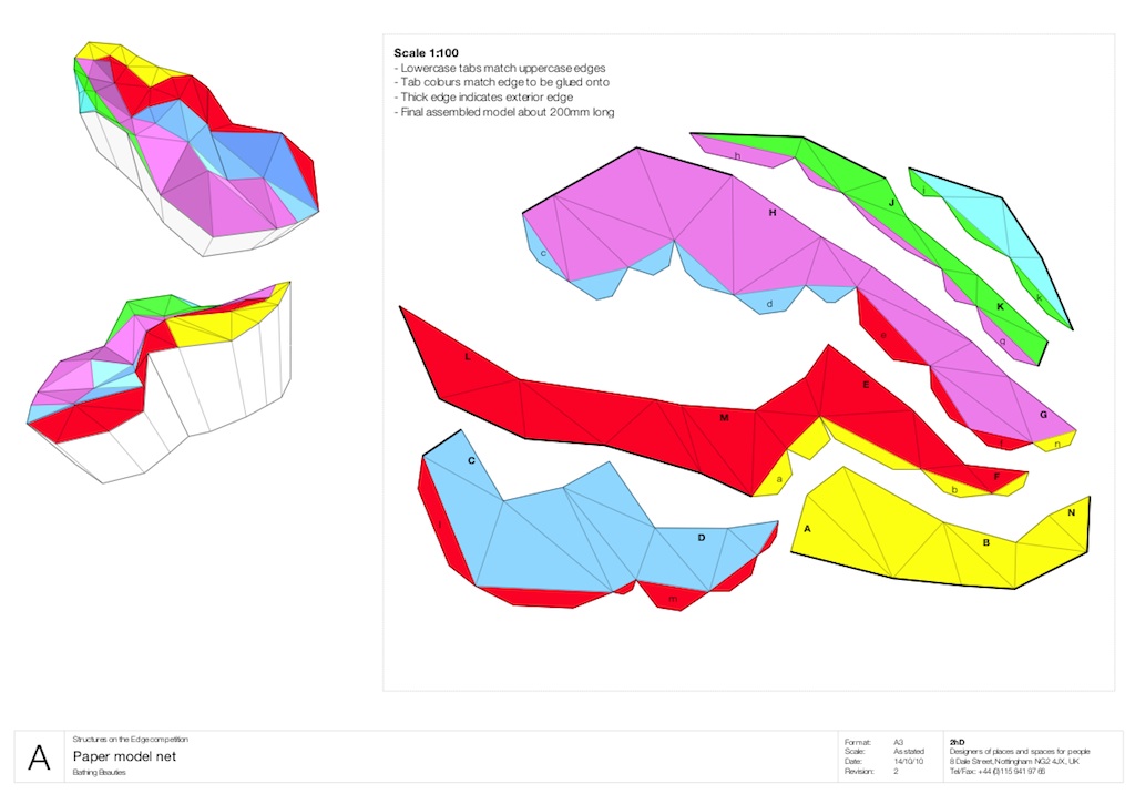
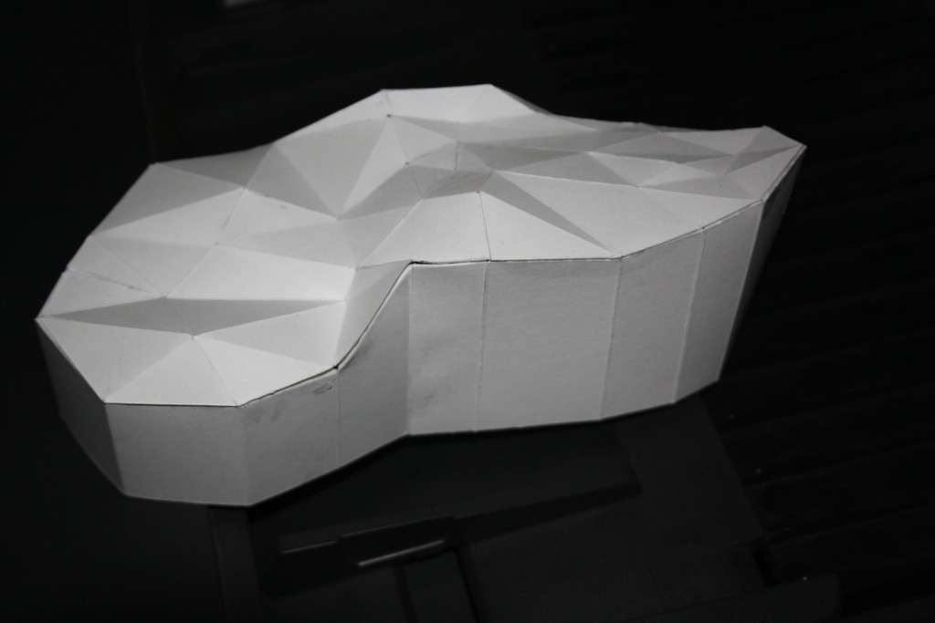
The first stage was to check the geometry of the folding pattern with a paper net, which could be printed onto card with our office A3 printer. The Flattery plugin for SketchUp came in handy to explode the facets of the object and generate the tabs to glue the different pieces together. The rather complex geometry required that the net was split into 8 foldable panels, each with a different form.

To simplify the assembly, I colour-coded and labelled the facets and tabs, with some 3D orientation views to explain how the different pieces were meant to be glued together. I emailed Tom a PDF version of this net.

A few hours later, Tom video-conferenced me with the assembled model. So far so good. This paper model would later be spray-painted black and used for one of our models.

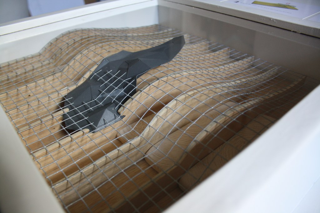
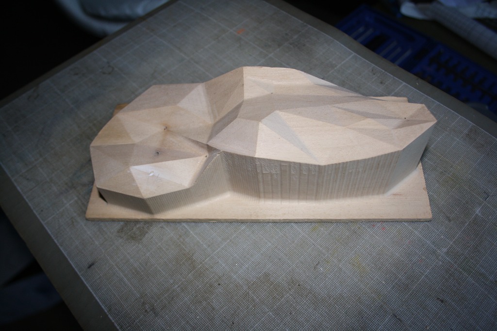
We then needed a durable plastic version that could be handled by the public and we called on to the expertise at the workshops at Nottingham Trent University — we both teach there part-time and Tristan is a graduate from their Fine Art school. I generated an STL file from the 3D model and sent it to the workshop, to be fed to their computer controlled milling machine. The idea was to manufacture a strong mould onto which thin plastic versions could be formed by vacuum.

Four hours passed and Tom called me from the workshop with the mould ready, CNC-machined from a solid block of MDF. Nice!

Tom then laboured hard with the workshop team to produce two perfect vacuum-formed plastic shapes. I received the images by email straight from the workshop.

This beats having a 3D printer directly connected to my laptop! Many thanks to the team at the NTU workshops for their expertise and help!

Portfolio project
Stranded: extreme picknicking in the dunes

Tom Hughes

In response to the Structures on the Edge competition, we collaborated with artist Tristan Hessing, of One Thoresby Street, to explore the ambivalent relationship between art and nature conservation. We designed a shifting public art installation on the wild beaches of the Lincolnshire coast, on the theme of extreme picnicking.

The Stranded art installation, slowly eroding within the shifting sand dunes of the Lincolnshire coast

Our chosen site: a fragile dune ecosystem, isolated on a windblown seashore.

Stranded was our shortlisted entry for the 2010 Structures on the Edge art programme, and a distant cousin of our Bathing Beauties competition entry.

The artists’ brief called for small permanent structures in the sand dunes of the Lincolnshire coast that would respond to the wild beauty and harsh environment. Our response was to design an installation for extreme picnicking as a robust response to the rugged nature of the site.

Shifting sands

We decided to make our intervention at a dune crossing point, reinforcing and protecting the dune whilst giving views and shelter for visitors as they move between land and beach. Stranded would be a faceted concrete structure whose shape was derived from the dune surface, but with points raised to provide views and shelter, and others buried beneath the surface to provide foundations. We would see it as a geometric abstraction of the dune landscape, a frozen snapshot of the shifting sands. It might be taken for an archaeological artefact that has been exposed, or is in the process of being covered, by the sands.

Our collaboration with the artist

We found that Tristan shared our approach to understanding the project and our chosen site at Wolla Bank. We took our cameras and tape recorders and had a picnic in the dunes. We talked and sketched and thought, but we also interviewed everyone we could — hikers, families, fishermen, dog walkers, bird watchers.

It became obvious that it was the remoteness and rawness that they appreciated. All of them had visited Wolla Bank many times, and they all praised its quietness and undeveloped nature. Rather than change the place by inserting an icon that would signal development, we decided we should intervene in a strong but subtle way in the landscape.

The making

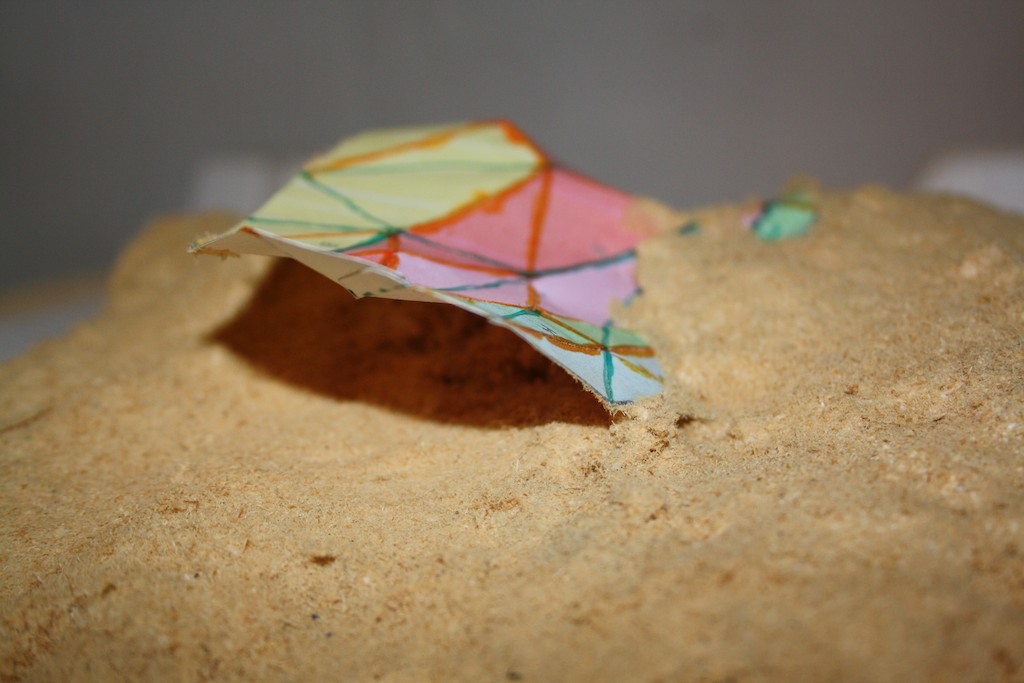
The process of making Stranded would be intimately connected to these intentions. Creating a mould from the sand of the dune, we would dig out areas of the structure which would be ultimately submerged beneath the ground, and build up areas that would be raised. Finally, we would spray on fibre reinforced concrete to form the structure. The process would be like building a giant sand castle — a hands-on process through which we would engage the local community and visitors.

The exposed concrete areas would collect sand and be blown clean so that the structure would change over time, a process that we would document and that would help to explain the life, mobility and sensitivity of dunes to the visitor.

" 2hD have been committed to delivering the highest standard possible at every opportunity in our collaboration, which is absolutely how it should be and the reason why it has worked so well for all parties.
From our initial shared exploration of the site, they were very engaged with my responses and ideas, responding quickly with visualisations and practical suggestions for the making process. The principle of our collaboration was to understand where our common ground was and how best to pool resources and create design without compromise."

— Tristan Hessing, collaborating artist


Portfolio project
1 Thoresby Street art space

Tom Hughes

Nottingham has a thriving arts scene, and over the last few years there has been a swell of artist-led studios and galleries.

We’ve had a chance to find out more by getting involved with the 1 Thoresby Street building, part of BioCity where the Stand Assembly artist studios, and the influential Moot gallery (which recently disbanded) have been given space. It’s a vibrant place with artist studios and several galleries from the poster-sized Keep Floors and Passages Clear, to the bedroom sized Trade to the 180m2 attic space. It was the Reading Room for the fantastic Hinterland project, a base for experiments in projection from Annexinema and is now the base and a major venue for the upcoming Sideshow — the British Art Show fringe event.

We’ve been helping the artists to get to grips with their building, making something workable, safe and with a strong identity on a minimal budget and, with the future of the building uncertain due to development and road widening plans, probably temporary. It’s a work in progress and an association with the art scene in Nottingham that we hope will continue. For us, it has also spawned a collaboration with artist Tristan Hessing on a piece for the Lincolnshire coast.

At 1 Thoresby Street an empty, wasted and forlorn building has had new life breathed in to it. We urge you to get down there to catch some Sideshow events, which run from 22 October to 18 December.

Portfolio project
A pavilion for a Museum of Modern Art

Tom Hughes

2hD were commissioned by the Lille Métropole Museum of Modern Art (LaM) to conceive an innovative pavilion to host the ceremonies, celebrating the museum’s re-opening after five years of refurbishment and extension works.

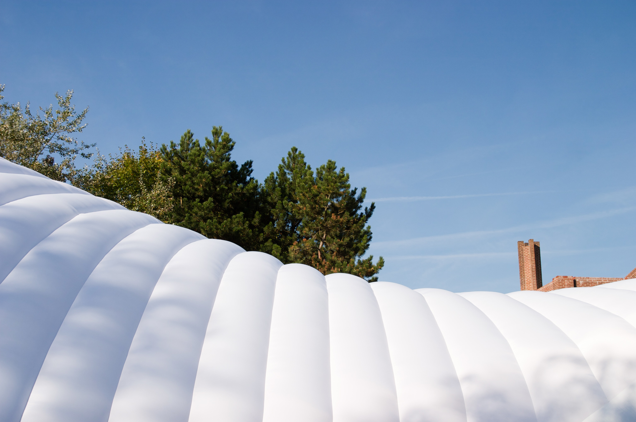
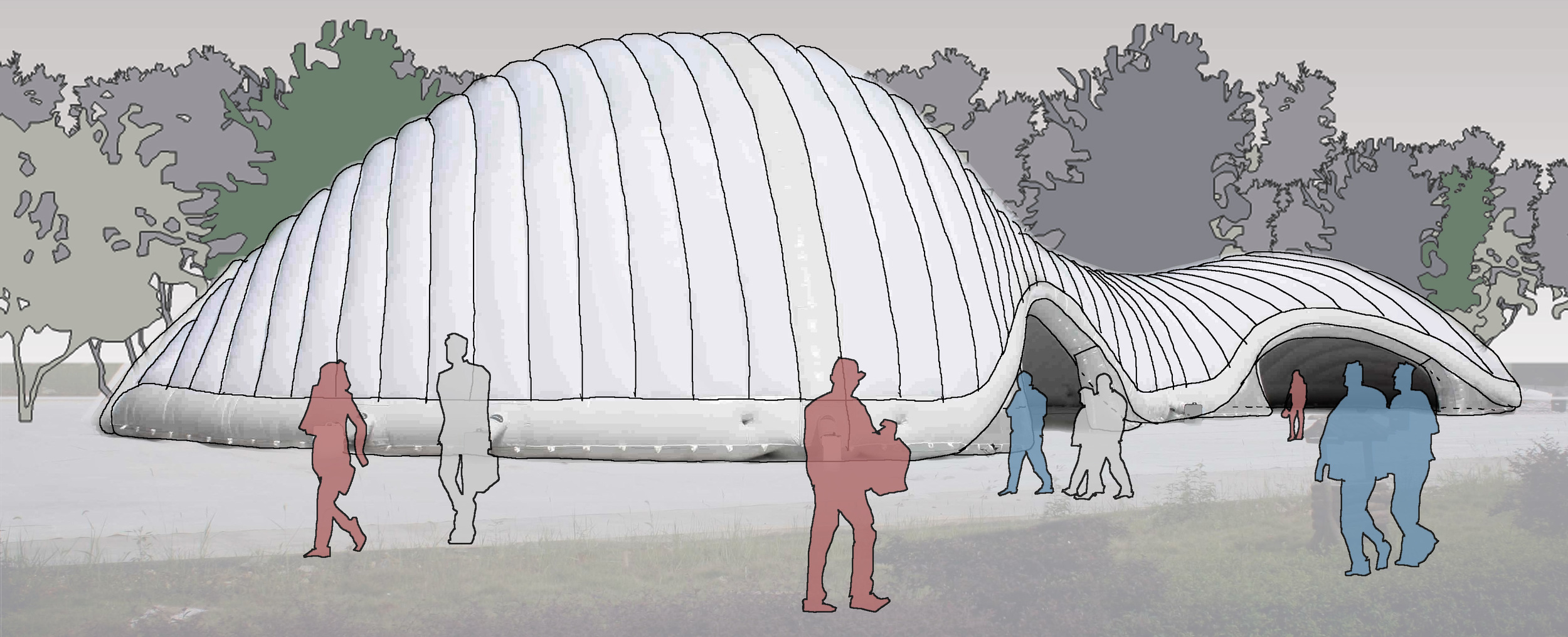
Challenging the existing negative paradigm of event tents, we designed a diaphanous inflatable textile structure to create a mesmerising spatial experience for visitors to the art museum and a striking backdrop for its high-profile public events.

The pavilion at dawn, against the rectilinear backdrop of the museum (Photo: Yves Morfouace)

The pavilion's diaphanous inflatable skin

Our collaboration with LaM started in March 2010, when the museum invited us to submit ideas for an event structure to host up to 350 people for large scale events, ranging from official receptions to dance performances.

Excited by our proposal of a large scale inflatable structure but unsure about its feasibility, the museum initially commissioned us to produce a comprehensive study covering all relevant aspects of feasibility, including the erection process, structural modularity, internal micro-climate, functional analysis, budget simulations and health & safety.
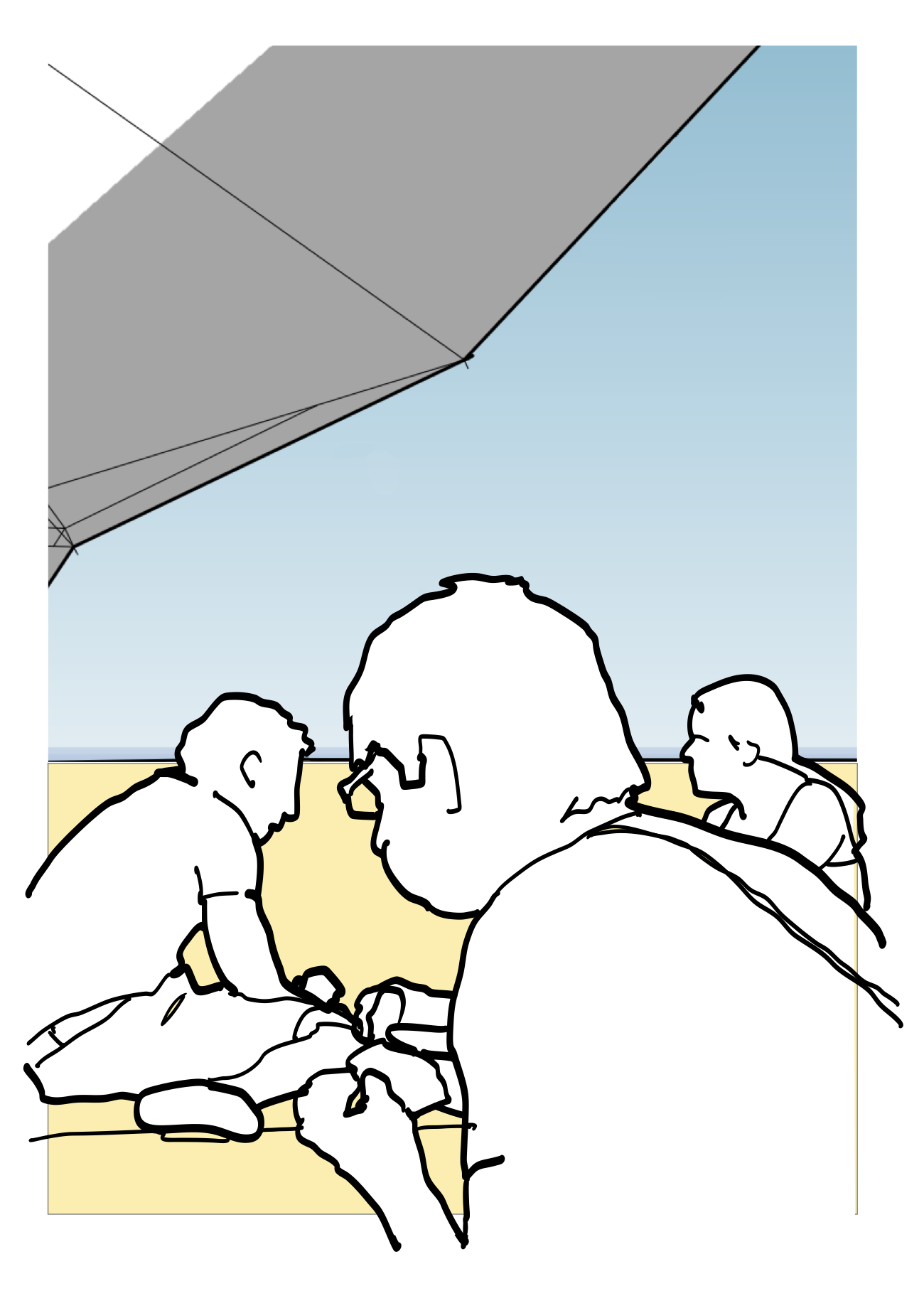
We then teamed up with Inflate, experienced makers of successful inflatable event structures, to produce a custom-designed pavilion that was versatile enough to host the wide spectrum of events envisaged by the museum and that fitted within the tight budget of this not-for-profit art organisation.

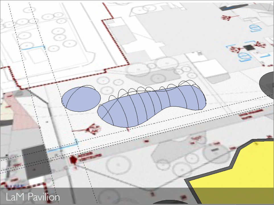
Complementing the orthogonal lines and hard materials of the existing buildings and the urban park surrounding them, the lightweight translucent envelope and organic lines define a transient space between the park’s outdoors and the museum itself, welcoming and orienting visitors in their exploration of the extensive art collections. The pavilion also acknowledges and creates a playful dialogue with the many large-scale modern sculptures inhabiting the museum grounds.

The pavilion is designed to adapt to a wide range of future uses, from public reception to theatre performance.

The structure was first installed in September 2010 to host thousands of visitors for the week long opening festivities. Beyond this, the pavilion will also provide a flexible and iconic new space to host the wide variety of future events to be held on the museum grounds, ranging from theatre performance to public lectures and outdoor interactive video installations.

Press releases and high-resolution images suitable for publications are also available in our press section.

The enjoyment with this wonderful pavilion is so great that everyone — despite the summer weather outside — wants to be inside it, and all faces are lit up with joy!
Barbara Gaul, invited artist from Düsseldorf

Awards

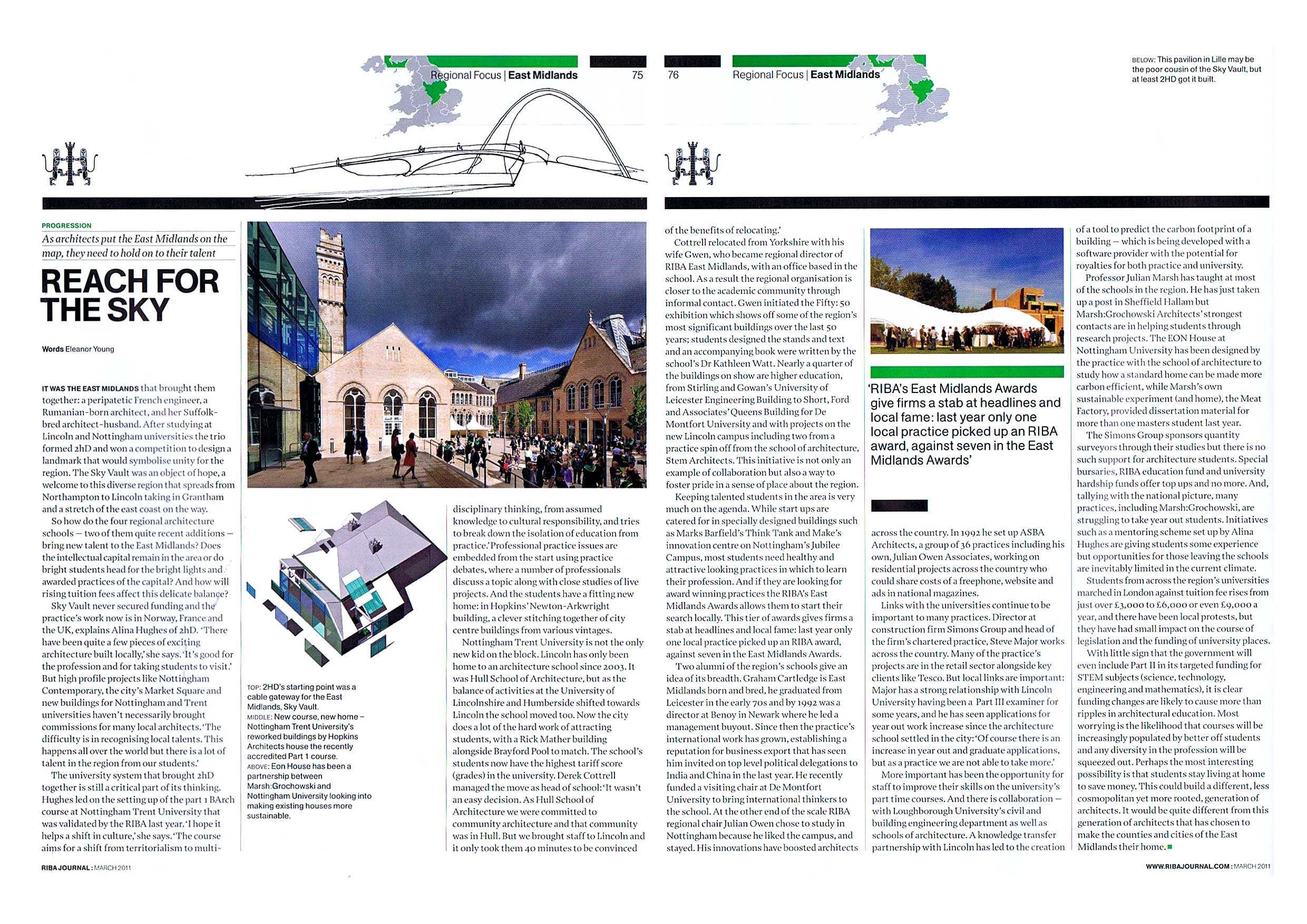
This pavilion received an architecture award from the Royal Institute of British Architects (RIBA) East Midlands in the Out of Region category, in September 2011.

This project has also been shortlisted for the World Architecture Festival Award 2011.

At night, the integrated lighting system transformed the structure into a beacon, softly glowing in the park.

At night, the integrated lighting system transformed the structure into a beacon, softly glowing in the park.


Mission Control tops out

Thibaut Devulder

It has been a while since we last gave our hairy micro-office project some attention, but this weekend we completed the roof. This tiny building is taking shape. Specifically, it is now the shape of a large wooden box.

What we are doing is trying to build ourselves a tiny office building that shimmers from above, shelters from within and bemuses from outside, a space for focussed work away from our increasingly chaotic home office. This is not a project that we are rushing.

We have a strange idea about the cladding for this building, which is where the hairy comes in. In the meantime we are celebrating topping out with the Viking (possibly...) tradition of fixing an evergreen tree branch to the roof. Skål!

Inflatable events space debuts at Lille Museum of Modern Art

Thibaut Devulder

Alina and Thibaut are on site for the official opening of the Lille Museum of Modern Art and have been hard at work seeking opinion on — and taking photographs of — our inflatable event space in the grounds.

French Culture and Communications Minister, Frédéric Mitterrand, described it as “very beautiful” during an official tour of the reopened museum yesterday — after diverting from his official route to view the inflatable.

Alina spoke to artist Barbara Gaul (a.k.a. ANNAH), from Düsseldorf, Germany, who said: “The enjoyment with this wonderful pavilion is so great that everyone — despite the summer weather outside — wants to be inside it, and all faces are lit up with joy!

She also spoke to guest Simone Few, who told her: “Not only is it functional but also very sensitive and protective”. Clearly a woman of excellent judgment and, as it turned out, wife of jazz musician Bobby Few.

For more information, see our press release section and our portfolio page about this project.

Event space interior view

Tom Hughes

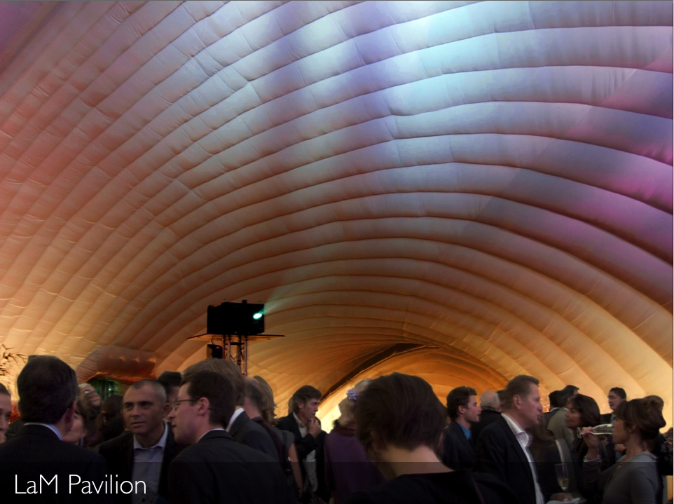
Our event space for Lille Museum of Modern Art was inflated today — a process that took just 10 minutes. This is the first view of the interior, taken by Thibaut shortly after inflation and uploaded to our Flickr group for this project

Freshly inflated...

Interior view of the curved envelop

There is still a lot to do before the official opening tomorrow, including the installation of flooring, lighting and doors. The team are hard at work... but just two days ago it looked like this:

The whole structure, arriving on site on a small trailer

The whole structure, arriving on site on a small trailer

For more information, see our press release section...

Inflatable event space goes on site

Thibaut Devulder

We have designed an inflatable pavilion for the Museum of Modern Art in Lille, France. The pavilion will house events celebrating the re-opening of the Museum, from 21st to 26th September 2010.

On reopening after more than 4 years of refurbishment and extension, the Museum wanted to hold its celebratory events in a striking alternative to the standard marquee. They called on Thibaut's specialist knowledge of fabric and membrane architecture, and Alina's design flair to come up with the idea for the events pavilion.

Located in the sculpture park at the entrance to the Museum, the pavilion will be the focal point for a week-long programme of events, including the formal opening of the Museum by French Culture and Communications Minister, Frédéric Mitterrand, on September 21st. 

The inflatable structure and flexible design mean that the pavilion can be simply depressurised and stored after the celebrations, ready to house future events ranging from theatrical performances to video installations.

The organic shape of the pavilion is meant to stand out from the Museum buildings behind, making it a clear focal point for arriving visitors. It will help to welcome and introduce people to the extended Museum and its huge, exciting collection of Modern art.

Inflatable structures are an excellent way to cover a large area for events. They are more efficient and interesting than traditional tent marquees. The lack of rigid poles gives a clear floor area, they are quick to set up, look fantastic during the event, and then fold away into a tiny storage area.

Designed to hold up to 350 people for events and performances, the pavilion is constructed of lightweight fabric by specialist manufacturer Inflate and was shipped to the Museum site in a single container. 

When pressurised with electric fans the double skinned fabric rapidly deploys to form a rigid but organically-shaped enclosure, covering a space 40m (130 feet) long by 15m (50 feet) at its widest point.

For more information, see our press release section...